By: Mengfei GAO, Kulakshi Fernando
Abstract
This article describes our approach, experiment, and analysis of a case study carried out to evaluate a novel application that is designed for in-situational data collection. We describe in detail our experience in the case study and show the importance of performing user testing at the beginning of a project.
Case-study description
DataLog is a data collection application specialized for situational and manual data collection. Situational (in-situ) data collection means collecting data while users are engaging in their day-to-day tasks. The target audience of the application is mainly researchers and data collectors who engage in human behavioral experiments.
DataLog is designed for mobile platforms as a Progressive Web Application. It is still in the early stages of its development. The application or its design is not yet evaluated with users yet. So we took the opportunity to do the very first user experiment of DataLog to see if its development is carried out in the right direction to meet its purpose.
In this case study we evaluate accuracy, non-intrusiveness and usability of DataLog application. We experimented with 12 students in a classroom. We select 3 scenarios that could use in-situ data collection and that require cognitive and/or social engagement: observing something, engaging in discussions, and generating ideas. The results suggest that the users appreciate the application, but the usability and accuracy has to be significantly improved. We will talk more about the application, reasons behind our experimental design, the experiment and results in detail in the next sections.
DataLog Application
In this section we expect to provide a detailed description about features available in the application at the time of our experiment.
There are 2 types of user roles in the application; Admin and User (normal user). Any user can login as an admin or as a normal user. Admin can create forms to collect data. There are two data types provided; Timestamps and numerical values on a scale. Timestamp can record the time of an incident. The data can be input with a button click. Scales can record a value within a given range (discrete value incremented or decremented by a given step) in addition to the timestamp.
Normal users can login to see forms created by admins, and participate in user experiments. When a user opens a form a simple tutorial screen is displayed indicating available features and their controls. These features are start/stop recording, edit/save layout, and hide/display labels (Figure 1). Users are supposed to start recording prior to entering any inputs (Figure 2). Recording enables sending all button clicks and scale updates to the server. Until the user starts recording the form appears in gray color to indicate a disabled mode. Form appears in pink when it is in recording mode (Figure 3). Using the edit/save layout feature, users can resize or drag and move input elements on the form. The intention of this is to make the form more personalized. The hide/show feature is provided for preserving privacy of users in a social environment when users don’t want others in the vicinity to know which data they are recording.
Figure 1

Figure 2

Figure 3

Measures
Because the application is still in its development stage, instead of evaluating user experience in detail, we wanted to evaluate if the application is in the right direction to provide a great user experience. In order to achieve this we identified 3 main aspects that developers should focus on this application. They are, accuracy, non-intrusiveness and usability.
Being a data collection application that can be used for other research experiments, DataLog should be reliable to provide accurate data. Because DataLog uses manual data entry, the accuracy of data ultimately depends on its end-users. However, DataLog itself should focus on preventing inaccurate data entry and gathering all accurate data as much as possible. This ensures admin users get a good user experience.
As DataLog is designed for in-situ data collection, the process of entering data should not disturb whatever cognitive task or social interaction that user is engaged in. While this may be impossible to avoid completely, DataLog should minimize the intrusiveness and try to get only as little attention as possible from the user. Being non-intrusive provides a good user experience for normal users. It also makes sure whatever the social experiment the data is collected about is not being disturbed ensuring accuracy of data .
Finally, as any software application, DataLog should be usable for its users in terms of user interface and overall user experience on using the application. This includes measures such as user satisfaction and feeling about their experience.
Following table indicates how we used data to calculate our measurements. When collecting data users had the choice to be anonymous if they preferred. However we made all data anonymous when pre-processing data. We also cleaned all data entries recorded out of the experiment time. We describe how we collect data in the next section.
| Measure | Data |
| Accuracy | Error rate when entering timestamp data. Error Rate=(Total Incorrect Button Presses/Total Button Presses)×100 |
| Non intrusiveness | Number of times a social interaction was interrupted due to DataLog |
| Usability | questionnaire results |
Experiment
In order to measure accuracy, non-intrusiveness and usability, we designed 3 user experiments for 3 tasks that require cognitive and/or social engagement of the user. They are observation, discussion and idea generation. We used the observation task to measure accuracy and the rest of the tasks to measure non-intrusiveness. We measured usability via a questionnaire provided at the end of all experiments. (More details later)
At the beginning of the experiment a consent form was provided. Each experiment was carried out for 4-5 minutes. The whole experiment took place for 20 minutes.
In the first experiment, which is the observation task, we displayed a 4 minute video [https://www.youtube.com/watch?v=ZOzzRlc_qho] to the user. This is a short comedy film representing a bad user experience in the IT support system of a company. While watching the video we asked users to record data using DataLog about incidents they observe and how they feel. Following table indicates the entries displayed on the DataLog form users used while observing the video.
| Question/Statement | Data type | UI Element on the form |
| A Pyraminx appeared (We showed users what is a Pyraminx before the experiment start) | Timestamp | Timestamp button |
| Video faded out to black | Timestamp | Timestamp button |
| A bad UX experiences shown | Timestamp | Timestamp button |
| I didn’t get the pronunciation | Timestamp | Timestamp button |
| I feel bordered/interested | Scale (0 to 10, 0 being extremely bored and 10 being extremely interested, step=1) | Scale |
For the discussion task we asked users to discuss bad user experiences they saw in the video in groups of 4-6 people for 4 minutes. In the idea generation task we asked them to stay in the same group and come up with solutions to provide better user experience as a group for a duration of 4 minutes. While users are engaging in these tasks they were asked to enter data in DataLog forms created for these experiments. As we wanted to evaluate the non-intrusiveness of DataLog in these 2 experiments we recorded users to detect if DataLog is disturbing the social interactions. We do not add the form details of DataLog used in these experiments here as they are not considered in our evaluation.
At the end of all experiments users were given two questionnaires, the UEQ(User Experience Questionnaire) and the SUS(System Usability Scale).
For the UEQ, we used a short version of UEQ that was constructed that consists of just 8 items. 4 of these items represent pragmatic quality and 4 hedonic quality aspects. It consists of the scales Pragmatic Quality
and Hedonic Quality. In addition, an overall scale (mean of all 8 items) is reported.
Forthe SUS, The SUS provides a “quick and dirty”, reliable tool for measuring the usability. It consists of a 10 item questionnaire with five response options for respondents; from Strongly agree to Strongly disagree.
Results
We had gathered 280 data entries from 10 users in our first experiment. The format of the data is as follows.
| Element idstring | Element type[Timestamp,Scale] | LabelString | User IdString | TimestampDateTime | ValueNull/Number |
When considering the overview of data we could see that there are very different patterns in data entries from different users in the first experiment (Figure 4). This high inconsistency in the user behavior results in inaccuracies.
We realized that some users have not entered any data and some only few data towards the end of the experiment. This suggests that the application may be confusing to users and they are having a hard time using it. In addition, we noticed that users can simply play with the form. Some users keep pressing timestamp buttons in unexpected periods. Also when reading the values of scale the maximum and minimum values were inserted within 2 seconds. This indicates that the application is not yet ready for gathering data in practical research experiments.
Figure 4

Accuracy
In order to measure accuracy we considered only 2 data labels in the first DataLog form data. There were 45 entries of these labels (Figure 5). Out of them 32 entries were incorrect (correct entries are ones that occur after 10 seconds of correct time indicated by a long vertical line). The calculated error rate is 71% which indicates a very low accuracy.
Figure 5

Non-intrusiveness
We unfortunately lost one of our video recordings. In the remaining recordings we had one of the groups of 5 people. We found it too difficult to calculate non-intrusiveness quantitatively as we expected when we observed the video. Therefore we present qualitative observations of data. Out of 5 users in the recording we observed that 2 users use DataLog at the beginning but they forget to enter data as they engage in discussions. We also observed that one of the users actively engaged in the discussion and entered data. However, this person kept looking at the phone screen even while he was talking which may indicate the intrusiveness of DataLog. We did not consider the rest of the users in our analysis because we could not see their screen on the phone.
Usability
For the UEQ feedback, we can find an interesting point(Figure 6) that DataLog seems confusing to our participants. Clear guidance should be provided to them. The results (Figure 7)also showed that pragmatic quality is negative and hedonic quality is positive. We thought the functionalities had a poor performance but the app seems to be interesting to participants.
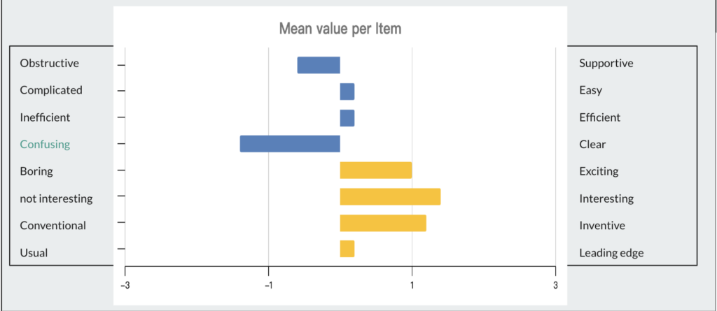
Figure 6

Figure 7
For the SUS feedback, the average score is just 62.5. We generally consider a score of 75 to be “good” and between 50 and 75 to be correct. A score below 50 indicates significant issues with customer satisfaction. So the score of Datalog shows that the app is kind of good but more improvement should be done.
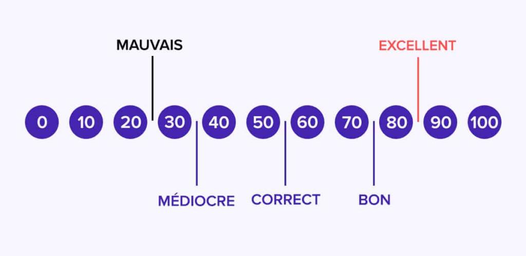
Figure 8
Oral feedback
During the experiment we observed that some users were trying to enter data without starting recording. Some users expressed their feelings and what they expect from the application. One of them said that it is confusing when entering data because they are not getting any feedback from the UI. One of the users appreciated the idea of the application but mentioned that it should be improved. We got a couple of valuable feedback for improvement as well which will be mentioned in the next section.
Insights and Recommendations
We recommend that DataLog should take strong measures to improve accuracy in order to make it reliable to admin users. In order to do that, developers should find ways to reduce confusion, decrease the error rate and try to make users enter all data. We suggest a few changes to achieve this;
- Provide an onboarding stage to the form where users are described about the experiment and the questions on the form [based on a user feedback]
- make the tutorial more attractive and user friendly
- Add input feedback on UI elements [based on a user feedback]
- Change the appearance of input elements to bring in a more serious look (like physical buttons and scalers)
- Control number of times an input can be provided with the same element within a short period of time (like 5 seconds)
- Remind users periodically to add data by adding a subtle vibration
- Force users to press ‘start recording’ when they seem to click on elements without recording
In terms of intrusiveness, we cannot make a conclusion on whether DataLog is really intrusive or not based on our data. However at the onboarding stage suggested before, users could be educated how this application can be intrusive to social situations and be mindful about it.
In the usability tests we can see that users are not satisfied with pragmatic qualities of the application. This suggests that users find it hard, confusing and non-intuitive to use. The suggestions mentioned to improve accuracy are applicable here too. In addition,
- the application must be bug fixed
- Follow common UI designs available on other data collection applications (for example, colors and icons)
- Update the layout of action on form into a more standard way.
In summary, we can conclude that DataLog is not yet ready for practical usage. However we believe our experiment in its early development stages brought it valuable insights on what to prioritize in the next development cycles.