Abstract
Géovélo is a cycling navigation app that already optimises routes for comfort and safety, but route choice still often happens in seconds—based on what is most visually salient rather than what is objectively safest. In this Quant UX project, we tested whether changing the presentation of safety information (without changing the underlying routing engine) could shift user decisions toward safer itineraries while also reducing decision friction. Concretely, we redesigned the route-selection screen to make the percentage of cycling infrastructure easier to notice and compare at a glance, thereby adjusting the “choice architecture.” We ran an experiment with three interface conditions: baseline (no change), medium safety guidance, and a best (strongest) safety-oriented redesign. We measured final route choice (Short / Best / Safe / Touristic) and decision time, and we also collected self-reported user context (e.g., priorities and psychological state). Results show a strong behavioural shift: Safe routes increased from 7/73 (baseline) to 16/73 (medium) and 49/73 (best), while decision time decreased across user priorities.
Introduction
Overview of geovelo
Géovélo is a free bicycle GPS and routing platform designed specifically for cyclists. Unlike general-purpose navigation tools, it is built around bike-relevant constraints: it prioritizes cycle paths, bike lanes, and low-traffic streets, and aims to avoid areas perceived as dangerous for cyclists.
Beyond navigation, Géovélo also supports activity tracking and cycling statistics (including routes recorded in navigation mode, manual recording, or automatic detection if enabled), and it provides aggregated insights that can help local communities understand cycling flows and plan infrastructure.
A key element of the product that we will focus on is personalization. Users can specify their bike type (classic, electric, cargo) and choose a routing preference/profile (more secure vs. more direct), which influences the itineraries proposed.
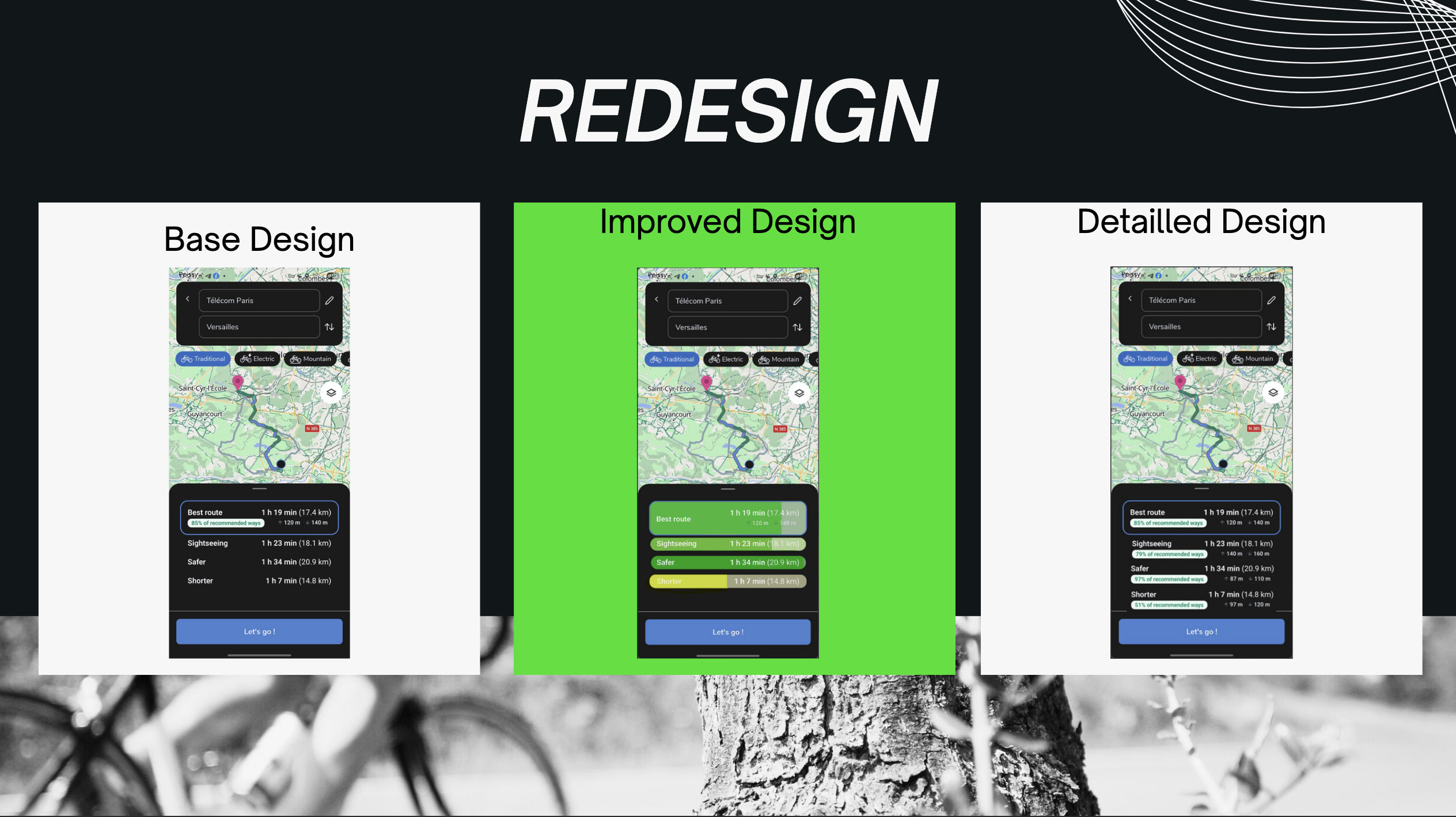
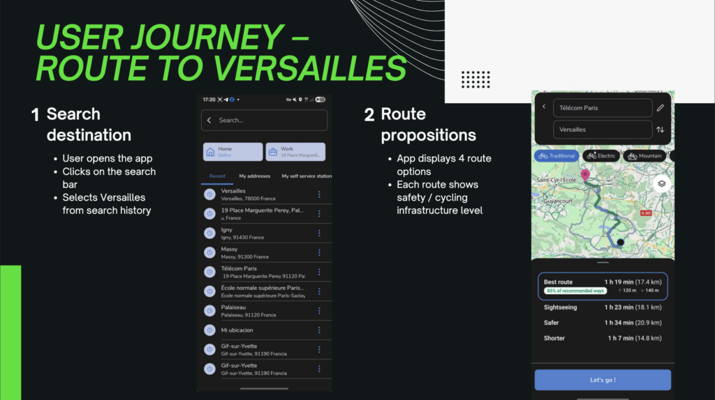
When a user searches for a destination, Géovélo typically offers four route types:
- Balanced (compromise between speed and infrastructure)
- Direct (fastest / most direct)
- Secure (maximizes cycling facilities)
- Tourist (more scenic / discovery-oriented)
The route doesn’t change. The probability of accidents doesn’t change. But the cognitive weight of safety does.
Our motivation
Finally, the broader context motivating our study is that cycling safety remains a public concern in France: for example, between 2019 and 2023, reported cyclist deaths increased by ~18% even as cycling usage rose—making the question of “how to help people choose safer routes” both practical and socially relevant.
The real problem isn’t information — it’s presentation
Cycling lanes reduce accident risk. That’s not controversial. But when a user opens a navigation app and sees several route options, safety isn’t always the deciding factor.
Why? Because route selection often happens quickly. Users glance at estimated time, maybe distance, and make a choice in seconds. They’re not carefully evaluating percentages of cycling infrastructure. They’re using shortcuts — fast, intuitive judgment.
So the problem may not be that users don’t care about safety. It might be that the interface doesn’t make safety cognitively easy to prioritize.
That’s where our intervention comes in.
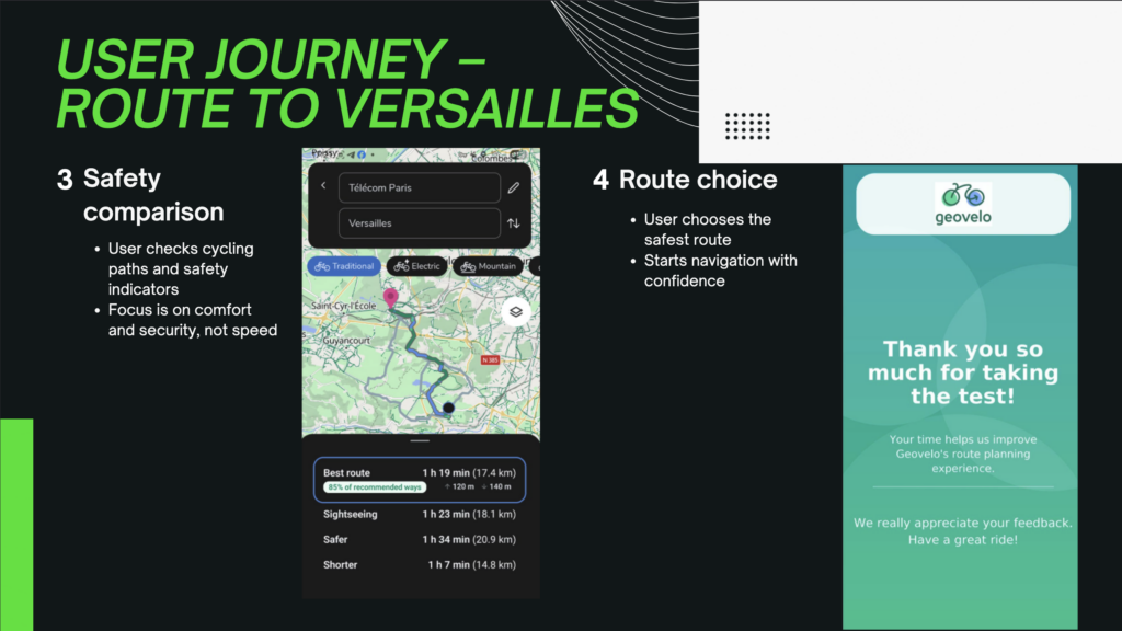
User journey
Our Idea: Change the Decision Architecture
We didn’t remove unsafe routes. We didn’t force users into one option. We didn’t change the underlying routing algorithm.
Instead, we changed how routes were presented.
We increased the visibility of the percentage of cycling lanes in each route. We made safety easier to compare at a glance. We structured the information so that it is aligned with fast decision-making rather than requiring effortful analysis.
In other words, we redesigned the choice architecture.
The key insight is this: people don’t always optimize perfectly. They rely on what stands out. If safety is visually secondary, it becomes behaviorally secondary. If safety becomes prominent and easy to process, it gains weight in the decision.
The experiment
Our Hypothesis
We formulated a clear, testable hypothesis:
If safety information is more visible and better aligned with rapid decision-making processes, more users will choose the safer route — and they will do so faster.
That second part is important.
Usually, when you add emphasis to an attribute, you risk increasing complexity. More information can mean more thinking time. But we hypothesized the opposite: better structured information reduces cognitive friction.
In simple terms, good design should make better decisions easier — not slower.
Protocol
Since this was a Quant UX project, intuition wasn’t enough. We needed measurable evidence.
We designed an experiment where participants were exposed to different versions of the interface: the original version and progressively more safety-oriented redesigns. The task was the same in each condition — select a route to a destination.
We measured two key things:
- Which route they chose
- How long they took to decide
Route choice tells us whether behavior shifts. Decision time tells us something about cognitive load and clarity. If people choose safer routes but take much longer, that might indicate increased effort. But if they choose safer routes faster, that suggests the interface reduces ambiguity.
We also collected psychological and demographic data — cycling frequency, stress levels, perceived risk tolerance — to see whether the redesign worked consistently across different types of users.
That’s important because a truly effective UX intervention shouldn’t only work for cautious users. It should influence decisions broadly.
Implementation
The key problem here is : how interface guidance affects decision time, final route choice, and user psychology ?
For context, when people choose a cycling route, they rarely optimize only one thing. Some prioritize safety, others simplicity, speed, or scenery—and their current state (stress, fatigue, risk appetite) can strongly influence the final decision.
In this project, we evaluated three interface conditions:
- Without change (baseline)
- Medium (some safety guidance)
- The best (strongest, most effective safety guidance)
We focused on two core outcomes:
How long people take to decide (decision time)
What they choose (final route category: Court/Short, Meilleur/Best, Sûr/Safe, Touristique/Touristic)
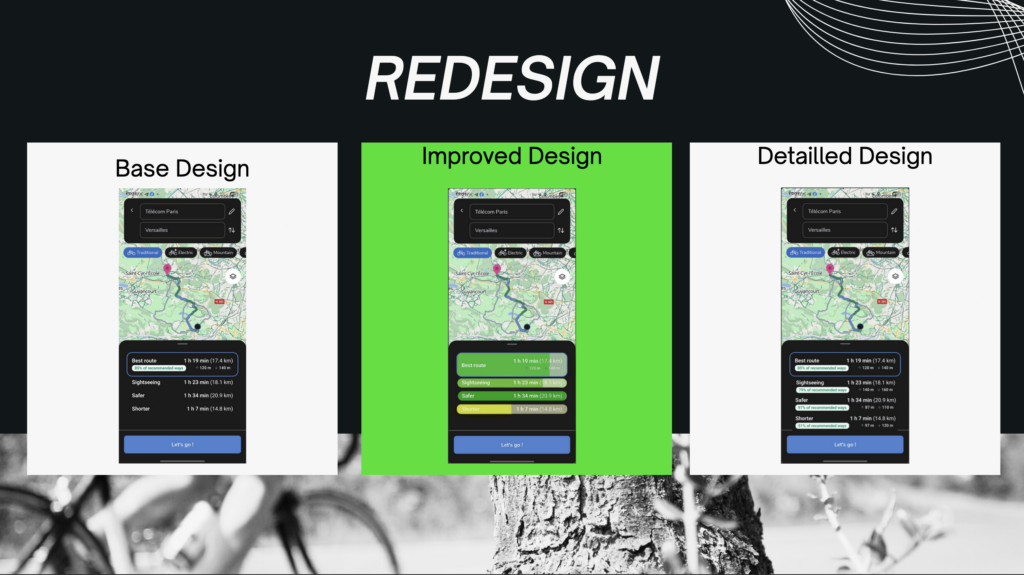
Caption : our two redesigns of the application
Results
The best model reduces decision time across user priorities
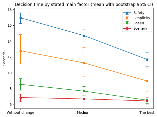
Caption: Decision time decreases from Without change → Medium → The best, across all stated priorities (Safety, Simplicity, Speed, Scenery). Error bars show bootstrap 95% confidence intervals.
This first figure shows a clear and consistent pattern: as the interface provides stronger safety guidance, users decide faster even when safety is not their main stated factor.
What stands out:
For users who prioritize Safety, decision time drops dramatically in The best model (largest improvement).
Users prioritizing Simplicity also show a strong reduction, suggesting that clearer safety cues reduce cognitive load and uncertainty.
Even users prioritizing Speed or Scenery still decide faster with The best model, indicating that the safety guidance does not create friction.
Key interpretation:
The best model doesn’t slow people down—it helps them commit faster, likely because the interface makes the “safe choice” easier to understand and compare.
The best model shifts choices toward safer routes
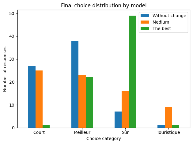
Caption: Final route choices shift strongly toward Sûr (Safe) in The best model.
This distribution plot shows how behavior changes across the three models.
From our chart:
Without change: Safe is a minority choice (7 / 73)
Medium: Safe increases (16 / 73)
The best: Safe becomes dominant (49 / 73)
That is a major behavioral change:
Safe route selection goes from ~10% → ~22% → ~67%.
Key interpretation:
The best model doesn’t just improve clarity—it changes the outcome. Users are substantially more likely to choose safer routes once safety is made salient and easy to interpret.
The shift toward “Safe” happens even when users did not prioritize safety
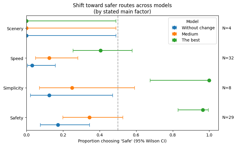
Caption: Proportion choosing ‘Safe’ increases across models for every stated priority; error bars show 95% Wilson confidence intervals. N per factor shown on the right.
This figure is powerful because it breaks the effect down by user intent (“what they said mattered most”). The key message is:
The best model increases Safe choices even among users who prioritize speed or simplicity.
From the plot:
Safety group (N=29): Safe jumps to almost everyone in The best model.
Simplicity group (N=8): Safe reaches near-total adoption in The best model.
Speed group (N=32): Safe still increases strongly in The best model.
Scenery (N=4): very small sample → interpret cautiously, but the direction remains consistent.
Key interpretation:
The best model acts like a “behavioral stabilizer”: even when users are not explicitly safety-driven, the interface strongly nudges them toward safer routes.
Psychological patterns: how stress, risk, and perceived safety relate to choices
Here we look at psychological self-reports by final route choice (Best/Short/Safe/Touristic).
Without change (baseline)
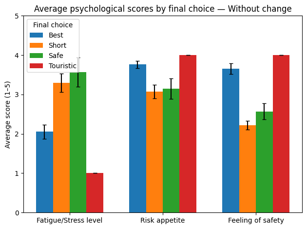
Caption: In the baseline, route choice is more sensitive to psychological state (stress, risk, perceived safety).
In the baseline condition, the differences between route types are visible:
“Short” routes tend to align with higher fatigue/stress and lower perceived safety.
“Best” routes align with higher perceived safety overall.
Some categories likely have small sample sizes (especially Touristic), so interpretation should remain cautious.
Takeaway:
Without guidance, users’ internal state can strongly shape the decision.
Medium
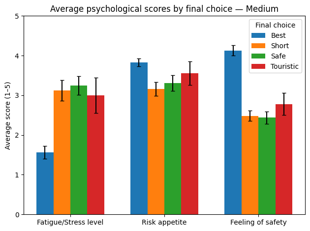
Caption: Medium reduces some differences, but psychological profiles still influence choices.
The Medium model begins to compress differences between choices:
Perceived safety improves for stronger route types.
Variability appears reduced compared to baseline.
Takeaway:
Medium helps, but does not fully stabilize behavior.
The best
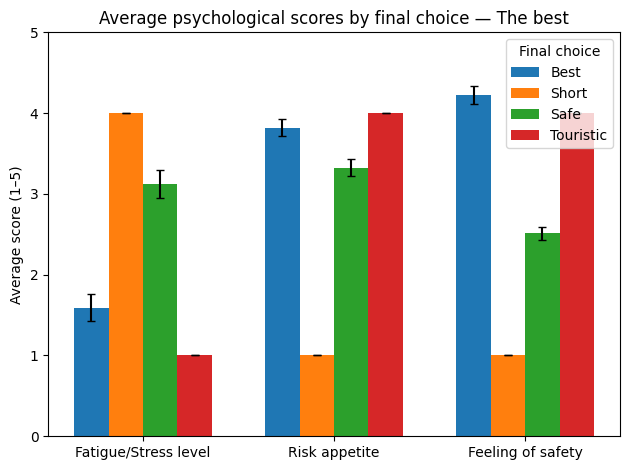
Caption: Under The best model, behavior becomes more consistent and less dependent on stress/risk differences.
In The best model, the overall pattern suggests:
Route selection becomes more strongly aligned with the interface structure.
Safe choices are selected broadly, not only by the most risk-averse users.
Takeaway:
The best model reduces the dependence of final decisions on momentary stress or risk appetite—users converge toward safer outcomes more consistently.
Conclusion
The best model reduces decision time across all user priorities.
The best model makes Safe routes the dominant choice (large behavioral shift).
The shift toward safety occurs even when users prioritize speed or simplicity, indicating a strong interface-driven effect.
Psychological factors matter most in the baseline; The best model stabilizes decisions and supports safer outcomes more consistently.
Limitations
Some subgroups (e.g., Scenery) have small sample sizes → interpret with caution.
Touristic choices are rare → psychological comparisons may be unstable
What we would do next
To quantify “what matters most” (interface vs. psychology), the next step would be a lightweight predictive model (e.g., logistic regression) to estimate how strongly each variable predicts choosing a Safe route—especially to confirm that model type is the strongest driver.