A comparative UX evaluation of two fashion e-commerce websites: Shein and Chrome Hearts.
Written by: Karabo KOBOLA, Sergei KHMIZIUK, Xinyi CHEN, Mattew YANG, Nguyen Duc Huy, Flavie LOUIS-ERNEST.
Abstract
Fast-fashion and luxury e-commerce platforms adopt contrasting interface strategies, yet their impact on usability and cognitive load remains unclear. This study compares user experience on two fashion websites, Shein and Chrome Hearts, to examine how interface structure, navigation design, and content density influence typical online shopping tasks. We conducted a task-based usability evaluation in which participants completed six representative shopping tasks on both websites. Usability was measured using Single Ease Question (SEQ) ratings and System Usability Scale (SUS) scores, supported by mouse tracking, screen recordings, and short qualitative feedback.Results show a consistent pattern: Shein supports product discovery and comparison more effectively, with higher ease ratings during early browsing stages, while Chrome Hearts performs better in later transactional steps such as checkout. However, neither platform reached the standard SUS usability benchmark.The findings suggest that structured categorization and filtering reduce cognitive load more effectively than minimal visual design alone, indicating that navigational clarity is more critical than interface density in supporting goal-directed shopping
Introduction
1.1 Overview of Study
The growing contrast between fast fashion and slow or luxury fashion has become an increasingly relevant topic in public discourse. This is especially evident when comparing brands such as Shein, a dominant fast-fashion platform known for affordability and rapid production cycles, and Chrome Hearts, a luxury brand that remains inaccessible to many users due to its high price point and exclusivity. Fast fashion is characterized by rapid product turnover, low prices, and constantly refreshed collections. While this model increases accessibility, it also raises significant environmental, social, and ethical concerns. From a user experience perspective, these platforms often encourage impulse buying, which can negatively impact how users perceive and enjoy their shopping experience.
In this study, we examined how users interact with both the Shein and Chrome Hearts websites during purchasing tasks. Beyond observing purchasing behavior, we focused on how cognitively demanding each platform is when users attempt to complete specific goals, such as finding a preferred perfume or product. Particular attention was given to how seamlessly users could navigate the websites without needing to backtrack, restart tasks, or become disoriented. Understanding these interactions allowed us to analyze user input, cognitive effort, and overall experience in depth. The insights gathered from this process informed potential design improvements for the Chrome Hearts website to better align with user needs and expectations, while also identifying areas where the Shein website could be adjusted or refined based on direct user feedback.
1.2 Purpose of study
The primary objective of this study is to evaluate and compare the usability of the Shein and Chrome Hearts websites. By conducting this evaluation, we aim to gain a deeper understanding of how different interface structures, content density, and navigation patterns influence the user experience across fast-fashion and luxury platforms.
Specifically, this study seeks to answer the following research questions:
- Does a denser interface with a larger number of product options increase cognitive load during product selection?
- Does non-standard or unclear categorization make it more difficult for users to decide between similar products?
- Does the navigation structure support goal-directed searching rather than encouraging unfocused exploratory browsing?
- Does one website consistently result in lower cognitive load across all shopping tasks compared to the other?
In addition to these research questions, the study evaluates four core usability goals, each supported by defined signals and measurable metrics:
| Goal | Signal | Metric |
|---|---|---|
| Efficient Navigation | Users are able to locate global settings and products without looping, backtracking, or becoming lost. | Task success rate, time on task, and number of pages visited. |
| Minimized Cognitive Load | Users remain focused on primary actions, such as purchasing, rather than being distracted by clutter, advertisements, or pop-ups. | Fixation duration on areas of interest (such as products), observed through mouse tracking. |
| High Perceived Usability | Users report that the website feels organized, professional, and easy to use. | System Usability Scale (SUS) scores ranging from 0–100, and Single Ease Question (SEQ) ratings on a 1–7 scale per task. |
| Error-Free Interaction | Users navigate size selection and cart interactions smoothly, without friction. | Error rates (e.g., attempting to add an item to the cart without selecting a size) and the number of backtracking events. |
1.3 Target audience
The target audience for this study includes frequent users of online shopping platforms, particularly individuals who regularly explore both fast-fashion and luxury fashion websites. These users provide valuable insight into real-world shopping behaviors, expectations, and frustrations across different market segments. Additionally, this study is intended for UX designers, product designers, and developers. By presenting an in-depth usability analysis and evaluation, the findings can support professionals in identifying design flaws, understanding user pain points, and implementing meaningful improvements to existing e-commerce platforms.
1.4 User journey map
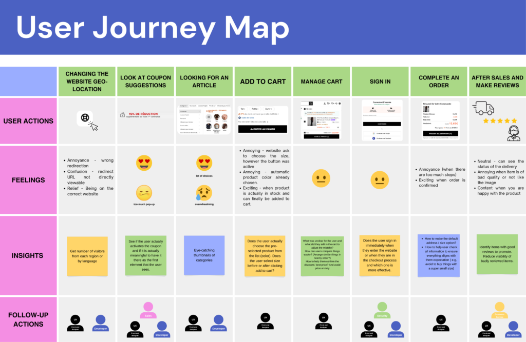
To effectively evaluate both websites, we began by observing how users naturally interact with them through realistic task-based simulations. These simulations allowed participants to replicate real-life shopping behavior, enabling us to assess usability in a context that closely reflects actual use. The user journey was mapped step by step, starting with changing the website’s geo-location and continuing through coupon exposure, product discovery, adding items to the cart, managing the cart, signing in, completing the purchase, and concluding with post-purchase actions such as delivery tracking and leaving reviews. At each stage, we documented user actions, emotional responses, and key pain points.
Early in the journey, users frequently experienced confusion or irritation due to redirections, pop-ups, and promotional interruptions particularly during location changes and coupon prompts. During product exploration, emotions fluctuated between excitement and overwhelm as users navigated extensive product selections. Significant friction emerged during size selection and cart interactions, where unclear information or additional steps caused frustration. While emotions stabilized during checkout, annoyance resurfaced when the process felt lengthy or required mandatory account sign-in.
These insights were crucial in identifying moments of hesitation, increased cognitive load, and critical decision-making points within the shopping experience, ultimately guiding our usability evaluation and design recommendations.
Methodology
This study is a comparative usability evaluation, using standardized questionnaires to compare user experience across two e-commerce websites.
2.1 Ethics
The study protocol followed the principles of informed consent, transparency, and participant autonomy, as typically required in formal ethics approval procedures for experimental studies. Participants were informed about the purpose of the study, the nature of the activities, and the use of mouse tracking and screen/audio recording before participation.
Participation was entirely voluntary. Participants were informed that they could refuse to participate without any consequences and stop the session at any time without any penalty.
2.2 Data protection
All data collection followed GDPR-compliant procedures in accordance with EU data protection regulations. The study was designed to minimize data sensitivity and risk by avoiding the collection of any personal or identifiable information. No names, contact details, demographic identifiers, or IP addresses were stored. Data access was restricted to the research team, and the dataset was used exclusively for academic purposes within the scope of this study.
Data was collected using JotForm, a platform with data storage on EU-based servers, ensuring compliance with European data residency and security requirements.
2.3 Post-Task Satisfaction
To measure usability at the task level, we used the Single Ease Questionnaire (SEQ) after each task, using a 1–7 Likert-type scale. SEQ captures users’ immediate perception of task difficulty directly after task completion, reducing memory bias and retrospective distortion.
This method enables fine-grained, task-specific analysis of usability, allowing identification of friction points within specific interactions rather than relying solely on aggregated session-level measures. SEQ scores were aggregated per task and per platform to enable comparative analysis between the two systems and to identify patterns of perceived difficulty across interaction flows.
2.4 Post-Test Assessment of Usability
To assess overall usability, participants completed the System Usability Scale (SUS) at the end of the session, using a 1–5 Likert scale with alternating positive and negative statements. This structure reduces acquiescence bias and response patterning, improving the reliability of self-reported usability ratings.
SUS provides a global, system-level measure of perceived usability, capturing users’ holistic experience beyond individual task interactions. Scores were aggregated per platform to enable comparative analysis between the two systems and interpreted using established SUS benchmarks, allowing assessment of relative usability performance and overall system quality.
2.5 Qualitative data
Open-ended questions were used to capture participants’ subjective reasoning, expectations, and interpretations of their interactions. This qualitative data provided explanatory depth to the quantitative findings, helping to contextualize SEQ and SUS scores.
2.6 Behavioural data
Screen and audio recordings were used to support detailed post-session analysis and data verification. Screen recordings enabled retrospective review of interaction sequences, navigation paths, and interface states in cases of ambiguity or uncertainty during analysis. Audio recordings ensured complete documentation of participants’ verbalizations and reactions, allowing researchers to revisit user reasoning and comments that may not have been fully captured in real-time notes. Together, these recordings supported analytical reliability and traceability of observations.
Mouse tracking was used as a complementary behavioural measure to analyze interaction patterns at the task level. Mouse movement and click data were aggregated per task and per platform to identify areas of concentrated interaction and attention. This data was used to generate visual representations such as interaction maps and heatmaps, enabling comparative analysis of interface saliency, navigation strategies, and user focus across the two systems.
Study
Results
In this section, we’re presenting the results from our post-task Single Ease Question (SEQ) and the overall System Usability Scale (SUS).
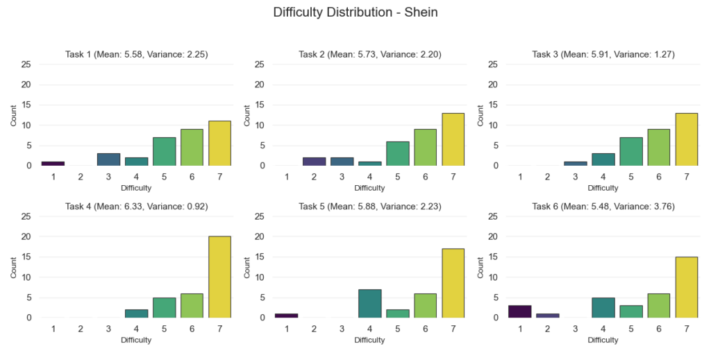
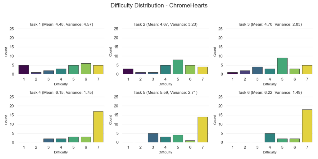
For the SEQ results, we organized everything by website and by each of the six tasks. These tasks included changing the shipping location, finding a specific product, comparing products, adding an item to the cart, modifying the cart, and proceeding to checkout.
For every task, we calculated the mean score and the variance. The chart shows the average SEQ rating per task for both Shein and Chrome Hearts, making it easy to compare how each website performed on the same activity.
We also included variance values to show how consistent participant responses were. Lower variance means people generally agreed on how easy (or difficult) a task felt. Higher variance means opinions were more spread out.
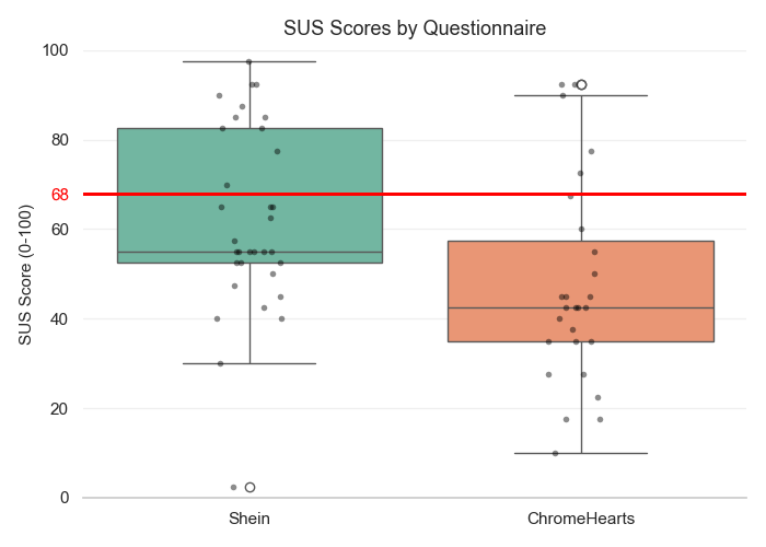
For the SUS results, we used a box-and-whisker plot to visualize the overall score distribution. This type of plot shows five key statistics: minimum, first quartile (Q1), median, third quartile (Q3), and maximum.
The box represents the middle 50% of scores (the interquartile range), and the line inside the box marks the median. The “whiskers” extend to the lowest and highest values within the non-outlier range.
We also plotted individual participant scores as dots so we can clearly see how spread out the results are. Extreme values are highlighted with a white circular marker, showing the minimum and/or maximum observed scores.
Finally, we added a horizontal red line at 68, which is the commonly accepted benchmark for a “passing” SUS score. This gives us a clear visual reference point for how the overall distributions compare to that threshold.
Discussion Insight
SEQ Results
When we look at the SEQ scores, Shein performed consistently well across all tasks. The average scores were high, which means most people felt the tasks were easy to complete.
Adding an item to the cart was the easiest task and had strong agreement between participants. Comparing products and modifying the cart were also rated as easy. Finding a product and changing the shipping location were still rated positively, but responses were a bit more mixed.
Checkout had the lowest score on Shein and the biggest spread in answers. This tells us that while many users had no issues, others likely struggled with parts of the checkout flow.
We can see that Shein made browsing and product-related tasks feel easy, but the checkout experience was less consistent.
Chrome Hearts showed a different pattern. Tasks like changing the shipping location, finding a product, and comparing products received lower scores and had a wide spread of answers. This suggests that some users found these tasks harder or less clear.
However, once users found a product, things improved. Adding items to the cart and checking out were rated highly and more consistently. That tells us the buying steps themselves were clear and structured.
In short, Shein performed better in browsing and product discovery, while Chrome Hearts performed just as well (or slightly better) during checkout. This suggests Shein supports searching and exploring better, while Chrome Hearts keeps the final buying steps simple.
SUS Results
Shein’s overall usability scores were very spread out. Some users rated it extremely high, while others rated it very low. The middle score (median) was below the standard usability benchmark of 68, but a portion of users rated it well above that mark.
This shows a split experience. Some users handled the busy layout and large product range well. Others may have felt overwhelmed.
Chrome Hearts had lower scores overall. Most participants rated it below the 68 benchmark. While four users (or seven, if we’re being generous) rated it highly, the majority found it less usable compared to Shein.
In simple terms, neither website clearly passed the standard usability benchmark. However, Shein had more strong positive ratings, while Chrome Hearts’ scores were generally lower across the board.
Takeaways
Shein makes it easier to browse, search, and compare products, even though the site is visually busy. This suggests that good filters and clear categories matter more than having a minimal design.
Chrome Hearts, on the other hand, struggles more during browsing and product discovery. But once users decide to buy something, the checkout process feels smooth and straightforward.
The main takeaway here is that, maybe intuitively, clear structure and guidance is preferred over how simple or minimal a website looks. Users want help finding what they’re looking for quickly and easily.