Authors: Nazrin Nasirova, Ayda Yurtoglu, Dimah Bassal, Kimia Senichault
Abstract
This report summarizes a quantitative user experience (UX) study conducted on the GoodReads website. The project aimed to evaluate how intuitive, efficient, and satisfying the process is for users when finding a book recommendation. By combining quantitative metrics (click counts, time spent, cursor trajectory) with qualitative feedback, the study identified both strengths and weaknesses in the current design. The findings highlight specific areas for improvement in navigation, personalization, and user interface design, ultimately offering actionable recommendations to enhance the overall user experience.
Case Study Description
The system analyzed in this case study is GoodReads, a website owned by Amazon designed for book enthusiasts seeking recommendations, reviews, and community interaction centered around literature. GoodReads’ primary purpose is to assist readers in discovering new books, tracking their reading habits, sharing reviews, and engaging with fellow readers.
The main audience comprises readers ranging from casual book readers to literature enthusiasts, predominantly within the 18-25 age group. The uniqueness of GoodReads lies in its combination of extensive user-generated content, personalized recommendations, and community-driven interactions, setting it apart from simpler e-commerce platforms or traditional recommendation systems.
This case study is particularly interesting because of the platform’s popularity among readers and its ability to influence users’ reading choices. Understanding the strengths and weaknesses of such a widely used website can help improve the user experience in other digital recommendation systems.
Data
The data for this project were collected during structured user testing sessions with 16 participants. No external data sources were used. Participants interacted with the GoodReads website through defined tasks, and their feedback was gathered using Google Forms after each task was completed. Additionally, cursor-tracking data were collected throughout user interactions.
Most participants were young adults, with 75% between 18 and 25 years old. Specifically, 43.8% were aged 18-21, and 31.3% were 22-25, while the rest were older. Participants’ reading habits varied, with 37.5% reading a few times a month and 18.8% reading several times a week. Other reading frequencies were less common.
Quantitative data included the number of clicks, time spent on pages, cursor trajectory, and the total distance traveled by the cursor. Metrics captured through mouse tracking included the frequency and pattern of interactions, average time spent on different sections, and cursor paths taken during tasks.
Qualitative data involved participant comments and answers provided in Google Forms, capturing subjective experiences such as ease of navigation, user satisfaction, perceived intuitiveness, and overall impression of the platform. Data was anonymized to protect participants’ privacy.
Methods
In this study conducted on the GoodReads website, our goal was to assess how intuitive, efficient, and satisfying the process is for users when finding a book recommendation. Our approach combined quantitative metrics with qualitative feedback, focusing primarily on the “finding book recommendations” functionality.
We identified this functionality as crucial during our initial user journey mapping, which highlighted key pain points and opportunities throughout the website’s user experience. This analysis showed that discovering books is the most important and engaging aspect of the GoodReads platform.

Then, we identified the goals, signals, and metrics for our project before we started the data collection, which guided us better to decide on how to collect and analyze the data.
| Goals | Signals | Metrics |
| Identify pain points and inefficiencies on the Goodreads website. | – User reported frustration or confusion. – User gave a low rating to a feature | – Average time spent locating different sections; – Frequency of interactions per page; – Qualitative feedback from surveys. |
| Evaluate ease of finding book recommendations. | – Users quickly found desired books or show confusion and difficulty. | – Average time spent finding a relevant book; – Average number of books consulted; – Cursor movement distance. |
| Measure user satisfaction and suggest improvements. | – User feedback about their overall experience, navigation ease, clarity of design, and recommendations. | – User satisfaction ratings (Likert scale); – Qualitative feedback (open-ended responses); |
Protocol
We prepared a protocol that fit the goals of the study. We had 16 participants who went through different tasks using the Goodreads website and filled up a form based on their experiences. The protocol involved three primary tasks:
- Task 1: Participants created an account and were asked to find a book they would personally enjoy, aiming to understand how first-time users navigate the site.
- Task 2: Participants completed mini-challenges, which involved using different GoodReads functions such as ‘Similar Books’, ‘Favorite Genres’, ‘Explore’, ‘Lists’, and ‘Community’, to better understand the site’s various sections.
- Task 3: Participants used the platform to find a book recommendation for a friend’s birthday, helping to analyze the platform’s social and recommendation features.
Analyzing Results
To analyze the results of our user experience study on GoodReads, we employed two primary methods: Google Form Analysis and Cursor Tracker Analysis.
Google Form Analysis
- Quantitative Analysis: We collected structured, numerical data through Google Forms, which included metrics like user ratings and time metrics. This data was visualized using charts and graphs to identify patterns and insights that could inform our understanding of user satisfaction and site usability.
- Qualitative Analysis: The forms also included open-ended questions to capture the subjective experiences and opinions of participants. Initially, we attempted to apply Natural Language Processing (NLP) techniques to analyze these responses. However, given the limited sample size and the nature of the feedback, NLP did not provide the expected insights. As a result, we manually reviewed the responses to conduct a thematic analysis, summarizing the key points raised by users to better understand their experiences and challenges.
Cursor Tracker Analysis
We utilized cursor-tracking plugin to obtain detailed quantitative data on participants’ interactions with the GoodReads website. This analysis helped us understand users’ browsing patterns, identify frequently visited areas, and spot sections that might have caused confusion. We first restructured the raw cursor data to prepare it for detailed analysis. We analyzed following types of metrics:
- Interaction Frequency per Page Type: The number of times each webpage (Home page, Book page, Genre pages, etc.) was interacted with, helping identify important or problematic areas.
- Total Time Spent per Page: The total time participants spent completing each task was analyzed to measure efficiency and detect any problematic areas in the navigation process.
- Cursor Movement Distance: The total distance the cursor moved on-screen (measured in pixels), reflecting the amount of user navigation or potential uncertainty.
- Average Number of Books Consulted per Task: The average count of books users viewed during each task, indicating the quality and relevance of book recommendations.
- Cursor Interaction Heatmaps: Visual maps showing where users clicked, hovered, scrolled, and moved their mouse most frequently. These heatmaps help identify which parts of the website attracted the most user attention.
The analysis was conducted by Python scripts. Specifically, we used libraries such as pandas for data manipulation, numpy for numerical computations, matplotlib for creating visualizations (including heatmaps, bar charts, correlation matrices, and line plots), and seaborn for enhanced statistical graphics. These visualizations allowed us to clearly visualize cursor trajectories, heatmap activity on specific webpage elements, and the distribution of interactions across different sections of the site.
Through cursor-tracking analysis, we could quantify how users interacted with various website components, enabling a quantitative assessment of user engagement and interaction complexity without relying only on self-reported survey data.
Results
Task 1: Free Exploration
The first task required participants to freely explore the website and find a book that interested them.
Our analysis of the survey revealed mixed opinions from the participants. While five participants found the website easy to navigate and two appreciated its non-distracting color scheme, others encountered challenges. Four participants described the site as confusing, three felt it displayed excessive information and had an unappealing design, and one noted that requiring users to sign in before browsing could dissuade some users from using the website. The average user rating for finding a book recommendation was 3.9 over 5. These insights highlight the need for improved usability, clearer information presentation, and a more inviting user experience.
Cursor-tracking analysis for Task 1 revealed valuable insights into user interactions, navigation patterns, and overall user experience during free exploration on the GoodReads website.
From the correlation matrix, we noticed some important patterns among the interaction metrics collected from users. When users spent more time on the GoodReads website, they tended to click more frequently and move their cursor around more. This makes sense because users who spent longer exploring naturally clicked around the website more. Another interesting observation was that users who spent more time and clicked around more frequently usually gave lower ratings. The “rating” variable here refers to participants’ self-reported rating of how easy they found the task of locating a book recommendation on GoodReads during task 1. This suggests that spending a lot of time and making many clicks might mean users were confused or had difficulty finding what they wanted.

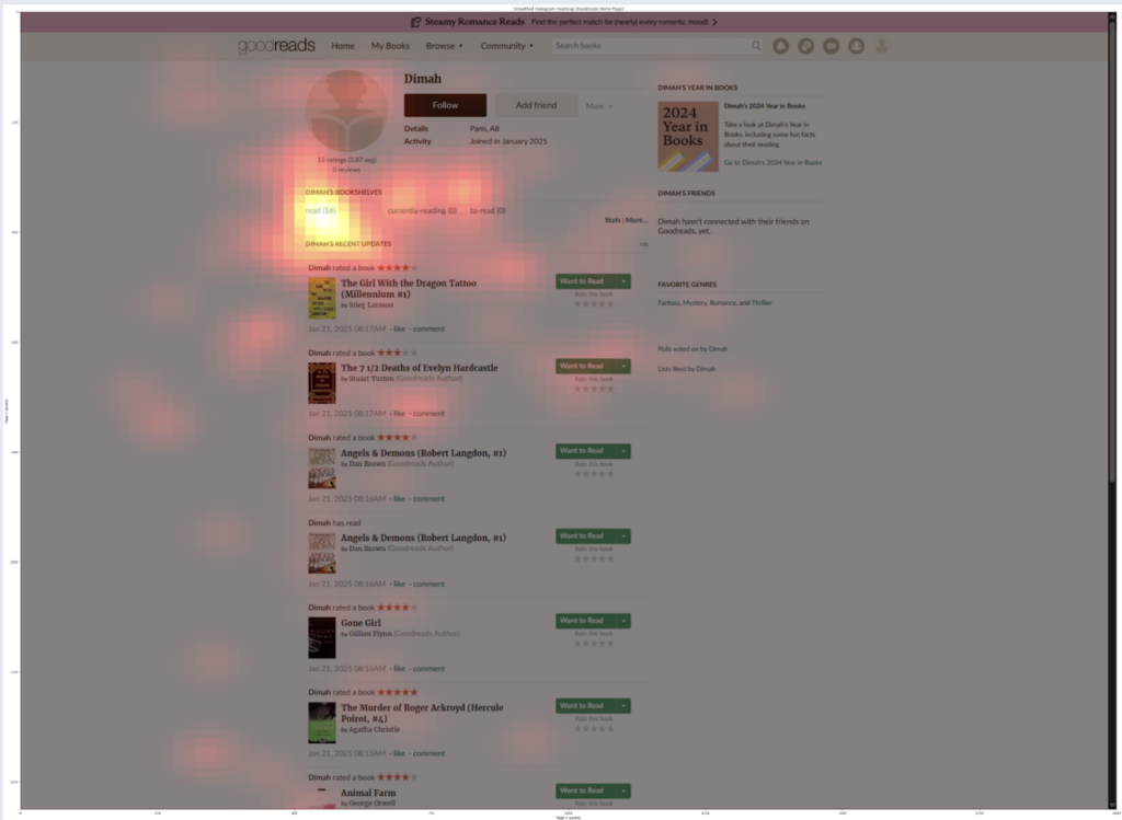
The bar chart showing the frequency of interactions by page type revealed that the Home Page received the highest number of interactions, followed by the Book Page. Although it’s natural for the Home Page to have high interactions since it was the starting point of the task, it still has a lot of interactions meaning that users may have referred back to it periodically throughout their search. The significant interaction with the Book Page shows that participants actively navigated between different books, regularly consulting detailed book information.

The smoothed histogram heatmap of the Home Page showed that users mainly interacted with the “Browse” and “My Books” sections on the navigation bar. However, the “My Books” section typically contains no relevant content for new users (displaying an empty page if they haven’t previously added books they have read or want to read), which could lead to confusion or uncertainty about how best to begin exploring the site. This highlights a potential usability issue where new users might interact with areas of the website that initially offer limited value, indicating a need for clearer guidance.


Task 2: Mini Challenges
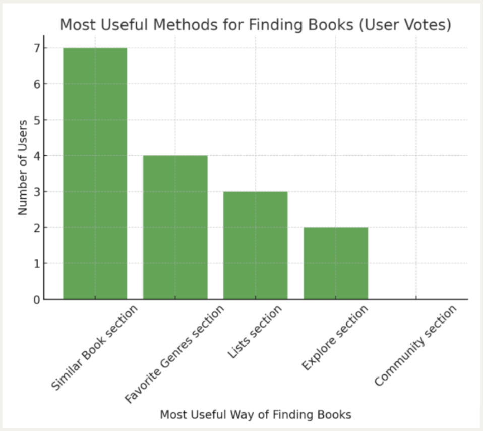
For our second task, participants completed mini-challenges designed to test five key sections of the Goodreads platform: Similar Books, Favorite Genres, Explore, Lists, and Community.
User Experience Across Core Features
Participants generally responded positively to four of the five sections. The Similar Books, Favorite Genres, Explore, and Lists sections received favorable feedback regarding recommendation relevance and overall design quality. Our engagement metrics supported these qualitative impressions, with Similar Books emerging as the most engaging section. Users spent an average of 1.9 minutes in this section and consulted 2.2 books on average—significantly higher than any other section. This suggests that users found genuine value in the book recommendations, actively exploring multiple options.
Despite this positive engagement, participants identified several common improvement opportunities across these sections. Participants noticed a lack of personalization in recommendations and insufficient filtering options to refine searches. They also thought the pages had too much information overall. Three participants were confused between the Explore and Lists sections and described those pages as functionally redundant.
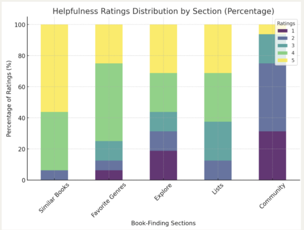
Community Section: A Critical Pain Point
The Community section emerged as the most problematic area of the website. Only one participant found this section useful, while the overwhelming majority expressed strong dissatisfaction. User comments were particularly negative, with feedback including:
- “This feels like it wasn’t touched since 2009”
- “HORRIBLE it looked like Craigslist from 20 years ago”
- “SO HARD TO FIND A SINGLE RECOMMENDED BOOK”
Participants felt that this section was not useful, citing a lack of filters to find relevant information, and two participants were unable to find relevant communities. Regarding design, four participants thought the section looked outdated and unattractive, with too much information displayed.
They suggested several improvements, including displaying less information, recommending groups based on the user’s profile, adding more group filters, completely redesigning the UI, and providing explanations on how to use the page and navigate it, especially for first-time users.
Our quantitative data reinforced these sentiments. Despite users spending the most time in this section (3.1 minutes on average), they consulted the fewest books (0.7)—indicating struggle rather than productive engagement.


Overall, users preferred the Similar Books section. However, we noticed that they spent a considerably long time on this section (1.9 minutes on average, as shown in the image above on the left). To understand why, we analyzed how many books they consulted in each section. The data revealed that participants consulted significantly more books in the Similar Books section (2.2 books on average) compared to other sections, as shown in the image above on the right. This suggests that users were more engaged with this feature, actively exploring multiple book recommendations.
Task 3: Finding a Book for a Friend
The third task focused on evaluating the utility of the Friend Profile feature to find suitable book recommendations for gifting purposes. Overall, participants rated this task positively, with 50% describing it as very easy (rating of 5 out of 5) to find appropriate books using their friend’s profile. Users particularly appreciated the ability to view favorite genres, previously read books, and personalized preferences. However, suggestions for improvement were also provided. Users suggested adding a dedicated feature like a “find book for a friend” button, along with enhanced filtering options and a clearer distinction between friends’ reviews and general ratings.
Cursor-tracking analysis for Task 3 provided clear insights into user behavior while searching for a book recommendation on a friend’s GoodReads profile.
From the frequency and total time spent graphs, we see that the Book Page was by far the most interacted page type. It had the highest number of interactions as well as the longest total time spent. This strong engagement indicates users actively explored multiple books, closely examining details such as descriptions, author information, and user reviews. The high interaction with the Book Page also suggests that participants frequently navigated back and forth between different books to evaluate their suitability.
The User Profile page was also highly interacted, ranking second both in interaction frequency and total time spent. This aligns well with the user ratings from the Google Form responses, where participants generally rated the Friend Profile as helpful or very helpful in choosing a suitable gift. It demonstrates users actively utilized the friend’s profile details, particularly their “Read” shelf.


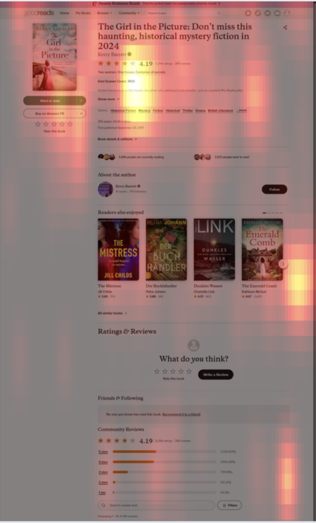
Additionally, heatmap analysis of the Book Page revealed specific areas that captured user attention. Participants frequently scrolled down to view the reviews section and also frequently interacted with the “Similar Books” section. This behavior highlights these features as particularly useful for decision-making. Similarly, the heatmap of the User Profile showed concentrated interaction on the “Read” shelf and the favorite genres area, reinforcing the notion that users actively relied on this information to determine their book choice.
Overall, these cursor-tracking insights suggest that users found GoodReads effective in leveraging a friend’s profile information for finding personalized book recommendations. However, the frequent back-and-forth navigation between books indicates room for improved usability, potentially through more efficient filtering or clearer differentiation of content on individual book pages
General Feedback
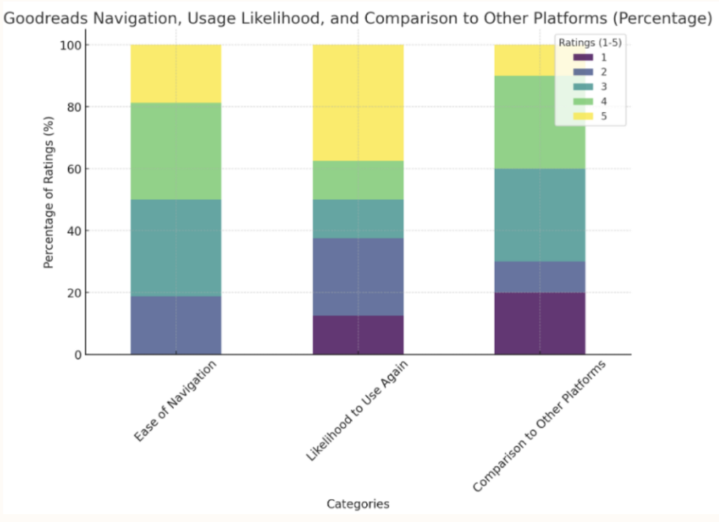
From the open-ended responses, participants acknowledged that the website has good overall functionality, making it easy to discover new books, providing strong recommendations, and offering a helpful friends’ profile section. However, as shown in the graph below, while navigation is generally decent, some users encountered difficulties, indicating room for improvement. Many participants expressed willingness to use Goodreads again, but a significant portion would not. Compared to other platforms, Goodreads is perceived as average to slightly better, though some users were notably dissatisfied.
Takeaways
The analysis of participant feedback highlights several key areas for improvement on Goodreads, as we can see from the two graphs below.
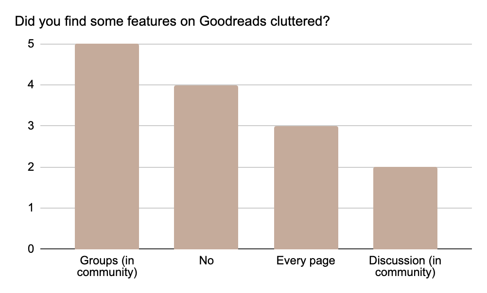
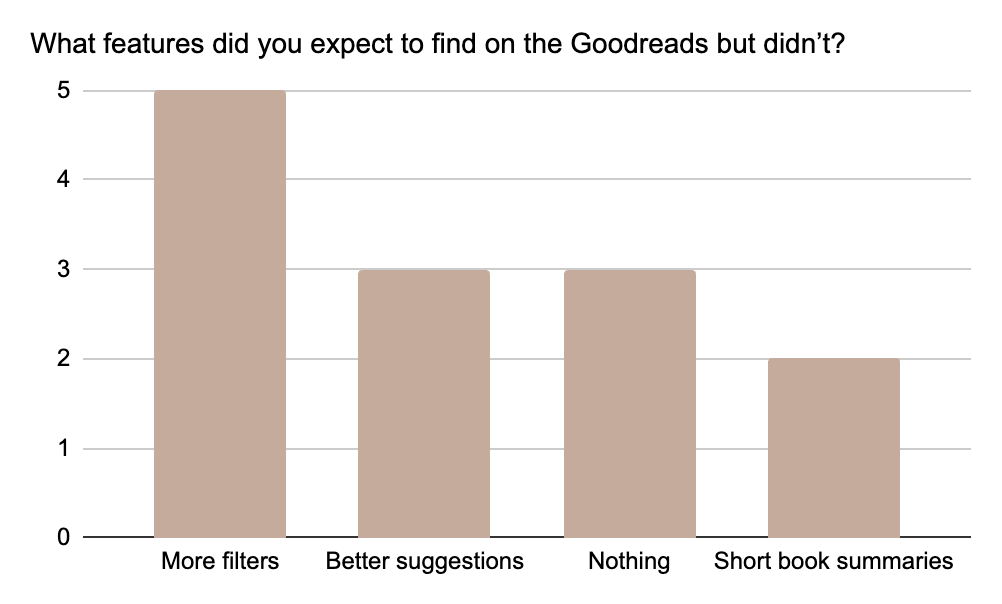
A major issue is the lack of filters across the platform, making it difficult for users to customize their experience and refine the information they see. Adding filtering options would allow a better and more customizable user experience.
Participants want better book recommendations, tailored to their reading history and preferences.
Additionally, the website should allow users to explore its features before requiring them to sign in, as this would encourage engagement without the immediate commitment of creating an account.
Another pain point is the navigation, with many users finding it unintuitive and confusing when searching for information. It needs improvement to be simpler and more intuitive. Finally, the platform’s design, particularly the community section, is seen as outdated and in need of a complete redesign to improve usability and modernize the overall user experience.
Conclusion
The user experience study of the GoodReads website provided valuable insights into user interactions and perceptions. By combining quantitative metrics such as time spent, books consulted, pages navigation, and user interactions with qualitative feedback, we identified both strengths and weaknesses in the website’s design and functionality.
Our study has led to several key findings. Navigation varied in ease among participants, which suggests a need for a simpler, more intuitive user interface. While the process of discovering books was generally effective, there is room for improvement in personalization and filtering to better match book recommendations to individual user preferences. Additionally, the community features were perceived as outdated, indicating a significant area for improvement.
Based on these findings, we recommend the following actions to enhance the user experience on GoodReads:
- Simplify the user interface to improve navigation, making it more intuitive, especially for new users.
- Enhance personalization by developing advanced algorithms that provide better book recommendations based on user preferences and activities.
- Redesign the community section to modernize its visuals and functionality, making these features more engaging and useful for the users.
- Continue to expand user testing and feedback collection to ensure the platform meets the diverse needs of all users.
Addressing these issues and implementing the recommended changes could significantly enhance user satisfaction and solidify GoodReads’ position as a leading book recommendation platform. Our study highlights the importance of continuous adaptation and user feedback in evolving digital platforms. We hope these insights and recommendations will guide future enhancements, making GoodReads a more user-friendly and engaging platform.