Introduction
Anki Desktop is a spaced‑repetition tool for language learning, but many learners find it complex and unintuitive, especially at the beginning. Users often struggle with discovering basic features, understanding Anki’s terminology, and recovering from mistakes, which can discourage consistent use even though spaced repetition is highly effective for long‑term memory. Our project looks into how well Anki supports learnability, efficiency, and error recovery, since weaknesses in these areas can reduce motivation and prevent learners from benefiting fully from the method.
Methods
Participants
A total of 20 participants took part in the study. All had studied or were currently studying at least one foreign language, and some had prior experience with Anki Desktop. Participants were recruited through convenience sampling, as they were acquaintances of the team members, including friends and family members. Participants completed the study either in person under the supervision under supervision or remotely via an online session.
Data collection
We used a combination of tools to capture what was really happening during each session:
- Anki Desktop (Version 25.09.2): This was the core app the participants used.
- Custom Anki plugin: We built this from scratch to record mouse movements and clicks every 200ms throughout the app.
- Screen and audio recordings: Participants were asked to think aloud as they worked through tasks, narrating their confusion, guesses, and reactions in real time.
- Pre-study questionnaire: To obtain demographic information about the participants and their previous language learning history, prior Anki experience, familiarity with spaced repetition.
- Tasks: Participants worked through 30 tasks covering the full range of things a real Anki user would do, grouped into six categories: Managing decks, Card creation, Studying, Scheduling, Browsing cards, and Customization & settings.
- Ease-of-use rating after each task group: Once they finished a category of tasks, participants rated how easy each task felt on a 1–5 scale (1 = very difficult, 5 = very easy).
- Post-study interview: To understand overall impressions, frustrations, and what would make them actually want to use Anki in their daily life.
Measures
This study had four major goals: evaluate the overall usability of Anki Desktop, assess learnability, ease of use, and error recovery, compare usability between new and experienced users, and identify tasks and interface areas that cause user difficulties. Following our goals, we created the following Goal–Signal–Metric framework, shown in Table 1.
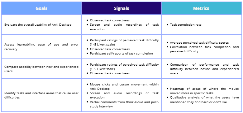
Table 1: Goal-Signal-Metric framework
Study protocol
This study followed a mixed-methods approach, combining quantitative measures and qualitative feedback to evaluate the user experience of Anki Desktop. Each session followed the same structure regardless of whether it was in person or remote and consisted of:
- Introduction: A brief explanation of the study’s purpose was provided, followed by a consent and recording confirmation.
- Pre-study questionnaire: Participants then completed the pre-study questionnaire, covering demographics and language learning background.
- Introduction to Anki: Participants then received a short introduction to Anki Desktop and spaced repetition, enough context to understand the tool without giving away how things worked.
- Task execution: Participants worked through all 30 tasks while thinking aloud, with their screen and voice recorded throughout and the custom plugin running in the background. Participants could skip any task at any time and those skipped tasks were marked as incomplete. After finishing each category of tasks, they rated each task on the Likert scale.
- Post-study Interview: The session closed with a post-study interview, covering overall impressions of Anki, participants’ future intention to use it, and specific improvements that would encourage its use.
Data analysis
Plot generation
The first step was loading and parsing our dataset. We extracted ratings and completion statuses for each participant and task into a JavaScript object for later use. From there, we computed statistics like average ratings, completion counts, and group comparisons (e.g. participants with vs. without prior Anki experience). Our visualizations were made using D3.js, and our Sankey diagrams were built using the visualization tool, Flourish.
Task Classification
We wrote a Python script that automatically classifies tasks based on their global average and completion rate.
Collecting cursor data
To collect cursor data, we built a custom Anki plugin with the help of AI that captures data every 200 milliseconds. Each data point records the timestamp, action type (movement or click), cursor x/y position relative to the active window, window name, and window size. Clicks are logged twice to give them heavier weight compared to passive cursor movement. Any activity outside the Anki application is excluded from analysis. Logs ran from the start to the end of each task category, producing six log files per participant.
Processing cursor data and generating heatmaps
Cursor data from 15 of the 20 participants was used in the final analysis. Others were excluded due to operating system differences or technical issues. Data was cleaned up, then cursor coordinates were normalized across different screen sizes and rescaled to a fixed canonical size, allowing data collected at different resolutions for the same window across different devices to be meaningfully combined. We have ignored tool menus because their window names are not unique and we therefore lose their individuality during recording. Heatmaps were then generated using Kernel Density Estimation (KDE). The final output overlays the heatmap at 50% opacity on top of a screenshot of the corresponding Anki window. Red areas indicate high cursor activity; blue areas indicate low activity.
Processing Qualitative Data
Participant audio recordings were transcribed and cleaned for clarity, covering both think-aloud comments during tasks and post-study interview responses. Comments were organized by task and coded into eight recurring issue categories. From these eight categories, three broader themes emerged that we expand on in our insights: Interactivity Gaps and Cognitive Overload, High Barrier to Entry and the Power-Simplicity Tradeoff, and Terminological and Conceptual Understanding Barriers.
Results
Demographics
A total of 20 participants took part in the study: 40% were male (8), 55% were female (11), and 5% identified as non-binary (1). The majority of participants were aged between 25 and 34 years old (13/20), while 7 participants were between 18 and 24 years old.
Regarding previous experience with foreign language learning, all participants had studied or were currently studying at least one foreign language. In terms of materials used for learning new languages, most participants had previously used textbooks (19/20), videos or online content (17/20), and language learning apps (18/20). Fewer than half of the participants had used flashcards to study a language (7/20).
Among those who had used flashcards, the most frequently mentioned apps were Quizlet (3/7) and Anki (5/7), across its different platforms. Concerning the specific platform analysed in this study Anki Desktop, as seen in Figure 5, only 25% of participants (5/20) had used it before, while 75% had not (15/20).
When asked about their familiarity with the spaced repetition learning technique, most participants reported being aware of it: 7 stated that they fully understood how it works, and 5 indicated that they did not fully understand it. Only 8 participants reported not knowing what this study technique was.
Cursor Heatmaps
Firstly, information overload in Anki could be experienced by beginner users. When asked to perform scheduling tasks that involve changing mode options (e.g. from “Preset” to “This deck”), we can see in Figure 1 that users had no problem editing the numbers in “Daily Limits” but there was less activity on the mode options (highlighted in red square) since there could be too much information to read and process.
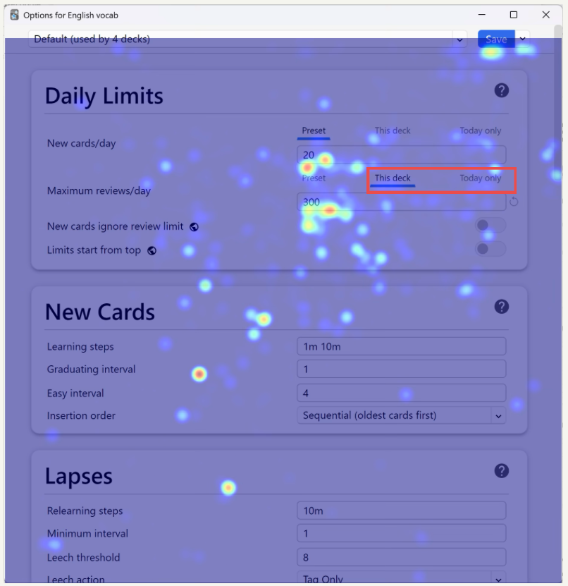
Figure 1: Final heatmap of the “Options for English vocab” window for the fourth section of tasks where directions for a task are highlighted in a red square
Secondly, barriers are present for beginners who are not familiar with specific Anki terminologies or functionality, such as the creation of a cloze (fill in the blanks) card. Users need to click on the add a cloze field button (highlighted in red square in Figure 2) then enter the text to be hidden in the produced fields(e.g. “{{c1::To hope }}means to have confidence and trust”) to create a cloze card successfully. We see that there is not much activity on the buttons because users are just not aware.
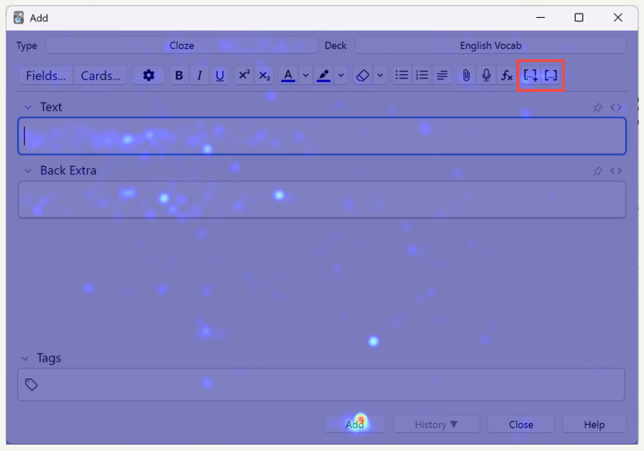
Figure 2: Heatmap of the “add card” window for the second section of tasks where functions for creating a cloze bank are highlighted in red
Design Problems in the Browser
Lastly, a significant number of users struggled to complete tasks in the browser, a window that is reported by users as “confusing”, “not intuitive”, and “meaningless” due to its ineffective organization of functions. Users frequently accessed menu options such as “Edit”, “View” menu options at the left top, or the gear icon at the right top of the window in Figure 3 – all of which do not provide any relevant functions related to our tasks.
Important functions such as changing a card’s type or deleting a card are hidden inside nested submenus that are accessed by right-clicking on a card (e.g. on “To surrender” in Figure 3). The terminology used in the submenu for changing a card’s type could be confusing for new users who are not looking for the wordings “Change Note Type”. It is even more difficult to perform the delete function, which is hidden at the very bottom of the list inside the nested menus. This hiddenness of common and basic functions shows the lack of optimisation in function layouts in the browser, where less-important functions are more available than important ones.
Figure 3: Demonstration of how to change a card’s type in the nested submenus in the “browser” window
The role of prior experience
As it can be expected, prior experience with Anki Desktop significantly influenced perceived task difficulty. On average, experienced users rated tasks as easier (3.950) than non experienced users (3.636). For five specific tasks, the difference was statistically significant with a large effect size that indicates certain features have a particularly steep learning-curve (see Figure 4)

Figure 4: Mean difference per task difficulty. On the right, Cohen’s d values for effect size
Completion Rate vs. ease ratings per task
To understand why tasks were viewed as difficult, we analysed the relationship between completion rate and ratings for each task. This analysis revealed four categories of trends (see Table 2):
- Discoverability failure (Give-up cluster): tasks where users frequently abandon the task and perceive it as hard which shows a discoverability/affordance problem (e.g. Delete a card, change card’s type)
- Confidence-performance mismatch: user think the action is easy but they fail doing it which suggest a misleading interface that can be due to unclear labelling or insufficient feedback that leaves the user with a false sense of success (e.g. change maximum reviews per day limit)
- High-effort success: many users succeed at a task but they still perceive it as difficult meaning the flow should be simplified as it currently causes friction that makes successful interaction feel like a struggle (e.g. filter by tag, move cards from a deck to another one)
- High-concordance / easy tasks: tasks are both easy and succeeded meaning they are good patterns to emulate (e.g. create a deck, export a deck)
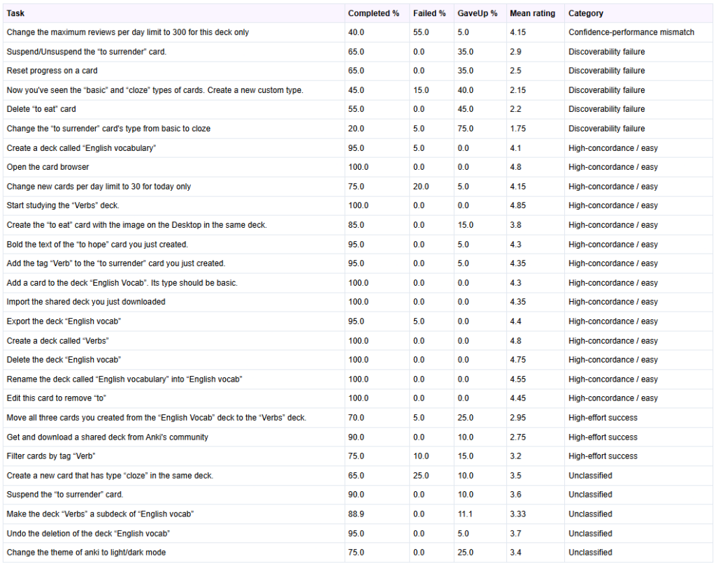
Table 2: Table showing for each task their completion, failed and gave up rates, and under which category they fall
Error Recovery
Five tasks were analyzed to evaluate error recovery mechanisms in Anki Desktop: “Undo the deletion of the deck ’English vocab’”, “Rename the deck called ’English vocabulary’ into ’English vocab’”, “Edit this card to remove ’to’”, “Suspend/Unsuspend the ’to surrender’ card” and “Change the ’to surrender’ card’s type from basic to cloze”.
We selected these tasks because they allow us to assess how easily users can correct minor mistakes (e.g., typos), revert accidental actions (such as deck deletion or card suspension), or fix structural errors (e.g., selecting the wrong card type).
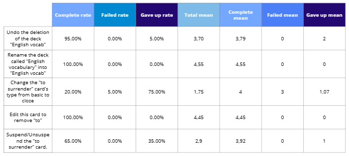
Table 3: Completion rates and perceived difficulty per task
The key results found about error recovery extracted from Table 3 are:
- Most error recovery tasks show high completion rates.
- The task Change the card’s type from basic to cloze was an exception: 75% of participants gave up, indicating a discoverability issue rather than intrinsic difficulty.
- Minor text corrections (renaming a deck or editing a card) were successfully completed by all participants, with mean difficulty ratings around 4.5, showing these actions are intuitive.
- For Suspend/Unsuspend the card, about two-thirds of participants completed the task with high ease ratings (4–5), while the remainder gave up, suggesting the control is easy to use once located but not highly visible.
- Undo deletion was completed by nearly all participants (95%), though difficulty ratings varied, indicating the function works but is not immediately obvious.
- Only one participant explicitly failed a task, showing that system feedback is generally clear when the recovery function is found.
Insights
Our analysis of quantitative data, as well as participant observations, think aloud protocols, and post-task interview sessions revealed three themes that account for the majority of usability issues encountered across all tasks. These themes are Interactivity Gaps and Cognitive Overload, High Barrier to Entry and the Power-Simplicity Tradeoff, and Terminological and Conceptual Understanding Barriers.
Interactivity Gaps and Cognitive Overload
A recurring pattern across nearly all tasks was the disconnect between user expectations and the actual interactive behavior of the interface. Core card management features are distributed across multiple separate windows and menus, with no unified space where users can manage, edit, and review their content in context. For example, the “Browse” window, intended as the card management system, was described by multiple participants as “very heavy on cognition” (P3) and containing “way too much info” (P7), with columns and sidebar categories that felt irrelevant to beginners. Critical controls are frequently hidden or separated from their logical context. For example, users (P6,16,11) expected right click menus to offer standard card actions such as delete and edit, yet these were absent. The interface also lacks meaningful visual feedback for state changes. There was no explicit confirmation or “Save” indicator when a card was added or when dragging a deck to create a subdeck provided, there was no visual indicator of where it would land, causing several participants to abandon the action or repeat it incorrectly (P1,2,3,17).
Recommended improvements: A unified, hierarchical card view where users can see and manage cards within their deck context; consistent right-click context menus across all views; clear visual indicators for drag-and-drop targets; and explicit save/confirmation feedback for card and deck operations.
High Barrier to Entry and the Power-Simplicity Tradeoff
Anki Desktop is feature rich and highly customizable. However, this power comes at a significant cost to first-time usability. The interface does not support self-guided learning: there is no onboarding flow, no in-app tutorial, and no progressive disclosure of features. New users are immediately confronted with the full complexity of the application, with no clear path to understanding even the most basic operations. For example, multiple participants failed on their first attempt to create a deck, either accidentally renaming the Default deck (P15) or clicking the “Add” button intended for cards (P4). For more complex tasks such as changing card types, creating custom note types, or accessing scheduling options, users repeatedly searched through menus that felt synonymous or overlapping (e.g., “Options” and “Custom Study”), often giving up before finding the correct path. We observed that on the second deck creation task, ease of use scores jumped dramatically because participants had overcome the initial discoverability barrier, suggesting that the interface’s poor first-time usability is the primary obstacle.
Recommended improvements: An interactive onboarding tutorial that introduces core workflows for new users; a simplified “Basic” mode that hides advanced options by default; improved button placement that groups operations by function and elevates primary actions; and contextual “Getting Started” cues within the interface.
Terminological and Conceptual Understanding Barriers
The participants’ inability to understand Anki-specific terminology without external reference was a critical theme. Technical terms such as “Cloze,” “Image Occlusion,” and “Suspend” were consistently misunderstood or entirely unknown (P1,3,13,14), even by participants with some prior flashcard software experience. The “Notes” versus “Cards” conceptual distinction which is central to Anki’s data model was a major source of confusion. Users were often uncertain whether “Change note type” referred to the card they were editing or something else entirely (P14, P20). In the Cloze task, participants struggled to locate the correct card type and even when they did, they were confused by the concept of “cloze deletion” itself. The error message displayed when a Cloze card was added without the correct formatting, “you have not made any cloze deletions” was found particularly frustrating as it neither explained the term nor guided users toward a solution (P1, P2, P13). The spaced repetition rating buttons (“Again,” “Hard,” “Good,” “Easy”) were generally understood in terms of their effect on review frequency, but participants found the time intervals displayed confusing and unexplained (P2, P3).
Recommended improvements: Plain-language labels or hoverable tooltips for all Anki-specific terms; clearer error messages that explain the issue and provide actionable guidance; brief inline descriptions for spaced repetition ratings; and a visible legend for colour-coded statistics on the deck screen.
What Works Well
Despite the identified usability challenges, several aspects of Anki Desktop were positively received and represent strong foundations for the product:
- Basic Deck Operations: Once participants had discovered the relevant buttons, creating, renaming, and deleting decks were consistently rated as easy and intuitive in execution.
- Shared Decks: The “Get Shared” feature was highly valued. Users appreciated being able to download pre-made decks rather than creating their own from scratch.
- Spaced Repetition Logic: Although the rating labels caused some confusion, the core concept of rating card difficulty to control review frequency was generally understood once participants encountered it in action.
- Flexibility and Customization: Advanced users acknowledged Anki’s breadth of features and the ability to build highly customized study systems. Several participants noted they would continue using the software precisely because no comparable alternative offered the same level of control.
Conclusion
This study evaluated how well Anki Desktop supports learnability, task efficiency and error recovery for language learners. Using a mixed method protocol approach, we found out that fundamental operations that should be discoverable (e.g. changing card’s type, deleting a card, creating cloze deletion card) were frequently hidden or confusing, leading to relatively high abandonment rates. Simple deck actions (e.g. creating a deck) were largely completed by participants. Overall, new users face discoverability and terminology barriers, while experienced users are able to complete some tasks more easily, showing there exists a steep learning-curve rather than inherently impossible tasks.
This study shows that Anki Desktop provides a powerful and flexible spaced-repetition based tool, but at the cost of first-time usability.
Key problems we discovered are fragmented navigation, hidden or inconsistent controls, poor feedback for actions and Anki-specific jargon that is not explained anywhere in-app.
To improve first-time success and retention, we propose:
- A lightweight onboarding that teaches Anki’s core concepts (decks, card vs. notes, etc.) and common actions, and slowly reveals more advanced options
- Clearer labels, hover tooltips, clearer feedback and error messages
- A unified, deck-contextualized card management view with consistent right-click context menus and clear visual feedback for drag-and-drop
These improvements would preserve the app’s power for more advanced users while lowering the barrier for newcomers.