Written by: Antony JULIAN, Rabii LAMHARZI ALAOUI, Xintian FU, Yizhen KE, Yongyan LUO
This blog post is just a condensed version of the formal report.
Abstract
This study presents a comparative UX research analysis between YouTube and Bilibili, focusing on the challenges and opportunities Bilibili faces as it seeks to expand to a global audience. Results show that while YouTube outperformed Bilibili in navigation efficiency and ease of use, Bilibili demonstrated superior performance in social interaction speed and community engagement, primarily driven by its “danmaku” (bullet comments) feature.
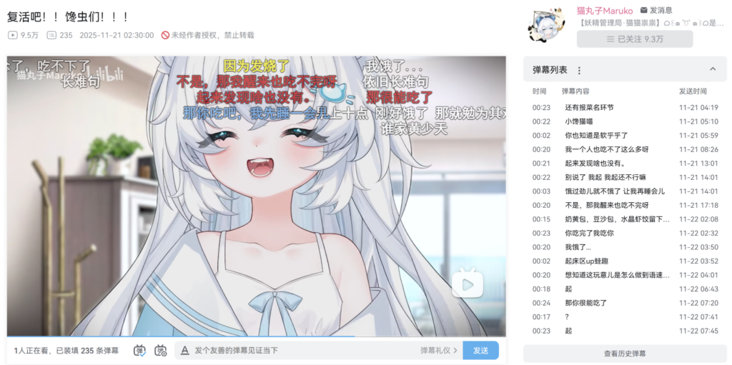
A screenshot of a Bilibili Video with “Danmaku” Enabled
The report concludes that Bilibili can bridge this usability gap without losing its unique community atmosphere by implementing multilingual support, simplifying its information architecture, and providing tutorials for its specialized social features.
Background
Video platforms have become the primary way to consume media, create communities, and partake in shared experiences on the internet. This study examined two of the world’s leading video platforms: YouTube and Bilibili. Both platforms provide users with an opportunity to upload, discover, and view video content. However, they represent very distinct conceptions of what a video platform should look like.
YouTube, which was launched in 2005 and subsequently acquired by Google, has emerged as the global leader of video-sharing platforms. YouTube’s business model is focused entirely on the individual user. It uses an incredibly advanced recommendation engine based on your viewing behavior and develops a profile of your interests, then uses this information to deliver personalized content that aligns with your past viewing behavior.
On the other hand, Bilibili, which was first developed in China in 2009, used a completely different paradigm when developing the platform. Bilibili started as a community primarily for Chinese anime and manga fans. However, today, it is one of the largest and most culturally distinct video communities in China.
| Design Dimension | YouTube Priority | Bilibili Priority |
| Primary Mechanism | Algorithmic recommendations | Social interaction / Community |
| User Experience Goal | Efficiency, Personalization, Speed | Shared experience, Belonging |
| Key Feature | Personalized content feed | Danmaku (bullet comments) |
| Potential Trade-off | Might reduce spontaneous social interactions | May distract from video content itself |
Methods
Study Design
For the interview, we recruited 20 participants aging between 18 and 24, have cultural contexts, and boast a certain level of platform usage experience. The study followed a within-subject design, meaning that each participant tested both platforms. In order to eliminate the influence of being nervous, fatigue or unfamiliar, we counterbalanced the order of platforms: of all the participants, half were told to complete the tasks on Youtube first and then on Bilibili, while the other half were told to finish the tasks in the inverted order.
Tasks
For each platform, we designed four tasks based on common behaviors on video platforms:
The first task was fundamental function location. Participants were asked to find out buttons or entries respectively for Account, Update, History, Q&A from the homepage interface.
The second task targeted search. Participants were asked to find a specific video starting from the homepage, more precisely, a video about making creamy mushroom pasta that is less than 5 minutes long.
The third task was uploader search. Participants were asked to find a video blogger in the DIY craft field, taking into account factors such as update frequency, number of views, and number of followers.
And the last task was to test the performance of Danmaku from Bilibili, compared to the comments from Youtube. Participants were asked to open a random video and watch it for 2 minutes with Danmaku/comments, and then give feedback about the impact on their viewing experience.
Data Collection
Aside from basic personal information collected via pre-questionnaire, we also collect quantitative data, behavioral data and qualitative data to figure out how well users perform on different platforms. If they encounter difficulties, we want to know where exactly they take place and the reason why they perform better/worse during certain tasks, or on certain platforms.
The quantitative data contains the completion time, task success rate, SUS (System Usability Scale) score, and the number of mistakes / slips that happened during the tasks.
The behavioral data contains mouse movement (moving, clicking, scrolling) and screen recording video, in case the CursurTracker is blocked accidentally. Heatmaps and journey maps are thus generated based on behavioral data.
The qualitative data is obtained from more comprehensive ways. By observing the facial movements of participants during the tasks, we estimate their level of hesitation and pain. We also encouraged participants to speak out their feelings (think-aloud) and express their feelings freely during the interview section.
Results
This section presents all quantitative results alongside behavioral data and participant quotes. Results are organized by metric type, then by task.
Overall Usability (SUS Scores)
YouTube received 79.1 (acceptable range) while Bilibili received 60.7 (marginal range). A paired t-test confirmed this difference is statistically significant. Almost every participant pair shows YouTube scoring higher.
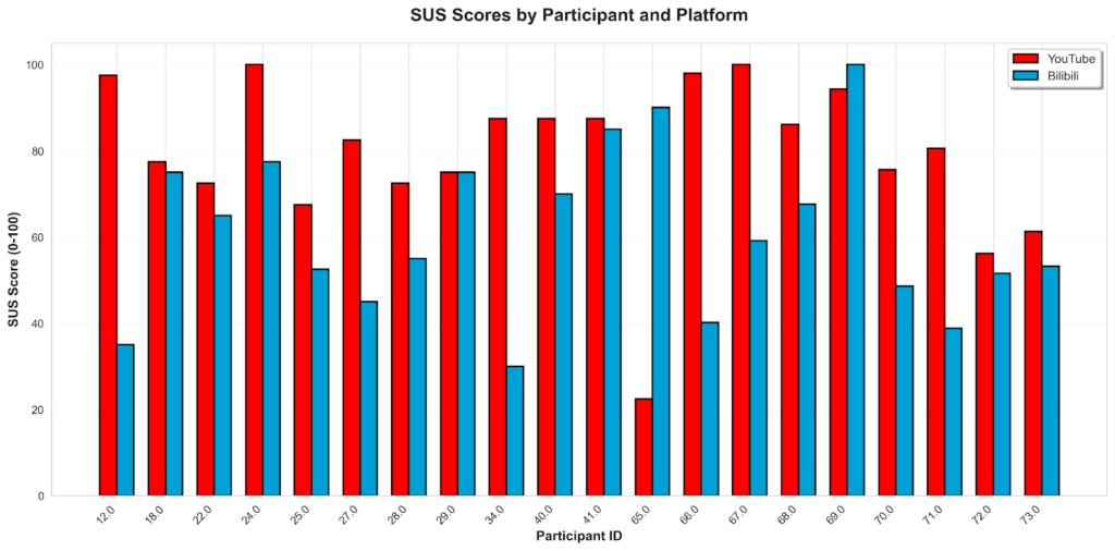
Actual SUS scores from all 20 participants in the study
YouTube had an average score of 79.1 out of 100, which falls in the acceptable range, meaning users generally found it easy to use. Bilibili scored 60.7, which is in the marginal range, suggesting that many users experienced difficulty. The difference between the two platforms is 18.39 points.
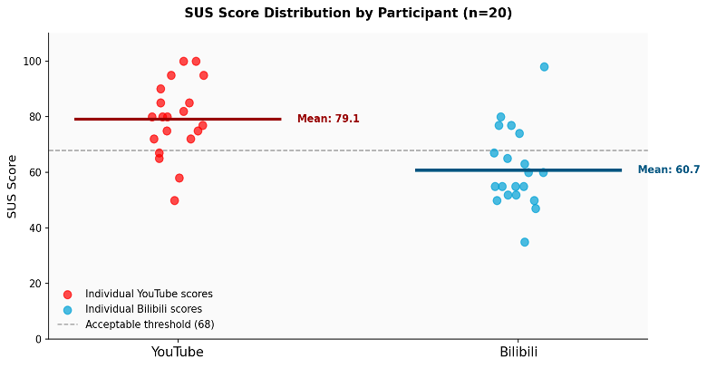
Distribution of individual SUS scores (each dot is one participant)
To test whether this difference is statistically significant, a t-test was calculated using the formula: 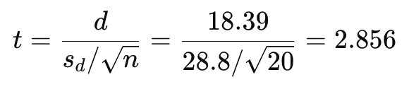
Task Success Rates
The chart below shows how many participants completed each task on each platform:
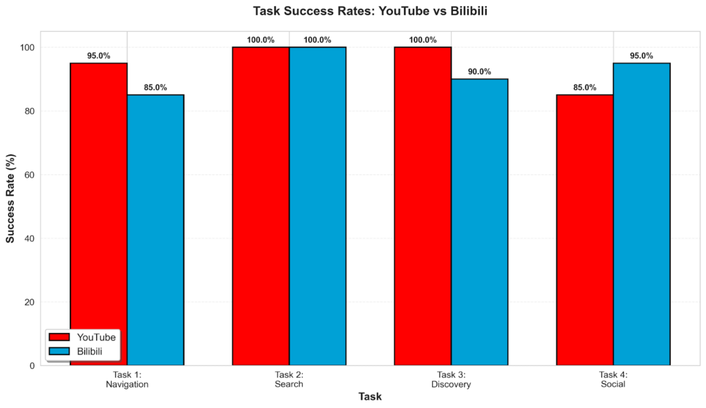
Task Success Rates by Platform and Task (%). Higher is better.
Task 1: Navigation (Finding Basic Interface Elements)
Navigation was the task with the clearest usability gap. On YouTube, users quickly found the familiar left-side sidebar. On Bilibili, the dense top navigation with dozens of categories caused significant confusion. The Help/FAQ section was the hardest item to find on Bilibili: only 60% of participants located it successfully.
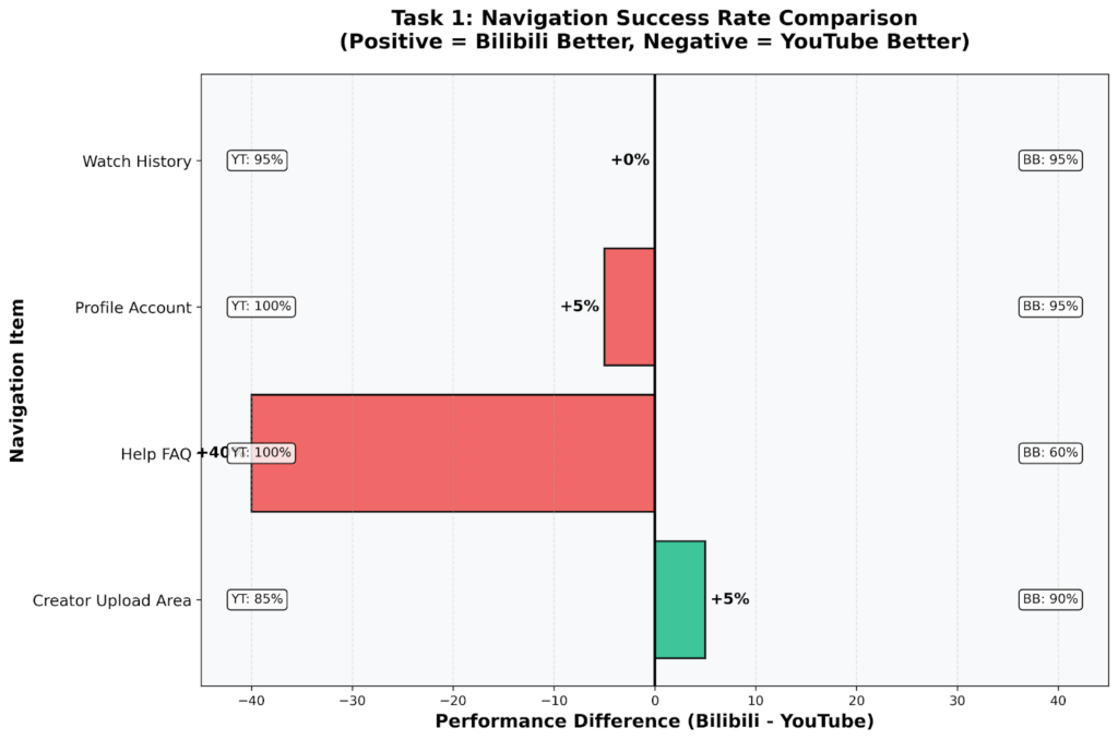
Diverging chart showing Bilibili minus YouTube difference per item.
Help/FAQ shows the biggest gap!
The attention heatmaps captured by CursorTracker show the same contrast visually. On YouTube, user attention clusters around the sidebar, search bar, and profile icon. On Bilibili, attention is spread all over the page, a clear sign of confusion about where to look:
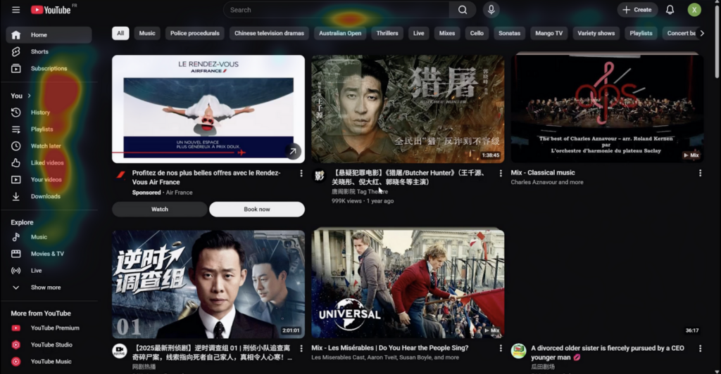
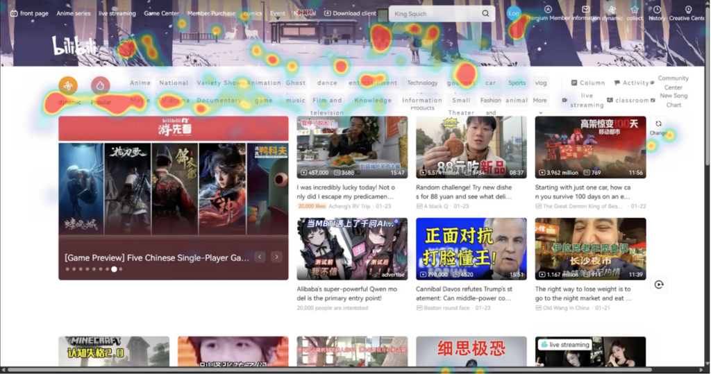
Heatmaps: targeted attention on YouTube and scattered attention on Bilibili
Task 2: Search (Finding a Specific Video)
Both platforms achieved perfect success rates here. The core search mechanic (type and press Enter) is universal. However, behavioral data tells a more nuanced story. On average, participants who found a video in 32 seconds with 3 clicks on YouTube needed 124 seconds and 27 clicks for the same task on Bilibili:
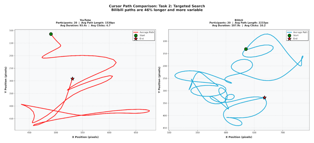
Task 2 cursor path shows YouTube at 32 s/3 clicks and Bilibili at 124 s/27 clicks
with a zigzag pattern indicating hesitation.
Task 3: Discovery (Finding a DIY Channel)
Two participants gave up on Bilibili during the discovery task. The homepage was too crowded and the category labels too unclear. YouTube’s recommendation algorithm also felt more relevant to participants since it was already familiar with their viewing history.
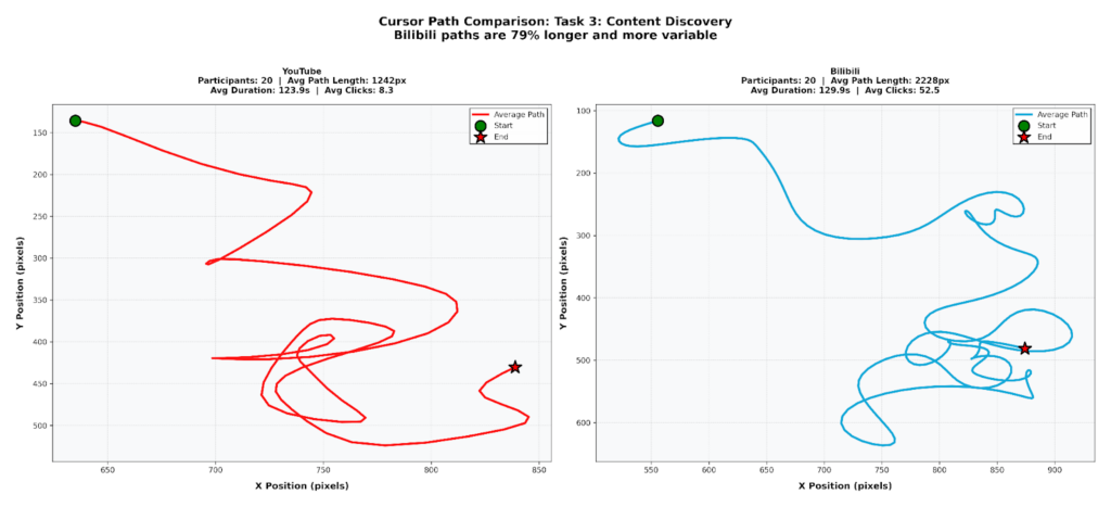
Task 3 cursor path shows YouTube at 5 clicks and Bilibili at 288 clicks with a zigzag pattern indicating hesitation.
Task 4: Social Interaction (Danmaku vs Comments)
This was the most surprising result: Bilibili outperformed YouTube on the social interaction task. Participants completed it faster on Bilibili (127.7s vs 143.1s) with a higher success rate. The reason is structural: danmaku keeps you engaged while watching, without needing to stop and scroll to a separate comment section. The chart below shows how participants reacted to danmaku:
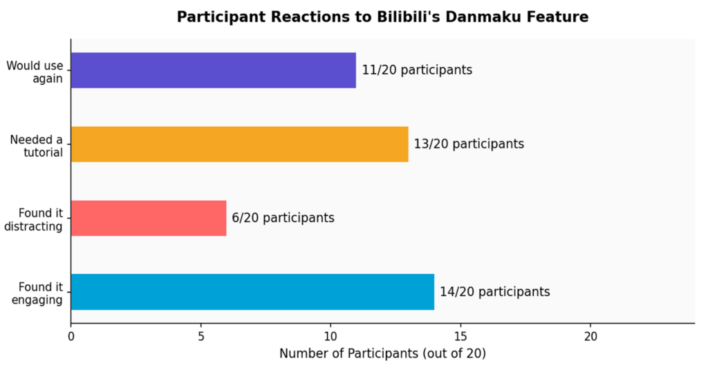
Participant Attitudes Toward Bilibili’s Danmaku Feature (n=20).
Positive reactions outweighed negative ones.
Task Completion Times
YouTube was faster on most tasks, but Bilibili was faster on Task 4. The completion time chart makes this pattern easy to see:
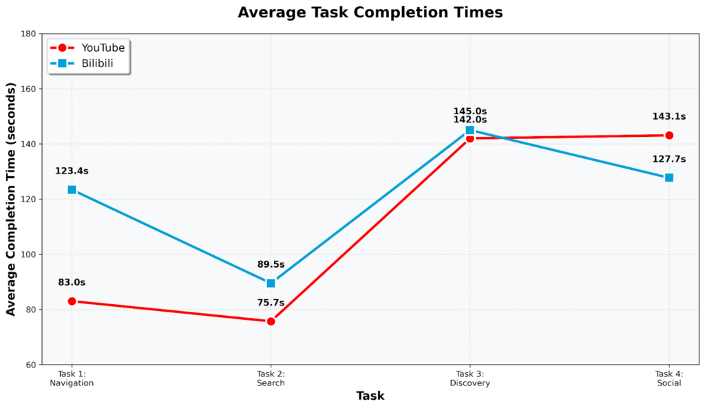
Average Task Completion Times in seconds. Lower is faster.
Perceived Difficulty Ratings
After each task, participants rated how difficult it felt on a scale of 1 to 5 (1 = very easy, 5 = very hard). Bilibili scored higher (meaning harder) on all tasks except Task 4:
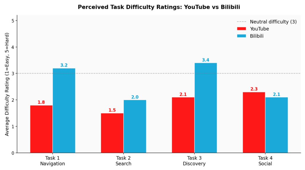
Average Perceived Difficulty Ratings per Task (1 = Easy, 5 = Hard). Lower is better.
Error and Misclick Counts
We counted the number of misclicks and navigation errors per task. Bilibili consistently had more errors on navigation-heavy tasks, reflecting the disorientation shown in the cursor paths:
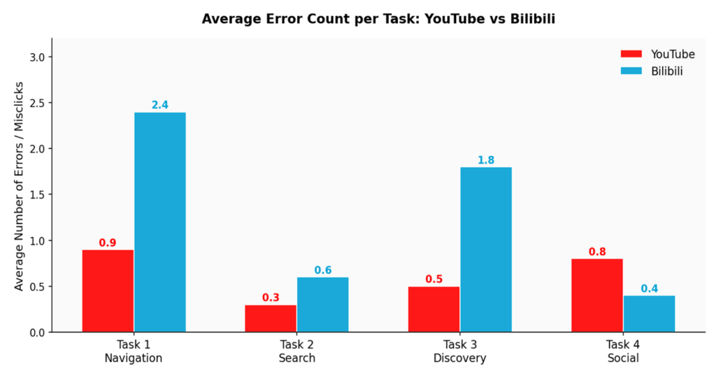
Average Error / Misclick Count per Task. Lower is better.
Bilibili had more errors, longer completion times, and higher difficulty ratings on every task that involved navigating the interface. Task 4 (social features) was the clear exception: Bilibili’s danmaku design is actually more efficient for social interaction than YouTube’s comment scroll.
Most Reported Pain Points
During exit interviews, participants were asked what frustrated them most about Bilibili. The chart below shows how often each issue came up:
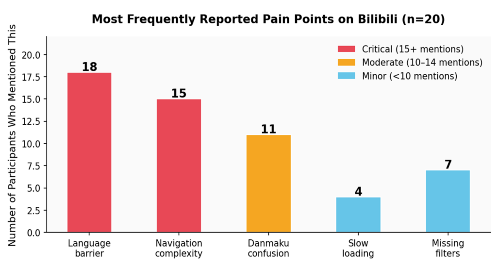
Most Frequently Reported Pain Points on Bilibili (n=20 participants)
Post-Session Platform Preferences
At the end of the session, participants answered three preference questions. The results reveal an interesting split: YouTube wins on ease of use, but Bilibili wins on community feeling and engagement. YouTube is easy to use but feels solitary. Bilibili is harder to use but creates stronger community feeling. This is the core UX challenge: Bilibili needs to close the usability gap without losing the community magic that makes it special.
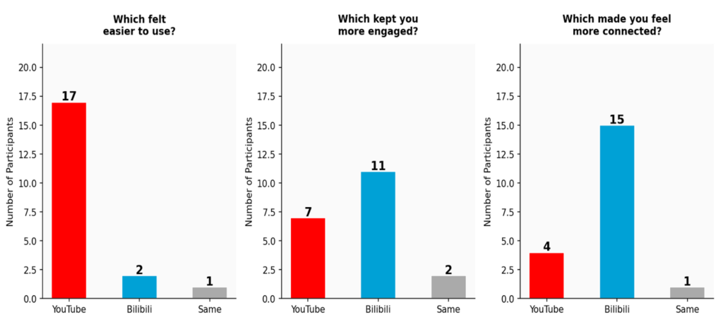
Post-Session Platform Preference Results (n=20). YouTube wins on ease; Bilibili wins on community.
Insights and Recommendations
Insight 1: The Language Barrier Is the #1 Obstacle
- Translate all UI elements into other languages: menus, categories, buttons, settings, notifications, and error messages
- Display a prominent language selector in the top navigation bar (flag icon or language code)
- Automatically detect the user’s browser language upon the initial visit, along with providing a clear manual override option
Insight 2: Navigation Is Overcrowded, But Engagement Is High
- Place the Help and FAQ in a persistent location in the main navigation bar
- Decrease the number of top-level menu items by grouping similar categories under fewer labels
- Organize features by category, and provide clearly labeled categories that international users will understand
- Conduct user testing with international users regularly to continually enhance the information architecture of the site.
Insight 3: Danmaku Needs an Onboarding Tutorial
- Develop a first-view animated tutorial for new users: “These are danmaku comments! The scrolling comments go across the video in real time. Turn them off/on here, and adjust the speed of the comments here…”
- Make the danmaku toggle button larger, since it is currently too small and easily overlooked by new users.
Limitations
Single-session design
Participants only used each platform once; although frustration with Bilibili’s user interface would likely be reduced after some time of familiarity with its patterns, a longer-term study of user experience would provide a much better understanding of the overall user experience.
Unreliable auto-translation
Because Bilibili has an entirely Chinese-only interface, we relied upon a Chrome auto-translation extension to translate the site into English. Unfortunately, the translation was often poor or misleading and may have artificially increased the usability gap somewhat. Results could have been closer if Bilibili had an English-language version.
Recommendations not tested
Although our proposed solutions were grounded in data, we did not build and test them. In future studies, Future work should implement these interventions and run a follow-up study to determine whether the proposed solutions are effective in improving usability.
Sample size and age range
Twenty participants are a sufficient number of participants for a class-based study, but not large enough to generalize to other populations. All participants were between the ages of 18 and 24 years of age. . We cannot say how older users would experience these platforms.
Conclusion
This study began with a simple question: why does a platform as innovative and community-driven as Bilibili struggle to gain traction outside China? The study found that while Bilibili’s design is not inherently poor, it was actually intentionally designed for a completely different type of user, and thus resulted in a statistically significant difference between the usability of the two video-sharing experiences (SUS score of 60.7 for Bilibili, SUS score of 79.1 for YouTube, p = .01). These differences are due to three specific (and easily fixed) barriers within the Bilibili experience: an interface which is entirely in Chinese, a confusing and difficult-to-navigate site structure, and an integral element of the experience called danmaku, which is introduced without explanation or introductory process to help new users understand how to use it.
What is particularly interesting about the results is what lies behind the barriers that exist. When participants did access Bilibili’s community features, their responses were quite positive. Users who participated in danmuku-based social interactions completed those tasks more quickly than users who interacted on YouTube. Fifteen of the twenty participants felt that Bilibili fostered a greater sense of community among users. The words “creative,” “fun,” and “I have never experienced anything similar to this on Western video-sharing sites” were common in post-study interviews. Therefore, the attraction is very real.
Therefore, the design implications of this study are clear. Bilibili doesn’t need to abandon what makes it unique in order to achieve success internationally. Bilibili doesn’t need to be YouTube. All that Bilibili needs to do is make the barrier to entry for new international users less daunting so they can discover the things that the Bilibili experience currently excels at doing. Translation of all interface elements, simplification of Bilibili’s navigation hierarchy, and creation of a brief danmaku tutorial for new users are the absolute bare-minimum requirements for allowing international users to have a good first-impression of Bilibili.