Authors: Nina Luc, Alaeddine Cheniour, Berna Zib, Natacha Malychev, Bérénice Nghiêm.
1. Introduction
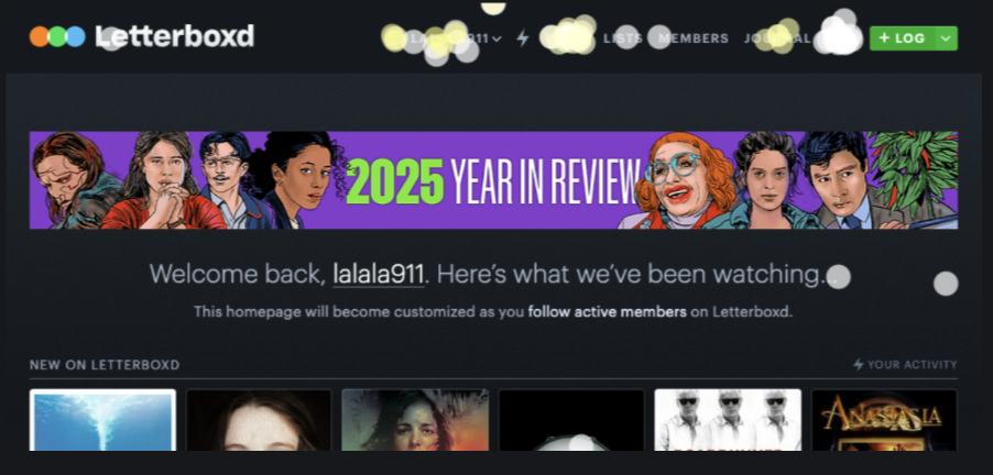
If you are a movie enthusiast, you are probably familiar with Letterboxd. Launched in 2011, it is a highly popular social network dedicated to cinema, especially among users aged 18 to 25. The platform allows users to track the films they watch, rate them, write reviews, and share lists with friends. For our Quantitative UX project, we decided to put the Letterboxd website under the microscope to evaluate its user experience and identify potential usability issues.
why we’re conduction this study ….
The motivation for this study came from our own daily use of Letterboxd. We noticed several minor aspects of the interface that felt unintuitive or seemingly missing. We wanted to step back and determine whether these personal observations were shared by the wider user base. By comparing different user experiences, our objective was to pinpoint areas where the website could be improved to enhance the overall user experience and identify potential features that could be added.
2. Methodology
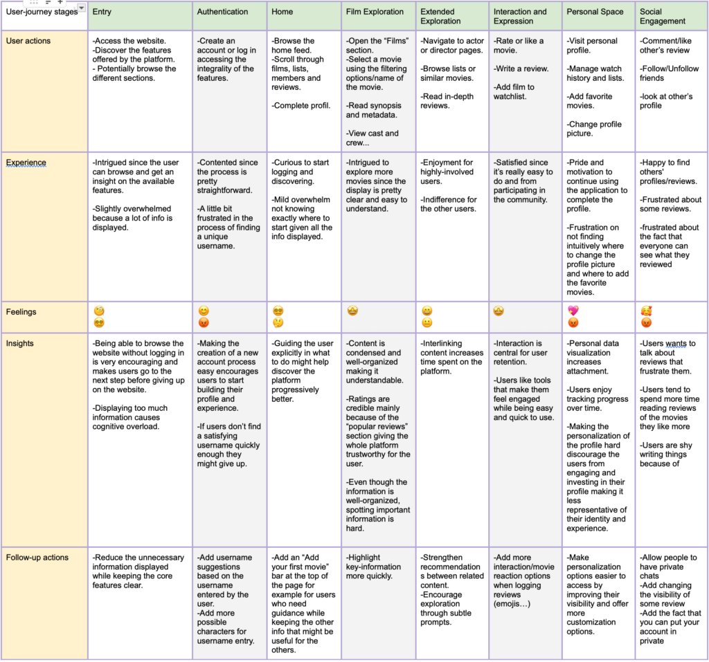
User Journey
To structure our evaluation, we mapped out the core user journey covering entry, authentication, home feed browsing, film exploration, and personal space customisation. A key insight from this journey is that at almost every stage we got both a mix of positive and negative emotions from users. For example, some expressed excitement at the content and suggestions on Home page while others expressed overwhelm.
We then applied the Goals-Signals-Metrics (GSM) framework based on the user-journey to evaluate specific interactions:
| Goals | Signals | Metrics |
| Evaluate how easily users can create an account and know what to do after logging in. | Users complete the login process without typing errors and report the home page content is clear. | -Task success rate -Time on task -Home page clarity score |
| Evaluate how easily users can personalize their profile to reflect their identity. | Users navigate directly to their profile to make changes and understand UI meaning. | -Task success rate by approach -Click efficiency -Percieved and actual difficulty |
| Evaluate how easily users can access and understand key information on a film page. | Users locate specific cast and crew information linearly, without erratic vertical scrolling. | -Findability Success Rate |
| Evaluate how easily and expressively users can interact with content and share their opinions. | Users successfully use the Log/review feature and receive clear system feedback after creating a list. | -Task Completion Rate -Heatmap Click Density -Post-Task Satisfaction Score |
Gathered Data
We collected data from 27 participants to ensure a relevant sample for testing a movie tracking platform.
- Demographics: Over 80% of our participants were between 18 and 24 years old.
- Experience: More than half (64%) had not yet used Letterbox and amongst the rest, only 6% are active users.
- Habits: A large portion identified as casual viewers, and 70.6% noted that they usually don’t keep track of movies.
To get a comprehensive view of the platform’s usability, we used a hybrid approach combining task-based testing, structured surveys, and behavioural tracking.
Protocol : Pre-survey, Tasks, Post-Survey
Pre-task Survey
We defined our participants’ digital profiles and tech-savviness to establish a baseline. We asked testers questions about their age, their expertise in using the app, How much they use social media, etc…
Executing Tasks
Users completed 10 specific scenarios (like logging a movie, finding a specific review, or adding a profile picture) . We used the Think Aloud protocol to capture their real-time frustrations. Additionally, we used a custom Chrome extension to track cursors and generate click/scroll heatmaps. We mapped these scenarios directly from our Goals-Signals-Metrics framework. These tasks covered core App functionalities like content engagement, organisation & social interactions.
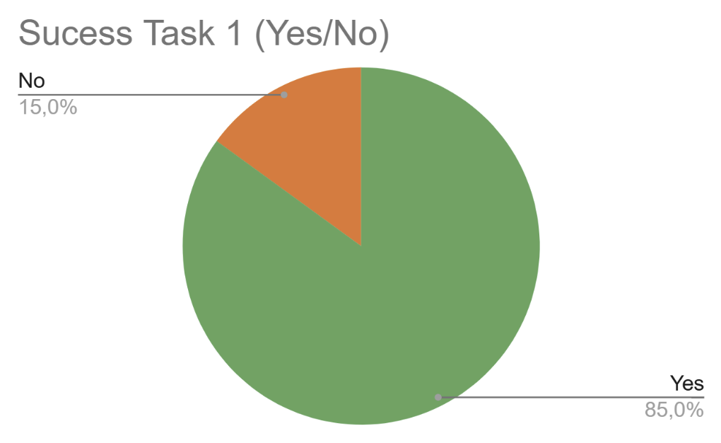
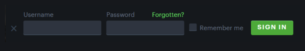
Task 1 : Can you log in with this account : username : ——, password : ——
Task 2 : Can you add a review of the movie Avatar by James Cameron, write more than 3 words.
Task 3 : Can you rate a movie of your choice you have already watched ?
Task 4 : Create a list with the name you want, and add in it the trilogy of the lord of the ring.
Task 5 : Can you follow egonyn, and try to find their review about La La Land posted on the 21st July 2024.
Task 6 :Add Titanic to your TOP 4 film.
Task 7 : Find how to add a profile picture.
Task 8 : Add Forrest Gump to your watchlist ?
Task 9 : Can you tell us how many movies are directed by James Cameron ?
Task 10 : Who is the editor of Mulan ?
Post-task Survey
Users completed Post-task survey and a System Usability Scale (SUS) questionnaire to provide qualitative comments and rate their experience we asked them question like which task they found the hardest, if they felt overwhelm, etc….
A General Questionnaire
To supplement our live testing, we sent a general questionnaire to existing users in cinephile groups, gathering 27 responses to understand daily habits To ask them about which features they appreciated most and what they would like to change about the app.
Primary Feature: We found that 59.3% of advanced users primarily use Letterboxd to log or review movies.
Privacy Needs: About 59.3% of users expressed that they would appreciate being able to manage the visibility of their accounts or reviews (e.g., setting them to private or friends-only).
Platform Preference: Interestingly, 37% of respondents found the phone app to be more intuitive than the laptop website
3. Results
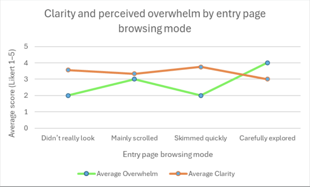
a. Home page Perception
The graph comparing clarity and perceived overwhelm on the home page shows an interesting trend. Users who carefully explored the page reported higher clarity. However, they also reported feeling more overwhelmed. Users who only skimmed quickly reported lower overwhelm but also lower clarity.
This suggests that the home page contains a lot of information. The more users explore, the more they understand it, but they also feel cognitive overload. This indicates a balance problem between richness of content and visual simplicity.
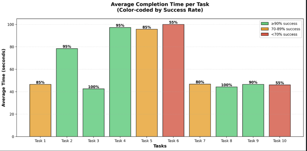
b. Task Performance and Success Rates
The graph showing average completion time and success rate highlights clear differences between tasks. Some tasks had very high success rates, such as finding movies directed by a specific director while others scored way lower number like customising the profile.
Tasks with lower success rates required more clicks and more time, suggesting navigation issues. They also indicate that certain features were not intuitive enough for users.
c. Detailed Task Problems
Logging in
Users struggled because they could not see their password while typing. This reduced confidence and usability.
Writing a review
Many users did not understand the purpose of the “Log” button. The label is not clear enough to show that it allows writing a review.
The heatmap confirms this issue, as almost no users clicked on this button during the task.
Rating vs Logging
Several users confused rating a movie with logging it. This shows a conceptual design issue.
Creating a list
After saving, users were not redirected to the created list. They were unsure if the action was successful.
Finding a review
The Diary section, filters, and dates had low visibility. Users had difficulty locating older content.
Profile picture
The word “Avatar” was unclear. Users expected “Profile picture”.
Watchlist
The difference between “Watch” and “Watchlist” was ambiguous.
Favorite Movies
This was one of the most problematic tasks. It had one of the lowest success rates and required many clicks. Users struggled to find where to add or manage favorite movies. The feature was not intuitive, and its location was unclear. This task clearly highlights navigation and information architecture issues.
The first graph shows that users who searched first had a low success rate of 40 percent, while users who went directly to the profile section had a 100 percent success rate. This means the correct path exists, but it is not intuitive.
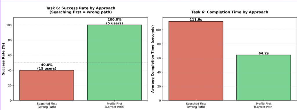
The second graph shows that users who searched first took much longer, about 112 seconds, compared to 64 seconds for users who chose the correct path.
The click analysis confirms this issue, with an average of 55 extra clicks and up to 98 in the worst case. This clearly shows strong navigation problems and confusion for Task 6.
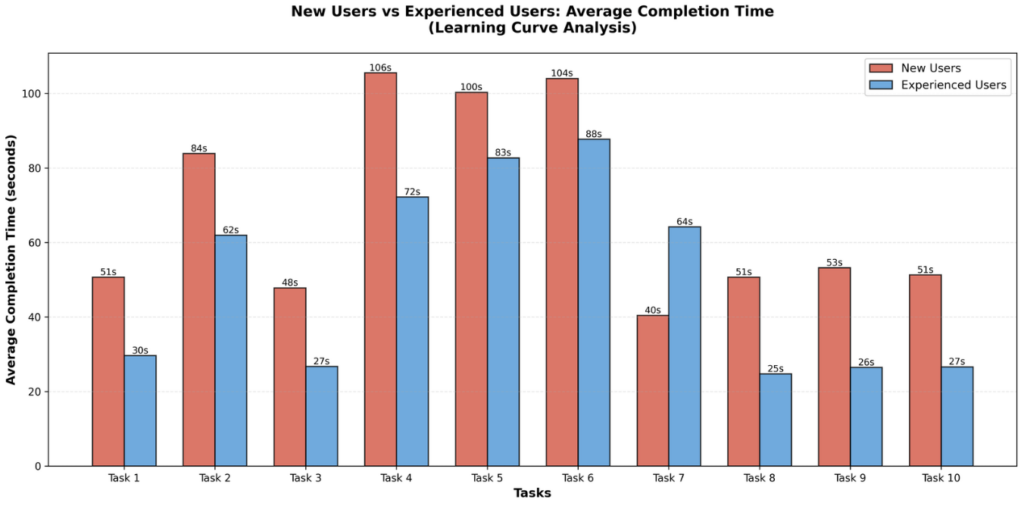
D. Learnability
The comparison between new users and experienced users shows that experienced users completed tasks faster. However, new users improved quickly across tasks. This indicates that the platform has relatively good learnability. So, the onboarding and first interaction could be improved.
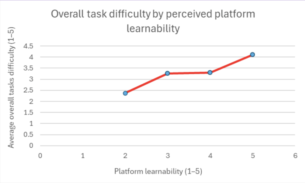
Also, we can see that the people who had the most difficulty completing the tasks classified the platform as the most learnable, which explains why people continue using it despite the initial difficulties encountered.
4. Recommendation
Clarify Wording: We recommend that the app replaces confusing terms like Avatar with Profile picture. Rename the Log button to Review. Also, clarify the ambiguous difference between Watch and Watchlist.
Restructure Profile Navigation: Also the app needs to make managing favorite movies much more intuitive.
Improve System Feedback: The app need to provide clear, immediate feedback after user actions. For example, redirect users to their newly created list immediately after saving it. Additionally, allow users to see their password while typing during login to boost confidence.
Add Privacy Controls: Implement visibility settings (private/friends-only/etc…), as 59.3% of surveyed users requested this feature.
Enhance Content Discoverability: Redesign the Diary section and date filters, which currently suffer from low visibility and caused users to struggle when looking for specific older reviews.
Expand Social Features: Introduce private messaging between friends to improve community interaction. Based on user feedback, consider adding the ability to reply to friends’ reviews , personalised recommendations , and TV series tracking.
Improve Accessibility: Add translations to better support international users , and improve the platform’s overall responsiveness for different screen sizes.
5. Conclusion
Our evaluation successfully highlighted both the strengths of Letterboxd’s learnability and the friction points hidden in its information architecture and terminology. While the platform is highly motivating for cinephiles, smoothing out onboarding, clarifying core buttons, and adding privacy options could vastly improve the experience for casual viewers. For future work, we’d love to validate these findings on a larger panel and dive deeper into the mobile app experience