Authors: Boyang XU, Pingtiao ZHOU, Zhiying ZOU, Xueqi YANG, Qingyue DENG
Abstract
This report presents a comparative user experience study of the Airbnb and Agoda mobile applications, focusing on the complete accommodation booking journey. The study aimed to evaluate which platform provides a more efficient, usable, and satisfying experience, from searching and filtering listings to comparing options and completing a reservation. By combining quantitative metrics—such as task completion time, interaction counts, and Likert-scale ratings—with qualitative feedback from post-task reflections, the study identifies distinct strengths and weaknesses in each platform’s interaction design. The findings reveal differences in efficiency, information presentation, and decision support, and offer targeted recommendations to improve usability, availability transparency, and the balance between experiential engagement and comparison efficiency.
Case Study Description
This case study compares the mobile applications of Airbnb and Agoda, focusing on the user experience throughout the accommodation booking journey. The evaluation covers the full process, from searching for listings and comparing options to completing a reservation. Both task efficiency and overall user experience during the booking process are examined.
Accommodation booking apps are now part of everyday life for many users. Airbnb is one of the leading platforms in this market. In addition to Airbnb, Agoda is another major online accommodation platform, particularly strong in the Asia-Pacific region.However, different apps may perform differently at various stages of the booking journey, such as searching, filtering, reviewing details, and finalizing reservations. These design differences can shape how users experience the process. By comparing the two platforms, this study seeks to understand how interaction design choices affect usability and performance.
The main goal of the study is to determine which app provides a more efficient, usable, and satisfying booking experience. The research addresses several key questions: Which app is more user-friendly? Which app allows users to complete booking tasks more efficiently? What usability issues or design limitations do users encounter during the process? By examining task completion efficiency, functional coverage, and user feedback, the study identifies the strengths and weaknesses of each platform, as well as areas that could be improved.
Methodology
3.1 Study Design
This study focuses on two homestay booking services, Agoda and Airbnb. We systematically compare users’ experiences through the whole homestay booking process, find variations in the user experience and functional support, and analyze how they affect booking efficiency and overall experience smoothness.
We use task-based assessments and online questionnaires to collect objective and subjective measures, and combine these with behavioral data in our analysis.
3.2 Participants
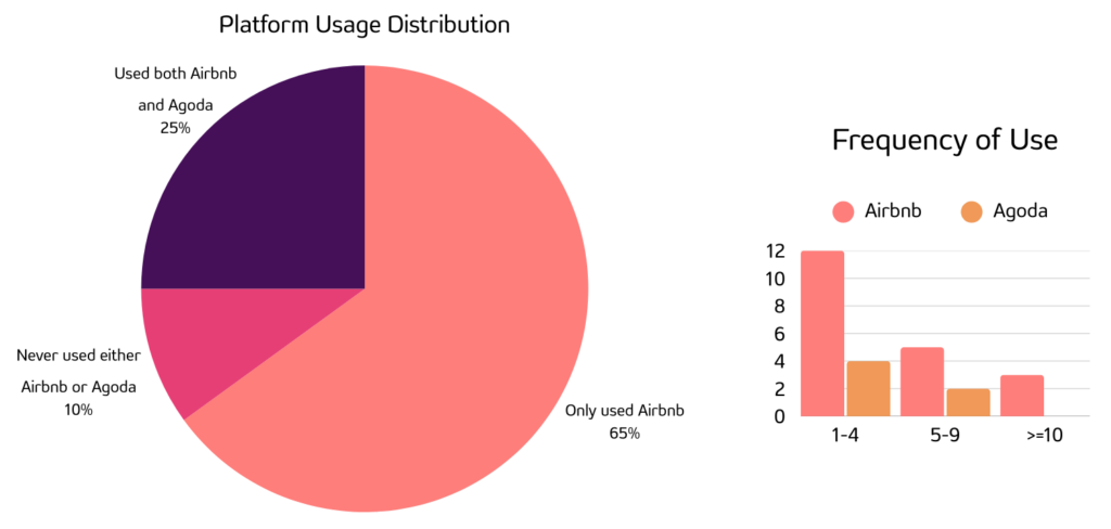
We recruited 20 participants, most of whom were students aged 20–28. To capture a range of usage backgrounds, we included participants with different levels of experience using homestay booking platforms. Specifically, 65% of participants had used only Airbnb, 25% had used neither platform, and 10% had used both Airbnb and Agoda. The grouped bar chart further illustrates the frequency of use of the two platforms among participants.
Students were selected as the target user group because they typically have more flexible schedules, travel relatively frequently, and often have limited budgets, which makes homestays an attractive accommodation option. In addition, this group already has a basic level of familiarity with booking platforms, making them a suitable target population for this study.
3.3 data collection methods
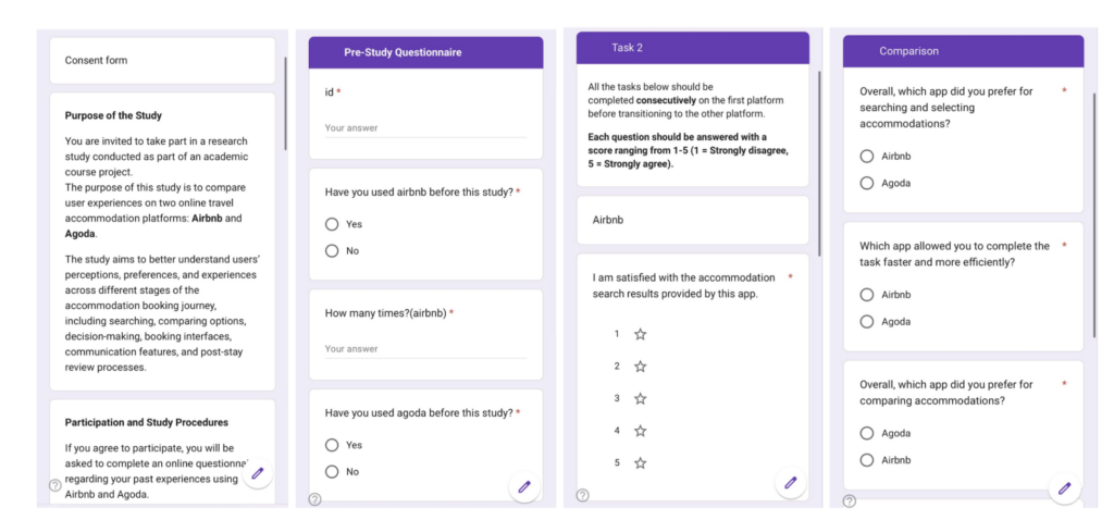
We used Google Forms to build online forms for collecting participants’ informed consent, pre-study background information, post-task Likert-scale ratings, platform preference choices, and open-ended feedback.
The link to our Google Form: https://docs.google.com/forms/d/e/1FAIpQLSf6WuFAN3t1lmL0c-rPy1tmCuUjMq-HGdH7UgDEsdasSD7iZg/viewform?usp=sharing&ouid=115161645448893660755
To obtain behavioral data, we used screen recording to record participants’ interaction traces while using Airbnb and Agoda. These recordings were used to review user behavior, count interactions, and verify key interaction steps. Due to practical constraints, clicks and swipes were counted as one interaction type during analysis. The study was conducted on mobile apps, where mature event-tracking tools are less available than on web platforms for automatically and precisely distinguishing interaction types. In addition, because the study was conducted with one researcher to one participant, it was challenging and prone to errors to record various movements with high precision due to time and labor constraints.
During the task, participants were encouraged to use think-aloud method to express their current understanding, decision rationale, and points of confusion. The researcher recorded these verbal comments as qualitative data to help identify potential usability issues.
Three steps were sequentially completed by the participants: informed consent, pre-study questionnaire, and task-based evaluation. The pre-study questionnaire collected background information such as past platform usage and platform preferences. Participants then completed a series of standardized tasks on Airbnb and Agoda using the mock accounts provided by the researchers, to ensure consistent experimental conditions and to minimize the influence of personal account settings or prior preferences. To reduce learning effects, participants were randomly assigned to start with one platform.
3.4 Experiment Protocol
The following were the tasks:
(1) Task 1: Precise search and availability verification – participants searched for a specific homestay and checked its availability within a given time period;
(2) Task 2: Exploratory search and wishlist saving – participants saved four possible options after searching for homestays under specified date, guest number, and location constraints;
(3) Task 3: Comparison and final decision in the wishlist – Participants chose their final preferred homestay after comparing the options they saved;
(4) Task 4: Finding the host communication entry and recalling communication experience;
(5) Task 5: Recalling check-in, check-out, and review experiences.
3.5 Measures & Data Collection
We collected both quantitative and qualitative data to evaluate user experience on Airbnb and Agoda.
Quantitative data were mainly used to assess efficiency and interaction effort during task execution on the two platforms. The measures included:
- Task completion time: the time required for participants to complete each task;
- Interaction count: the number of interactions completed during each task;
- Likert-scale ratings: ratings (1–5) of interface clarity, overall satisfaction, and perceived efficiency;
- Platform preference: participants’ platform preference reported in the pre-study questionnaire and their preferred platform selected after completing the tasks.
Qualitative data were collected mainly through open-ended feedback and the think-aloud method, which helped us understand users’ specific difficulties and perceptions during use. Participants provided textual descriptions of their experiences with searching, saving, comparing, communication, and check-in-related processes, as well as task reflections on the main problems encountered, inconveniences, and suggestions for improvement.
3.6 Data Analysis
In the following analysis, we present the results using visualizations to provide an integrated view of users’ backgrounds, subjective evaluations, and task performance on Airbnb and Agoda.
The visualization methods used in this study include:
- Pie charts to provide an overview of the sample composition and overall preference trends;
- Radar charts are used to compare the two platforms across multiple Likert-scale rating dimensions, reflecting users’ subjective evaluations across the booking journey.
- Grouped bar charts and scatter plots to illustrate differences between the two platforms in terms of efficiency and interaction effort.
3.7 Ethical Considerations
All participants provided informed consent and took part voluntarily, with the right to withdraw at any time. Our consent form is included in the link to Google form above. Participant data was anonymized, and no personally identifiable information was collected. All data was used only for course-related research and presentation purposes.
Quantitative results
4.1 Result 1
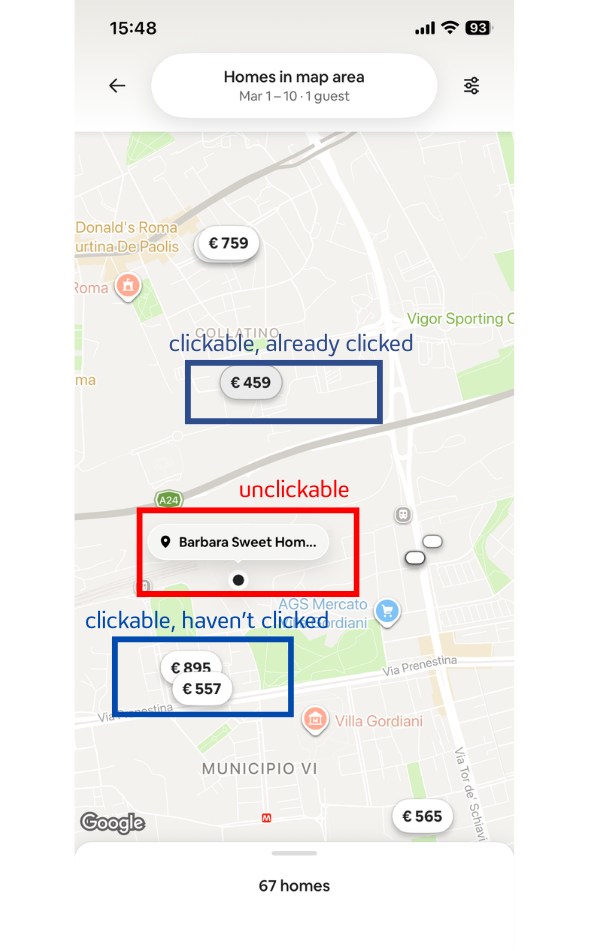
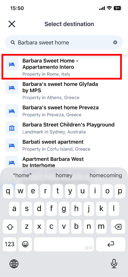
When performing the task of searching for a specific homestay and checking availability from March 1st to March 10th, none of the participants were able to successfully complete the task on Airbnb. When participants searched for <Barbara Sweet Home>, Airbnb did not directly present the target accommodation in the search results. Instead, multiple result cards that were not directly related to the target listing were displayed.
The target accommodation only showed up as a name label after moving to the map view, and clicking on it did not result in any clear feedback or take the user to the listing information page. The interface was unclear about whether the accommodation was available on the dates that were chosen. Some participants commented that “it doesn’t show the unavailable date, the card cannot be opened,” indicating apparent confusion when searching availability and interaction possibilities, which reduced the certainty and efficiency of task completion.
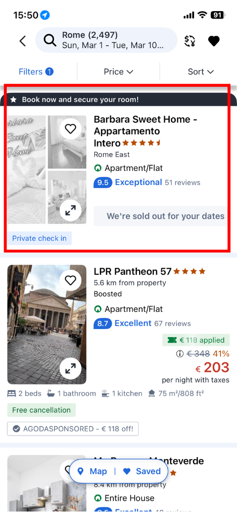
However, when searching for the same accommodation on Agoda, the system clearly displayed the listing existed and directly showed that it was sold out for the given period. This direct status feedback enabled participants to quickly figure out the availability of the accommodation for the target dates, allowing them to complete the task more smoothly.
In this task, the interaction count on Airbnb was higher than on Agoda, which is consistent with uncertain search feedback and unclear clicking ability of Airbnb results. In order to verify the listing’s status, participants frequently had to try many entry points. Result 2 below provides additional analysis of the differences in interaction activity.
These results show that Airbnb’s user interface offers less clear indicators for result clicking and availability status in precise accommodation searches, which may cause users to become confused and doubtful. In contrast, Agoda offers more detailed availability feedback, helping users better understand search results and make decisions more efficiently in searching.During the following comparison tasks, some participants also mentioned unclear information presentation on Airbnb, such as “the number of comments disappeared in the wishlist” and “key information was not presented clearly or directly, making it difficult to extend their exploration to recommendations aligned with their needs.” These remarks also reflect that Airbnb may do better with its display of important information linked to decisions during the stages of comparison and decision-making.
4.2 Result 2
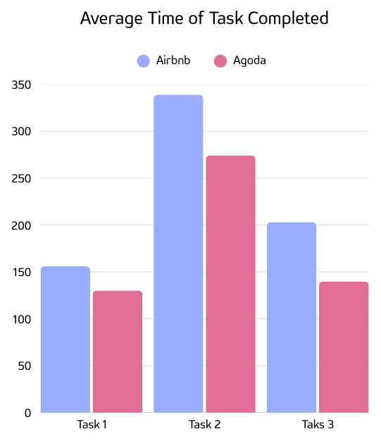
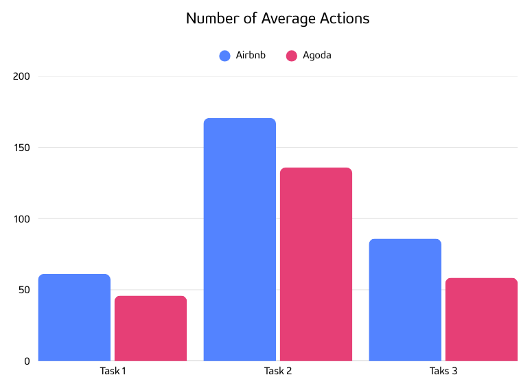
These charts show the average time spent and number of actions taken by participants to complete three booking tasks on Airbnb and Agoda. To ensure fairness and reduce the influence of testing order, half of the participants completed the test on Agoda first and then on Airbnb, while the other half started with Airbnb and then tested Agoda. The order was assigned randomly. Overall, Agoda is faster and requires fewer actions. This pattern is consistent.
For Task 1 (searching for a specific accommodation), Airbnb takes about 156 seconds, while Agoda takes 130 seconds. Airbnb requires on average 61 actions, compared to 46 on Agoda. Although Airbnb is more commonly used among our participants and some are already familiar with it, searching for a specific accommodation still takes longer on Airbnb. In addition to Airbnb’s misleading UI design, which is discussed in Result 1, it suggests that Agoda’s search bar and initial search flow are more direct. Its searching system also seems better adapted to searching by name.
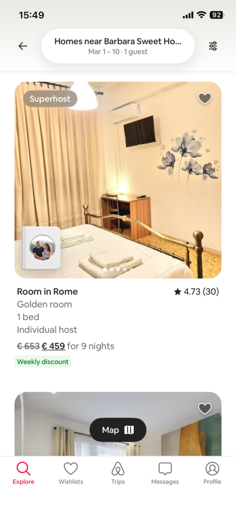
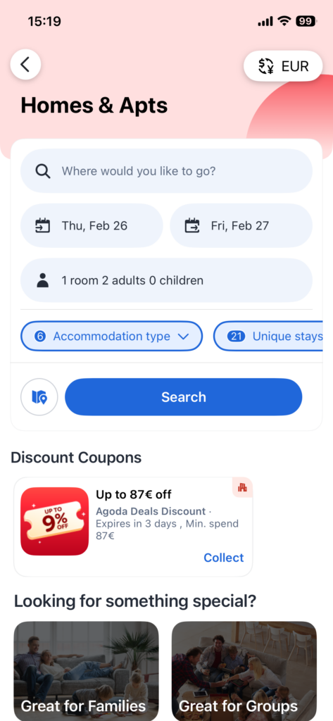
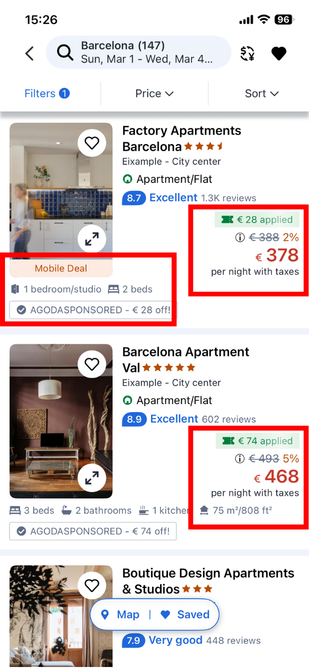
For Task 2 (filtering and saving 4 options in the wishlist), both apps require the most time compared to the other tasks. On average Airbnb takes about 339 seconds and about 171 actions, while Agoda takes 274 seconds (which is 65 seconds less) and 136 actions (which is 35 actions less). The average time saved on Agoda compared to Airbnb is more than 1 minute on this task. This difference indicates that Agoda’s users are more likely to decide more quickly and spend less time hesitating. From our observation of Agoda’s interface (see below screenshots), many discounts are displayed, including time-limited or device-specific offers.
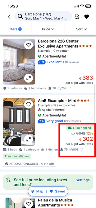
For Task 3 (compare saved options in the wishlist and choose the final one), Airbnb takes about 203 seconds, and Agoda takes about 140 seconds. Airbnb requires about 85 actions, while Agoda requires about 58 actions. Agoda is again faster, with a difference of about 40 seconds. This suggests that Agoda’s presentation of discounts might promote quicker decisions. As a result, users may find it easier to make decisions more quickly based on the principle of “discount comes first”. Even though it is unclear how Agoda distributes coupons and whether clients can truly benefit from reduction with these discounts, displaying discounts appears to be an effective strategy for shortening user’s decision time.
4.3 Result 3
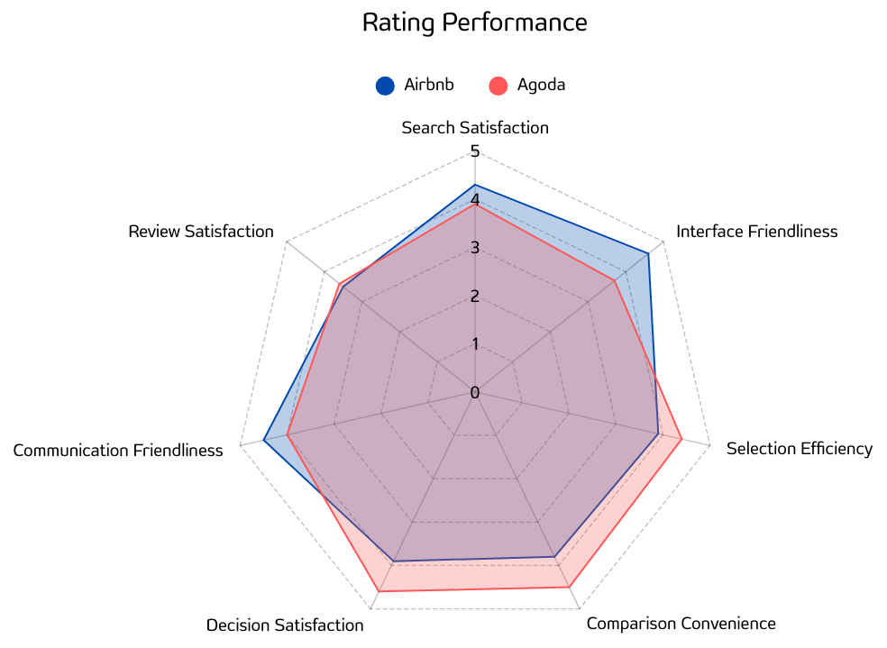
The radar chart clearly shows the design trade-off between the two products in terms of visual appeal and operational efficiency, accurately reflecting their respective strengths at different stages of the booking journey.
In the early browsing stage, Airbnb holds a clear advantage. The data shows that Airbnb significantly outperforms its competitor in interface friendliness (4.6 vs. 3.7), search satisfaction (4.3 vs. 3.9), and communication friendliness (4.5 vs. 4.0). This suggests that Airbnb’s image-forward visual layout aligns well with users’ exploratory mindset, delivering strong emotional value and making the browsing experience pleasant and comfortable.
However, the situation reverses in the decision part, where Agoda takes the lead across the board. Agoda scores higher in decision satisfaction (4.6 vs. 3.9), comparison convenience (4.5 vs. 3.8), and selection efficiency (4.4 vs. 3.9). This shift highlights a change in user behavior: when users need to apply strict filters based on dates, prices, and amenities, visual attractiveness becomes less important than access to dense, well-structured information.
The root cause of this difference lies in changes in cognitive load. On Airbnb, comparing multiple listings requires frequent page switching, which places a heavy burden on short-term memory and reduces comparison efficiency. In contrast, while Agoda scores lower on interface friendliness, it presents key decision factors, such as total price and ratings, side by side in a compact and intuitive single-screen layout. This high-information-density design minimizes unnecessary clicks and memory strain, offering more effective support precisely when users need to make a decision.
In summary, Airbnb’s strong visual design serves as a powerful hook during the browsing phase, drawing users in. Yet at the final decision stage, it is Agoda’s highly efficient information organization and comparison features that truly reduce user effort and drive bookings.
4.4 Result 4
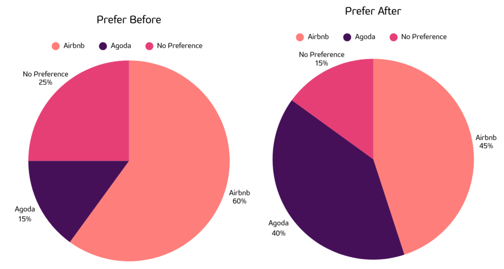
Before the test, brand familiarity led to a clear initial bias: 60% of users preferred Airbnb, 25% had no preference, and only 15% chose Agoda. However, after completing intensive tasks, the data shifted significantly. Preference for Airbnb dropped to 45% and Agoda’s preference surged to 40%.
This 25% preference shift reveals a core UX insight. While Airbnb’s aesthetic, image-heavy design dominates the early browsing phase and gives users a friendly using environment, its frequent page jumps and low information density increase cognitive load during the actual decision-making phase. In contrast, Agoda’s higher information density, structured layouts, and clear filtering mechanisms provide much more efficient support for users when they are ready to compare and make final booking decisions. Also we can see the possibility that Agoda may just need a chance of exposure to get in touch with users, the thing may change if their market promotion works better. To verify this, we conducted follow-up interviews with users who switched to Agoda after two weeks, and their feedback perfectly matched the data. One user noted that while Airbnb is great for looking at pretty houses, Agoda puts all key information on one screen, making comparison much faster without clicking back and forth. Another mentioned that Agoda’s filters successfully avoided the frustrating “fully booked” dead-ends common on Airbnb. This proves that as users move to the bottom of the decision funnel, pure efficiency and high information density become the key drivers for conversion.
Qualitative results
Apart from quantified data from SUS questionnaire and behavior metrics, we also gathered some qualitative feedback from our participants through post-task comments.
For Airbnb, more than half of participants reported difficulties during the stage of comparing saved listings and making a final decision. Several users mentioned that they had trouble comparing listings:
- It’s hard to compare them at the same time, I have to look at all the details separately.
- I can’t directly compare them in one page, I need to in-and-out.
Also, some other users found it difficult to check all details at the same time. Some noted that the number of reviews was not clearly shown after saving listings. Users could not search for a specific homestay by name, which reduced efficiency
For Agoda, more than two-fifths of participants reported difficulties during the decision-making stage.
- The dates for searching and saving should be independent and should not be changed simultaneously.
- No map-based system to compare saved homestays by location. (Remark: There is actually a map based search on Agoda, but probably not visible enough such that this participant failed to find it.)
- The number of reviews is often low, making high ratings less convincing.
- Users cannot view host ratings, reducing confidence in their final choice.
Conclusion
The comparative user experience study of Airbnb and Agoda provided valuable insights into user interactions and booking behaviors across different stages of the booking journey. By combining quantitative metrics, such as task completion time, number of actions, and navigation patterns with qualitative feedback from think-aloud protocols and post-test interviews, we identified both the strategic strengths and critical usability weaknesses of each platform.
Our study revealed a clear stage-based trade-off. Airbnb demonstrates strong visual appeal and interface friendliness in the early browsing phase, but its comparison process is fragmented and inefficient during decision-making. Frequent page switching and low information density increase cognitive load and reduce efficiency. In contrast, Agoda adopts a more information-dense and structured layout, which may appear less visually engaging at first, but significantly improves comparison clarity and decision speed. Across all three tested tasks, Agoda consistently required less time and fewer interactions. Furthermore, Airbnb showed critical issues in search accuracy and availability feedback. Participants were unable to successfully locate and verify the availability of a specific listing due to unclear search results and unresponsive map labels. While Agoda clearly indicated unavailability for selected dates, its interface can still feel visually dense and promotion-heavy. These findings highlight not only design trade-offs between aesthetics and efficiency but also functional barriers that directly impact task completion and user confidence.
To address the identified issues, several improvements are recommended:
- Enhance search precision and feedback clarity by improving name-based search recognition, providing clearer availability indicators, and ensuring interactive elements (such as map labels) respond consistently and transparently.
- Improve decision-stage efficiency by reducing unnecessary page transitions and increasing on-screen information density for comparison, allowing users to evaluate multiple listings without excessive cognitive load.
- Balance visual engagement with structured decision support through adaptive layouts: a visually immersive design in the exploratory stage, followed by a comparison-focused, information-rich layout when users apply filters and move toward final decisions.
- Strengthen filtering mechanisms and availability transparency so users can avoid fully booked dead-ends and make faster, more confident booking decisions.
By implementing these improvements, both platforms could better align emotional engagement with rational decision support, reduce cognitive strain during comparison, and ultimately create a smoother and more conversion-oriented booking experience.