Authors: Ala ELLEFI, Arsalan MASOUDIFARD, Fatemeh SHIRVANI, Ferhat ADDOUR, Yifei CHEN
Abstract
Temu is one of the most popular shopping platforms worldwide, yet its interface relies on manipulative design tactics known as dark patterns. We conducted a between-subject study with 20 participants, comparing a dark version of Temu (with amplified dark patterns) to a control version (with patterns removed), using surveys, interaction logs, and eye-tracking. Our findings show that obvious pop-up-based patterns were seen as most annoying but least influential on purchases, while subtler patterns like Misleading Discounts and Fear of Missing Out were perceived as less manipulative yet more influential. This suggests that the dark patterns users easily recognize may not be the ones that actually affect their behavior.
1. Introduction
Temu.com is an online shopping platform launched in 2022 known for its very low-price products, and it is the most downloaded e-commerce app from 2023 to 2025 [1]. With prices that often feel too good to be true, the platform has sparked a wave of consumer skepticism, yet millions keep coming back.
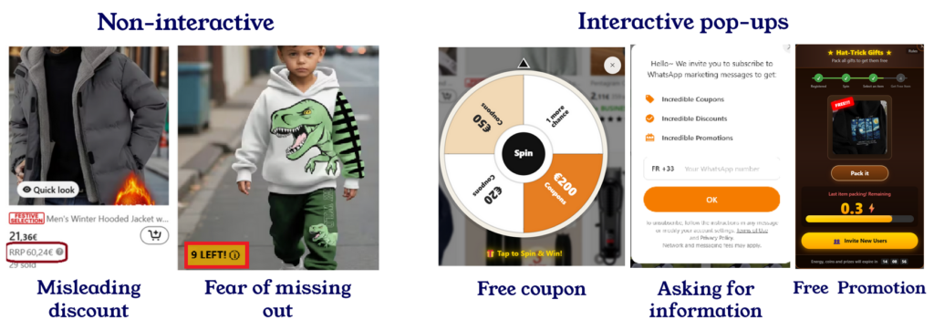
To understand users’ opinion about Temu, we scraped over 89,000 reviews from the French Google Play Store, and used Natural Language Processing (lemmatization + TF-IDF) to extract themes. The Sankey diagram below maps star ratings to the topics users mention most, showing that 1-star reviews are overwhelmingly tied to scam accusations, misleading ads, and fake giveaways, while themes like delivery, product quality, and pricing appear across all ratings, reflecting both positive and negative experiences.
Beyond user sentiment, academic work has also analyzed Temu’s interface design. Several studies frame these tactics as “dark patterns,” a term coined by Henry Brignull as design tricks that push users into actions they didn’t intend, such as unplanned purchases, difficult unsubscription, sign-ups, or gamified engagement [2, 3].
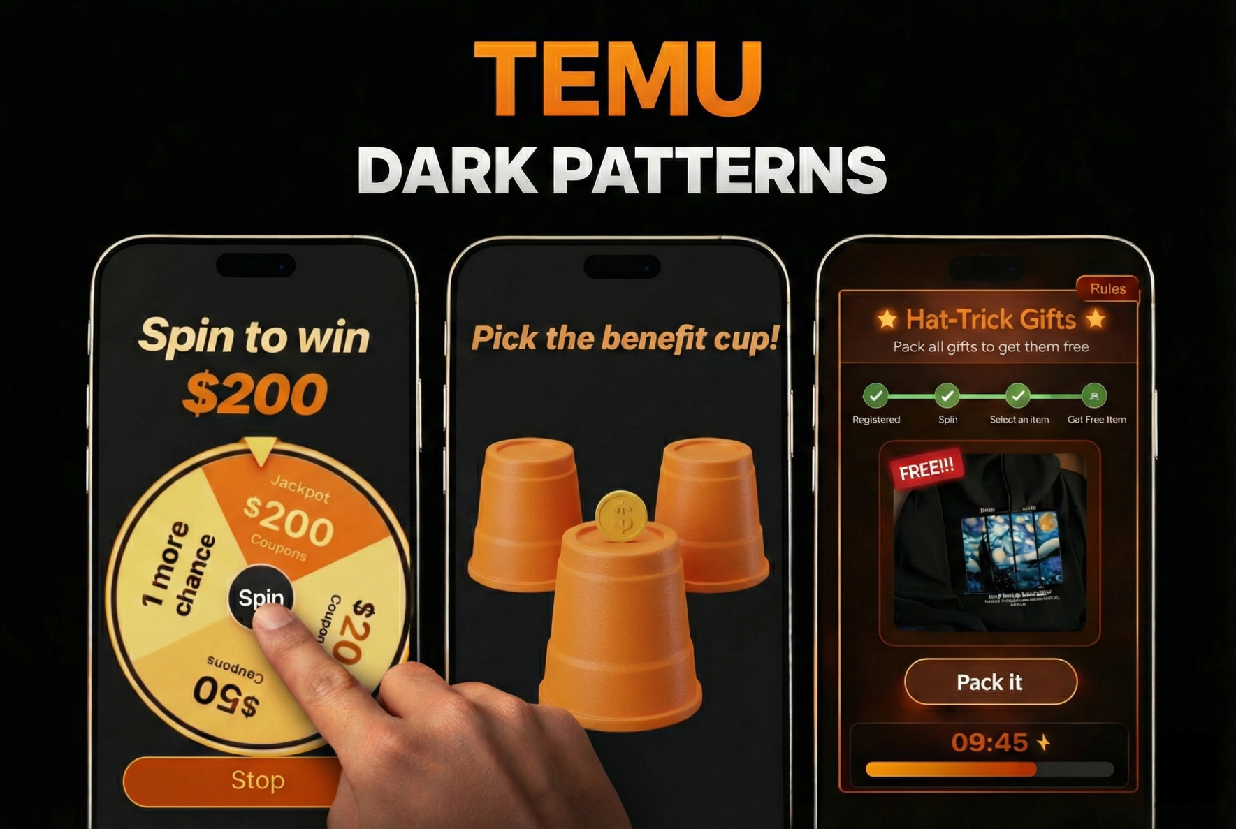
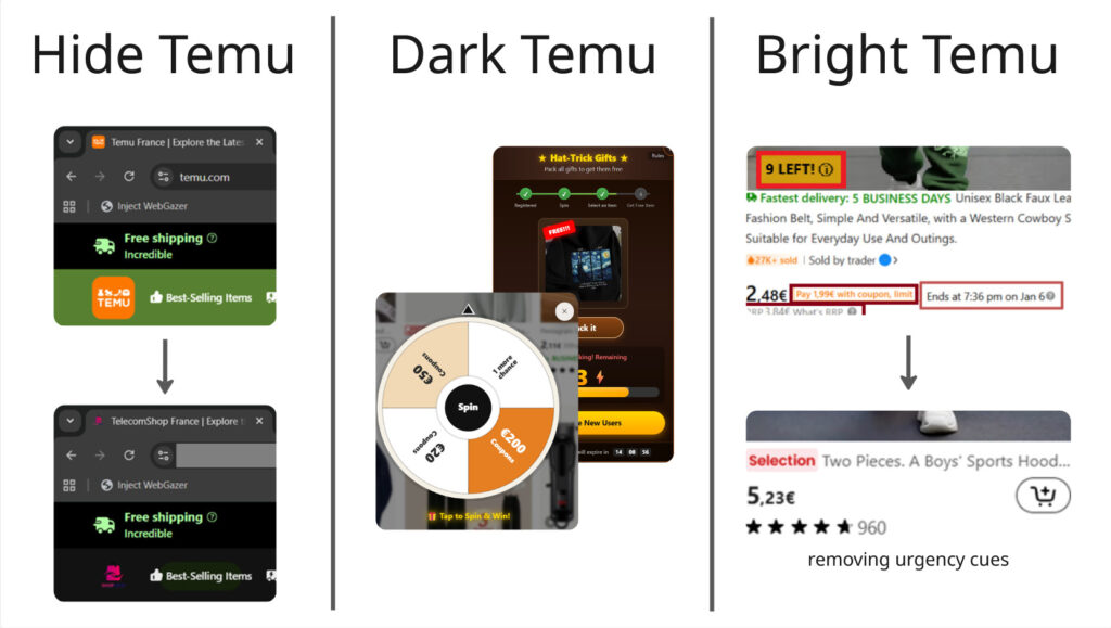
Based on the taxonomy of dark patterns elements in [3], we identified five of them for evaluation. As shown in Figure 2, these patterns are divided into two categories. The non-interactive patterns include:
- Misleading Discount : shows fake original prices to make the discount look bigger.
- Fear of Missing Out : uses messages like “1 LEFT!” to rush users into buying.
The interactive pop-ups include:
- Free Coupon : shows a spin wheel to attract users into claiming offers. We added this element to each participant’s homepage to ensure that everyone had the same experience.
- Asking for Information : pops-up asking users to share personal details like their WhatsApp number. We showed this pop-up at the beginning of checkout.
- Free Promotion : displays product ads as pop-ups while users are browsing. We presented this pop-up on the product page.
2. Motivation
Recent work has shown that users are often aware of manipulative design practices, yet still continue using platforms because of convenience and low cost. For example, a qualitative co-browsing study on Temu found that users noticed cheap-price traps, gamified shopping, fake urgency, and privacy concerns, but still adapted to these conditions and kept using the platform in practical ways [4]. In another study, researchers examined dark patterns in a prototype (non-real) shopping website and identified which patterns users reacted to most negatively [5]. Our work follows a similar direction, but studies these issues in a real website context with fewer experimental constraints, allowing us to observe user responses in a more realistic setting. This leads to the following research questions:
- Do users notice dark patterns on Temu, and do they interact with them?
- If yes, which dark patterns get the most attention and interaction?
- How much do these dark patterns influence users’ choices and purchases?
The last question is more challenging, and while we cannot answer it fully, we provide some initial insights. Regardless, understanding these patterns matters for two reasons:
- It can guide developers, researchers and policy makers in deciding which dark patterns to address first through counter-design solutions
- It can raise awareness among both designers and everyday users about how these manipulative design choices work.
3. Methods
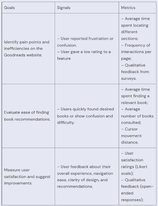
In order to answer the questions we proposed, we have designed a user study session and three different questionnaires. In this section, we will focus on the user study procedure and some design choices we have made.
First, we identified the metrics and methods we use for our project.
| Goal | Metric |
|---|---|
| Noticeability of the dark patterns and users’ willingness to interact with them | 1. User reported interest in interacting with dark patterns 2. Heatmap of users’ interaction with dark patterns |
| Identify the dark patterns that get the most attention and interaction | 1. User reported ranking of dark patterns |
| Determine if dark patterns will influence users’ choices and purchases | 1. User’s satisfaction score using a Likert Scale 2. User reported ranking of dark patterns |
Then we developed our protocol based on metrics we would like to investigate.
3.1. Experiment Setup
We designed two versions based on the temu website. For the sake of simplicity, we refer to one of them as the dark version and the other as the bright version. As the name suggests, the dark version is the one where the user interacts with the dark patterns we defined and the bright version does not include them at all.
We invited 20 participants and randomly split them into two groups. We follow a between-subject design principle, so each participant only interacts with one version.
In this study, we use the French web version of Temu. Because Temu’s interface differs across countries and platforms [6], we had to modify the UI, as shown in Figure 3. To minimize the influence of participants’ prior experience with Temu, we hid any elements (e.g., logos, text labels, and the word “Temu”) that could allow them to recognize the website, replacing them with neutral alternatives such as the name “TelecomShop” and a different color palette. We then created two versions of the website: (1) a Dark Temu version, in which dark patterns are amplified in the current web interface to make it more similar to the app version, and (2) a control version (Bright Temu) that does not include any of the five identified dark patterns, such as the spinning wheel.
3.2. Protocol
The user test session lasts for about 20 minutes. It will be carried out on the device of the test proctors as setting up the extensions and applications can be prone to errors. The users are asked to read and sign a consent form to obtain their permission for screen recording. They are informed that their answers are anonymous and they may stop at any time. The users are asked to think out aloud during the user test.
The user is given a task to make a purchase. They will look for an air fryer for everyday use with a budget of up to €90. They may choose multiple items. They will be given an account and login information, so they don’t have to share with us your personal information.
First, they will explore any promotions or offers. Then, add the item to their shopping cart and continue through the checkout steps up to the final confirmation screen (no payment required) and finish the purchase.
We used an eye tracking application called webgazer and a cursor tracker for further data analysis. The user’s think-aloud process will be recorded as well.
After completing the task, they will fill out three questionnaires which will be detailed in the next section of the blog.
3.3. Technology used
3.3.1. Website Modifications (Extention)
We have written several scripts to modify the appearance of the temu website. There is one general script to hide the word “temu” and change the color palette to eliminate bias. For the bright version, there’s one script and for the dark patterns, there’s one script for each dark pattern we wanted to investigate. Note that we observed some of them in the mobile version of temu but modifying the application was technically impossible so instead we transplanted them into the web version.
A key challenge is that these front-end modifications must be applied in real time. To do this, we use the Tampermonkey extension and JavaScript to dynamically modify the UI. This is difficult because the DOM elements do not have fixed IDs or class names, so we had to identify recurring structural patterns in the DOM to reliably target specific interface elements.
3.3.2. Eye tracking
Eye tracking makes a good indicator for how much these dark patterns can attract users’ attention. To enable desktop-level tracking and heatmap visualization, one of our team members modified the WebGazer library.
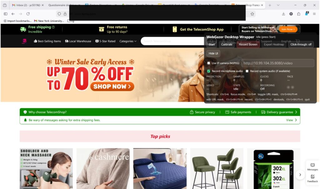
The black bar is used to cover the URL to prevent bias as we cannot change the URL with scripts. You can find the interface on the top-right corner. First, we will help the user calibrate and then start the recording. Then we will export the heatmap after the user study session.
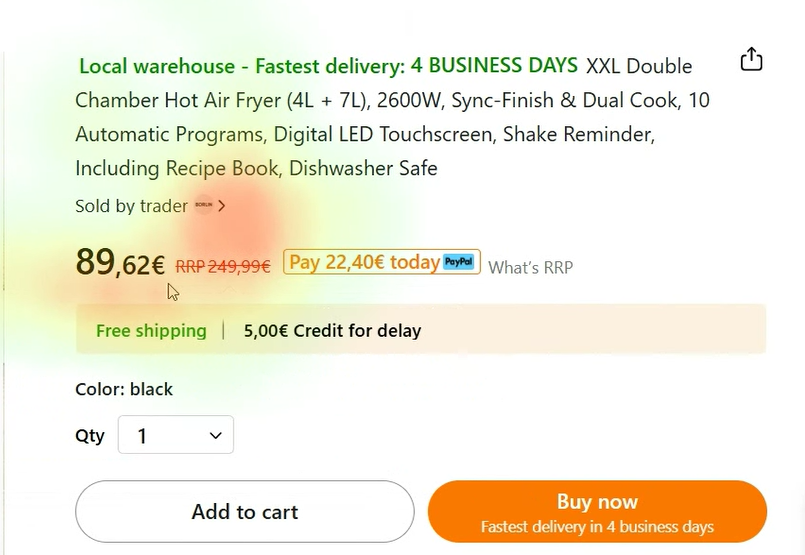
For example, in this image, red suggests that the user tends to gaze at those regions and green suggests less tendency.
3.3.3. Click tracking
The WebGazer application also integrates click tracking functionality, producing a log of the user’s mouse clicks. This allows us to analyze whether users who spent more time on the website also clicked more, or whether they remained idle.
3.4. Discussion (Between-subject or within-subject)
We conducted some research into these two different modes of user research design to make more informed decisions.
Between-subject studies distinguish a control and a treatment group and different people test each condition, so that each person is only exposed to a single user interface. In within-subject studies, the same person tests all the conditions (i.e., all the user interfaces).
The study that has the most similar protocol to ours uses a between-subject approach. They presented two different interfaces, bright and dark version, to 204 participants, out of which 134 were given the dark version. However, we do need a large number of participants to alleviate bias by introducing randomness.
For studies that took a within-subjects approach, either the task during the user test was less structured and more light-weight [7] or users were only asked to provide a simple ratings based on some pre-defined websites to browse [8].
Due to our hardware limitation, we end up taking the between-subject approach, as this would make sure that our users are not fatigued by repetitive tasks. It’s also more ideal as the users don’t have to set up the applications and scripts on their own since this is a pretty complex step. We believe that this setup is the most ideal one for the scope of the project for now.
3.5. Quantitative Methods: How We Measured the Impact of Dark Patterns
While the experimental setup explains what participants experienced, the quantitative part of our study explains how we measured the impact of that experience.
Our goal was to transform subjective feelings — such as confusion, pressure, or satisfaction — into measurable data that could be statistically compared between the bright and dark versions of the website.
3.5.1. The Questionnaires
We used structured surveys to collect numerical data from participants.
Two platforms were used:
- LimeSurvey – for questionnaires completed by both groups (bright and dark versions).
- easyfeedback – for additional questions answered only by participants exposed to dark patterns.
All responses were exported in numerical format for analysis.
3.5.2. Type of Questions Asked
Our quantitative data was collected using structured surveys composed of:
- Multiple-choice questions (gender, age, education, occupation)
- Frequency-based questions (online shopping habits)
- Multiple-selection questions (platforms used)
- 5-point Likert scale questions (1 = strongly disagree, 5 = strongly agree)
The Likert-scale questions were central to our analysis. They allowed us to measure subjective experiences such as:
- Confusion
- Cognitive overload
- Pressure
- Perceived manipulation
- Financial influence
- Satisfaction
- Autonomy in decision-making
By converting perceptions into numerical values, we were able to compare participants exposed to dark patterns with those interacting with the neutral interface.
3.5.3. Goal of Each Questionnaire
Demographics and Shopping Habits (Both Groups)
The goal of this questionnaire was to:
- Control for background differences
- Ensure comparability between groups
- Identify potential confounding variables such as online shopping experience
User Experience and Perceived Manipulation (Both Groups)
This questionnaire aimed to measure:
- Psychological discomfort
- Perceived pressure and confusion
- Financial influence
- Overall satisfaction
- Sense of autonomy
Because both groups answered the same questions, we can directly compare the dark and bright conditions.
Dark Pattern Reflection (Dark Group Only)
Participants exposed to dark patterns completed an additional questionnaire.
Its goal was to:
- Measure the intensity of perceived manipulation
- Assess awareness of deceptive elements
- Compare subjective perception with behavioral data (eye tracking and cursor tracking
3.5.4. GDPR Compliance and Data Protection
The surveys were conducted in compliance with GDPR principles. No personally identifiable information was collected, and all responses were anonymous. Participants provided informed consent before the session began.
3.5.5. Timing of Data Collection
All questionnaires were completed immediately after participants finished the shopping task.
Collecting responses right after task completion ensured reducing recall bias and increasing the reliability of self-reported data.
4. Results
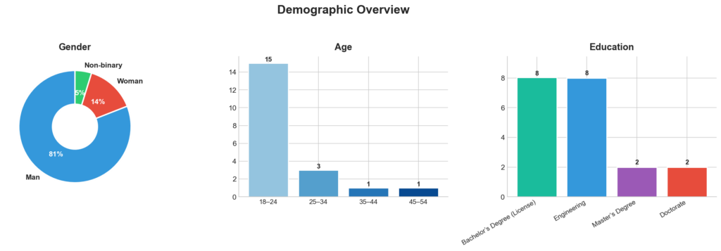
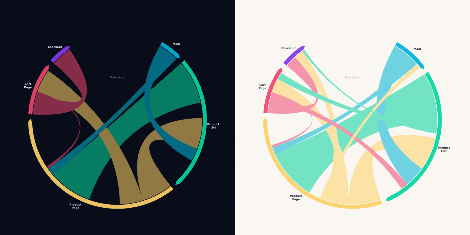
The experiment involved 20 participants, they were predominantly aged 18–24 and mostly students, indicating a digitally literate sample. All participants had prior online shopping experience, though most reported shopping only occasionally. This profile suggests familiarity with digital interfaces but not necessarily strong resistance to persuasive design (Figure 6). We had 5 main pages in the user journey that you can see the flow between these pages in Figure 7. Noticeably, in the dark version most participants entered the checkout from cart page, compared to control version where users entered there from product page and product list as well.
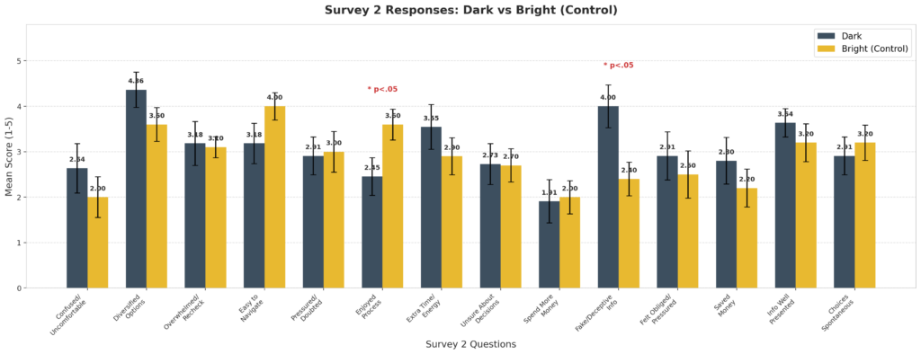
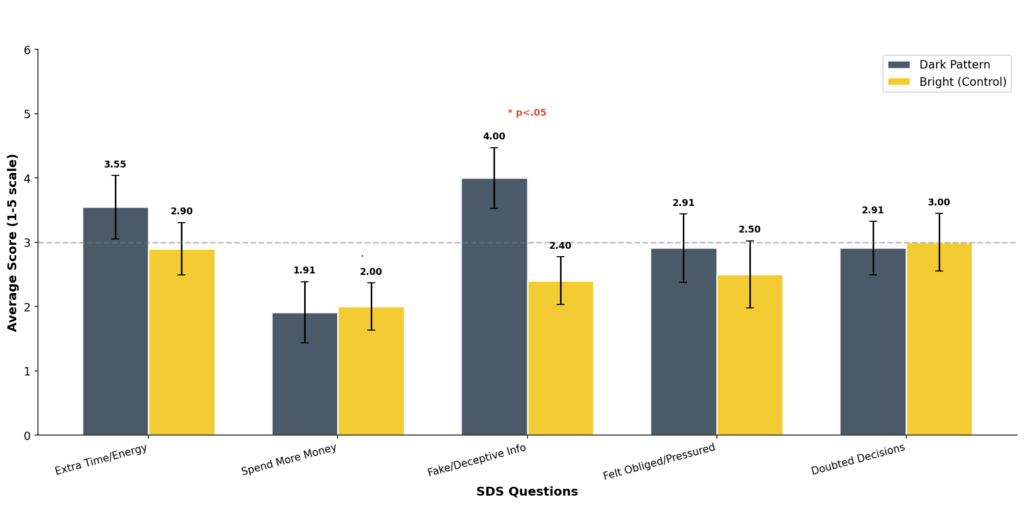
Survey 2 measured how participants felt after completing the shopping task using 14 questions on a 1–5 scale. Overall, participants in the Dark condition reported more negative experiences, feeling more confused, pressured, and needing more time and effort, while the Bright group found the website easier to use and more enjoyable. The only statistically significant difference was for “Fake/Deceptive Info” (Dark: M = 4.00, Bright: M = 2.40, p < .05), meaning Dark condition participants were much more likely to feel the website showed misleading information. Other differences were not significant, likely due to the small sample size (N = 20), but the overall trend suggests that dark patterns hurt user trust and experience.
The total SDS scores show that the Dark group reported a higher mean (M = 14.9) than the Bright group (M = 12.8), suggesting they felt the website was more manipulative overall. However, this difference was not statistically significant (p = 0.375), likely due to the small sample size. The Bright group’s responses were more consistent, while the Dark group showed greater variability, meaning participants reacted quite differently to the dark patterns. When looking at the five items separately, most scores were similar across conditions, except for the item about fake or deceptive information, which was notably higher in the Dark group. This suggests that while overall perceived manipulation did not differ significantly, the dark patterns were especially effective at making users feel deceived.
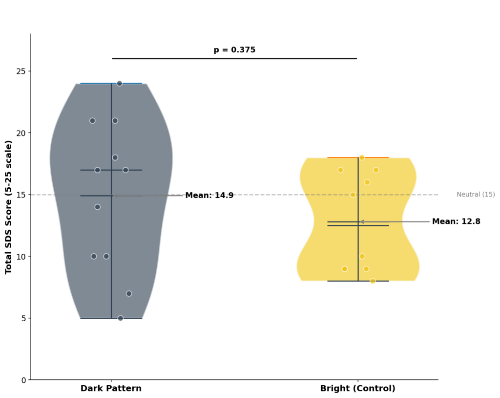
Figure 9. Total System Dark Scale (SDS) scores by condition (sum of five items, range 5–25). Error bars represent standard error.
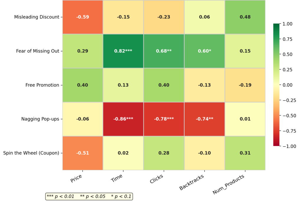
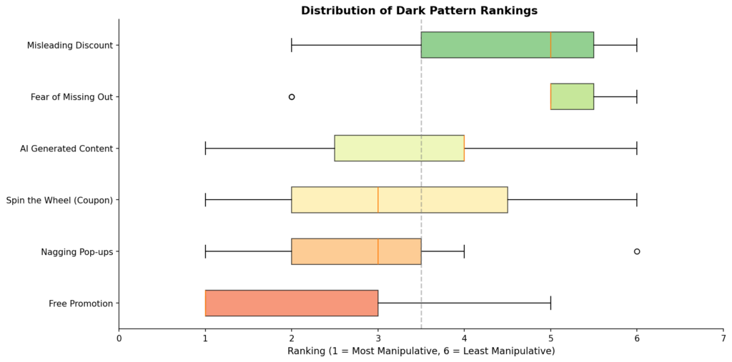
Participants in the Dark condition ranked the patterns they encountered during the shopping task based on how manipulative they felt each one was. Free Promotion was seen as the most manipulative, with 75% of participants ranking it first. Nagging Pop-ups and Spin the Wheel were also ranked relatively high, while Misleading Discounts and Fear of Missing Out were seen as less manipulative. These rankings reflect participants’ own perceptions, which were also compared with their actual behavior using interaction logs and eye-tracking data. The relationship between these rankings and behavioral metrics is shown in Appendix A.1.
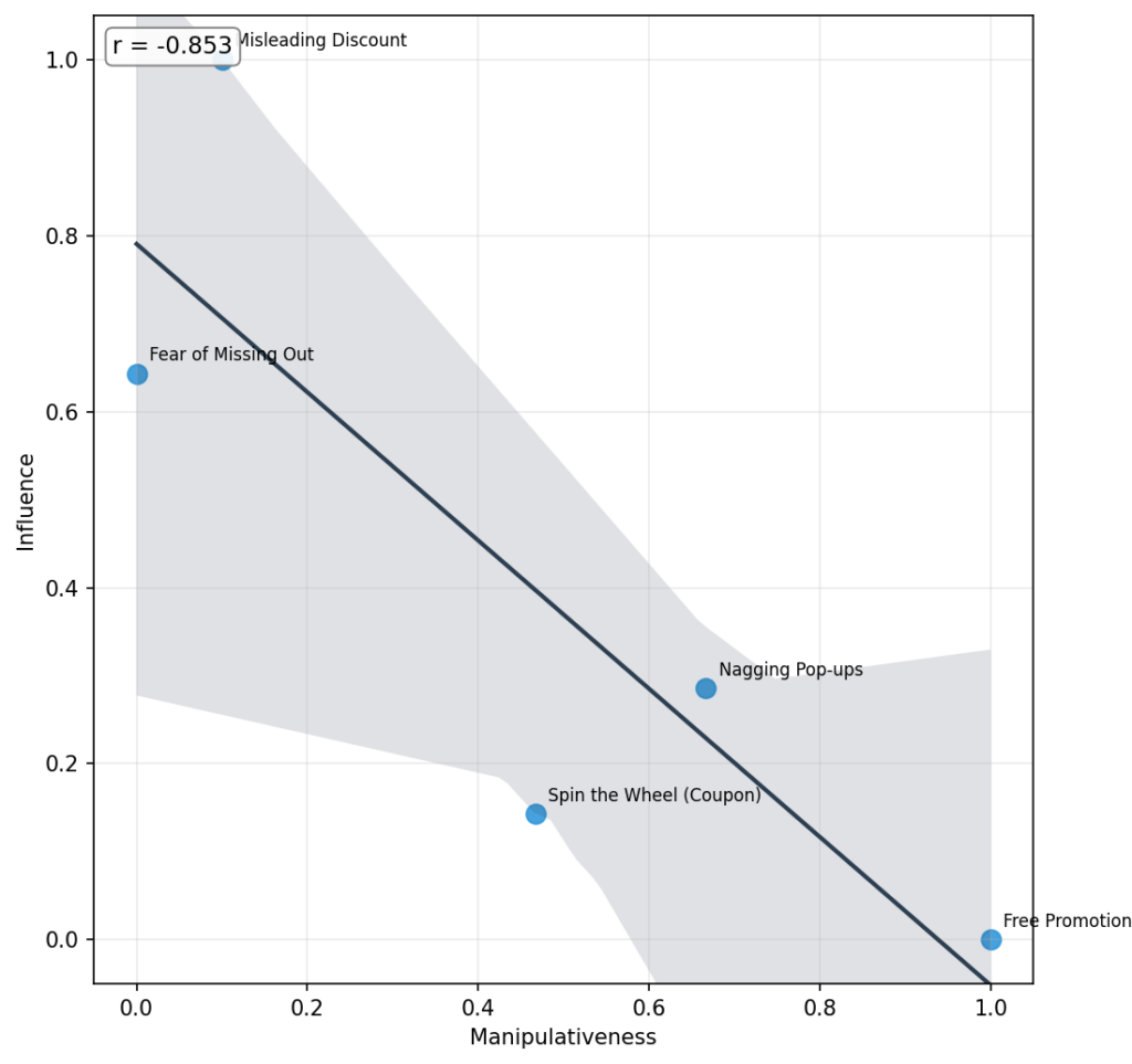
Interestingly, the plot reveals a strong negative correlation (r = −0.853), indicating that the patterns perceived as most manipulative were rated as least influential, while those considered less manipulative were seen as more influential. For example, Free Promotion appears at the extreme end of manipulativeness but is rated lowest in influence, whereas Misleading Discount and Fear of Missing Out are viewed as relatively influential despite being judged less manipulative. This suggests a possible psychological distancing effect: when participants clearly recognize a tactic as manipulative, they may report being unaffected by it. In contrast, subtler patterns that feel more legitimate or less deceptive may exert greater influence on decision-making, even if users do not explicitly label them as manipulative.
5. Conclusion
In this section, we first triangulate findings from the surveys, logs, and behavioral observations (including eye-tracking and think-aloud data) to answer the research questions introduced at the beginning. We then discuss the study’s limitations and suggest directions for future work.
5.1. Most Annoying Dark Pattern
Out of the five dark patterns we studied, three were pop-ups (Free Promotion, Nagging Pop-ups, and Spin the Wheel). Looking at our log data, we found that nearly half of participants didn’t even interact with these pop-ups, they just closed them right away. For the other two patterns, FOMO and Misleading Discount, some participants did mention them during think-aloud sessions, and we saw strong eye fixations in a few cases, but overall we couldn’t reach a clear conclusion about awareness levels for these two.
In the ranking survey (Survey 3.2), participants rated Free Promotion and Nagging Pop-ups as the most annoying patterns from their experience. But interestingly, this seems to be more about these patterns feeling useless than feeling manipulative. As shown in Figure 11, there’s a strong negative correlation (r = −0.853) between how manipulative participants found a pattern and how influential they thought it was on their purchasing. In other words, the patterns people found most annoying were also the ones they felt had the least effect on what they actually bought.
The log data backs this up from a different angle. As the heatmap in Figure A.1 (appendix) shows, the time participants spent on the platform has a strong negative correlation with how annoying they found the Nagging Pop-ups (r = −0.86, p < 0.01). Thus, basically, the longer people shopped, the more fed up they got with the pop-ups. One thing we found interesting is that even annoyed participants weren’t completely immune; one participant who instantly closed two pop-ups still ended up interacting with the third one.
Lastly, while our study didn’t specifically look at AI-generated images and videos on Temu, one participant did bring up AI-generated content, and we added that in ranking the patterns. Additionally, as shown in Figure A.3, there is a strong correlation between how much participants felt the platform presented fake information and how annoying they found the AI-generated content. This suggests that AI-generated images and videos on the platform may have been a key driver behind participants’ sense that the information was deceptive.
5.2. Dark Pattern Influence on Purchase
In Figure 10, participants identified “Misleading Discounts” and “Fear of Missing Out” as the most influential patterns on their purchasing decisions. Interestingly, these were also the patterns they rated as least manipulative, implying the idea that the patterns participants don’t find annoying might actually be the ones that affect them the most.
The behavioral observations support this finding, especially for Misleading Discounts. During the think-aloud sessions, discounts were the most frequently mentioned topic. One participant, for example, noted how a product had dropped from 220 euros to 81 euros and called it “perfect”, showing how the large gap between the RRP and the current price made the deal feel genuine. The eye-tracking data tells a similar story as we observed meaningful fixations on products where the difference between the RRP and the sale price was particularly noticeable, suggesting that these discounts were actively grabbing participants’ attention (Figure 5).
For Fear of Missing Out, the picture is a bit less clear. Since our study used a simulated shopping task rather than real purchasing, participants may not have felt the same urgency that FOMO typically creates. Still, the heatmap in Figure A.1 shows that participants who spent more time on the platform tended to rate FOMO as more influential (r = 0.82, p < 0.01). This suggests that the longer participants were exposed to the platform, the more they felt the pressure of scarcity and urgency cues even in a non-real buying context.
5.3. Limitations and Future Works
8:42 PM
Our findings show an interesting split: pop-up-based patterns like Free Promotion and Nagging Pop-ups were the most annoying, but subtler ones like Misleading Discounts and Fear of Missing Out were felt to actually influence buying decisions. This raises the question of whether the quieter, less obvious patterns deserve more attention going forward. That said, our study has several limitations. The small sample size (N = 20) limits generalizability, and the simulated shopping task with no real money may have reduced the sense of urgency, especially for FOMO. The between-subject design also means we cannot compare how the same person would react to both versions, and we only tested the French desktop version, so results may not apply to other platforms or regions.
For future work, a within-subject design or longer studies tracking responses over multiple sessions could provide deeper insights. Comparing self-reported perceptions with actual purchase data would help clarify the gap between what users say influences them and what actually does. Additionally, the link one participant raised between AI-generated content and perceived deception suggests that studying AI’s role in user trust is a promising direction.
References
[1] Zhitong Caijing, “According to Sensor Tower data, from January to October 2025, Temu once again topped …” Webull News, Nov. 4, 2025. [Online]. Available: www.webull.com/news/13796501181162496 Accessed: Feb. 22, 2026.
[2] H. Brignull, “Deceptive Patterns (formerly Dark Patterns),” Deceptive Design, 2010–present. [Online]. Available: www.deceptive.design Accessed: Feb. 22, 2026.
[3] A. Jain, Analysis of Dark Patterns in UI/UX Elements of Digital Platforms (Master’s thesis), Integrated Design and Management Program, Massachusetts Institute of Technology (MIT), Feb. 23, 2024.
[4] S. Liu and E. Gómez-Cruz, “‘Temu is evil, but I still use it’: Platform cynicism in platform capitalism,” New Media & Society, 2025. doi: 10.1177/14614448251365269.
[5] K. Bergman, Dark Patterns: Malicious Interface Design From a Users’ Perspective (Master’s thesis), Human-Computer Interaction, Utrecht University, Feb. 7, 2022.
[6] https://ir.similarweb.com/news-events/press-releases/detail/89/similarwebs-apps-100-finds-temu-hims-and-lisa-ai-tops-in-their-categories
[7] C. Nodder, Evil by Design: Interaction Design to Lead Us into Temptation. Wiley, 2013.
[8] L. Di Geronimo, L. Braz, E. Fregnan, F. Palomba, and A. Bacchelli, “UI Dark Patterns and Where to Find Them: A Study on Mobile Applications and User Perception,” in Proc. ACM CHI Conference on Human Factors in Computing Systems, Honolulu, HI, USA, Apr. 2020. doi: 10.1145/3313831.3376600
Appendix