Written by : KEBIR Mohammed Amine, JABAL Moncef, Phuc lai Le, WAXWEILER Julien
Abstract:
The Izly App UX Enhancement project aimed to improve the usability and overall user experience of the app, which serves over 3 million students for Crous services. Through user journey mapping, data analysis, and prototype testing, the study identified key pain points, such as complex onboarding, inefficient balance recharging, and difficulties in navigating support features. Using Figma and QuantUX, a redesigned version was developed and tested through user interaction and visual analytics metrics. Results showed a high success rate (97%), improved engagement, and better task completion times, though areas like issue reporting and restaurant search still needed refinement. The study concludes with actionable insights for further optimization, ensuring a smoother and more intuitive experience for Izly users.
Introduction:
With over 3 million registered users, the Izly app plays a crucial role in facilitating affordable meals for students through the Crous service. However, despite its popularity, users have encountered several pain points in its UX, leading to dissatisfaction and inefficiencies. This study explores how we analyzed, tested, and enhanced the Izly user experience by providing a redesigned version of the app, making it more intuitive and user-friendly.
One of the key steps in our approach was analyzing Google Play Store reviews, as they provided freely available insights from thousands of users. To establish a baseline for comparison, we first examined:
- The distribution of ratings to understand overall user satisfaction
- The sentiment behind each comment, using a large language model from Python’s TextBlob module
While it was clear that users expressed dissatisfaction, we needed more specific insights beyond general negative sentiment. To achieve this, we categorized comments based on their content, distinguishing technical issues from UX-related concerns.
Our analysis highlighted several recurring UX issues, leading to actionable improvement suggestions:
- Detailed Meal Information – Many users requested an option to view allergen information to help them make informed meal choices.
- Simplified Payment History – Users found the existing transaction history unclear and wanted a more straightforward layout.
- News & Notifications Section – A dedicated space for updates on holiday closures and exceptional events would improve communication.
In the next phase of our project, we focused on implementing and testing these enhancements to measure their impact on user satisfaction. By refining the Izly app’s UX based on real user feedback, we aimed to create a more intuitive and student-friendly experience.
Methodology:
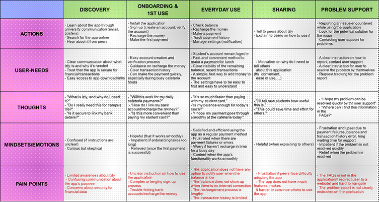
- User Journey Map:
We created a user journey map to help us identify potential issues that users might encounter while using the Izly app. This mapping exercise allowed us to gain a deeper understanding of user behavior at different stages, from discovering the app and onboarding to daily usage and seeking support when problems arise. By analyzing the user journey map, we were able to pinpoint specific pain points that could negatively impact the user experience.
The insights gathered from the user journey map played a crucial role in shaping the next steps of our research. They helped us:
- Formulate relevant questions for the survey forms, ensuring we captured meaningful feedback from users.
- Identify key areas for improvement, guiding the development of new features in the redesigned version of the app.
- Validate and refine our proposed solutions, ensuring they directly addressed the challenges users faced.
2. Methodology Overview:
To improve Izly’s UX, we conducted a data-driven analysis through multiple methods:
- User Surveys: Gathered insights via Google Forms.
- Data Scraping & Analysis: Extracted reviews from Google Play Store using Python to identify recurring issues.
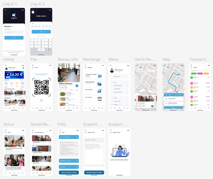
- Prototyping: Used Figma and QuantUX to create and test an enhanced app version.
- Moderated User Testing: Observed how users interacted with the improved prototype.
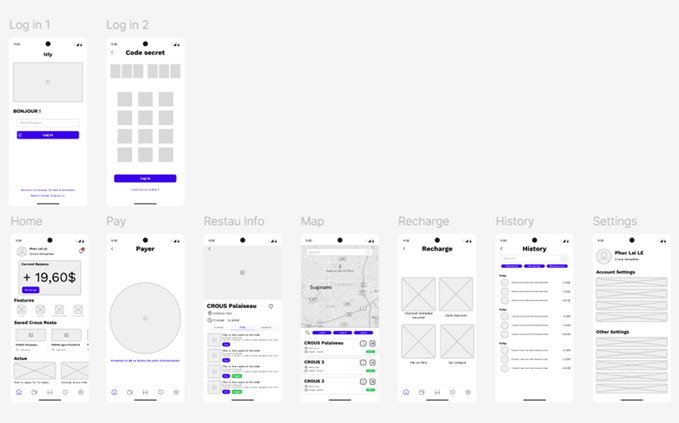
3. Figma:
We use Figma to create the improved version of the app, following a two-step process. First, we develop a wireframe to establish the app’s structure and layout before moving on to the actual redesign, ensuring a clear foundation for user flow and functionality. Once the wireframe is finalized, we proceed with the full redesign, incorporating complete UI elements to enhance usability and visual appeal.
4. QuantUX:
After completing the redesigned version of the Izly app in Figma, we imported it into the QuantUX platform to conduct user testing and collect valuable insights on usability and performance. This testing phase was crucial in evaluating how well the enhanced design addressed user pain points and improved the overall experience.
QuantUX offers a wide range of metrics to analyze user behavior, but we primarily focused on two key categories to assess the effectiveness of our redesign:
- User Interaction Metrics: These metrics help measure how users navigate and interact with the app, providing insights into usability and potential friction points.
- Test Coverage – The percentage of screens users accessed during testing, indicating how well the interface facilitates exploration.
- Duration – The average time users spent testing the prototype, helping us gauge engagement and task complexity.
- Task KPIs – Key indicators of user success in completing interactions:
- Start Rate – The percentage of users who began a given task.
- Success Rate – The percentage of users who successfully completed a task.
- Task Duration – The time taken to complete each task, highlighting potential usability bottlenecks.
- Task Interactions – The number of clicks needed to complete a task, helping identify unnecessary steps or inefficient navigation.
- Visual Analytics Metrics: These metrics focus on how users visually engage with the interface, revealing patterns in navigation and interaction.
- Click Heatmaps – Identify frequently clicked areas, showing which elements attract the most user attention and interaction.
- Screen Views – Track how many times each screen is viewed, helping us determine which features or pages are the most visited and which may need better visibility.
Results & Analysis:
1 . First Form Reults:
We created a Google Form to gather opinions on Izly’s design and compare the level of satisfaction to our redesigned version made in Figma. The survey gathered responses from 61 participants regarding their experiences with the Izly app. The main areas of analysis include:
- Usage Frequency: How often users engage with the app.
- Recharge Frustration: How difficult users find recharging their balance.
- Technical Issues: Frequency of encountering bugs.
- UI Experience: User perception of the app’s interface.
- Payment Convenience: Comparisons with other payment methods.
- Recommendation Likelihood: Net Promoter Score (NPS) insights.
The key findings are as follows:
Usage Frequency:
- Daily users: 46% (28/61)
- Weekly users: 30% (18/61)
- Monthly users or less: 24% (15/61)
Most users interact with Izly regularly, emphasizing the app’s importance in student life.
Recharge Frustration:
- 35% find it very or extremely frustrating.
- 28% find it moderately frustrating.
- Only 15% reported no frustration.
Recharge remains a major pain point, warranting usability improvements.
Technical Issues:
- 33% encounter issues often or always.
- 23% rarely experience problems.
- Only 13% reported never facing issues.
Frequent technical bugs negatively impact user experience and need to be addressed.
Interface Experience:
- 47% agree or strongly agree that the UI is outdated and hard to navigate.
- 31% are neutral, while only 20% disagree.
This suggests a strong need for a more modern and user-friendly redesign.
Payment Convenience:
- 51% find Izly moderately to extremely inconvenient compared to other payment methods.
- Only 15% report no inconvenience.
This highlights the need for a smoother transaction experience.
Recommendation Likelihood (NPS):
- 36% are neutral.
- 33% are unlikely or extremely unlikely to recommend it.
- Only 22% are likely or extremely likely to recommend Izly.
A low Net Promoter Score (NPS) signals overall dissatisfaction and limited enthusiasm for the app.
2 . Prototype Testing:
For the prototype testing, we asked participants to complete 7 tasks including:
- Log in
- Find news section
- Try to recharge
- Try the find restaurant feature
- View restaurant’s menu
- Get direction to a restaurant
- View transaction history
- Try to report a problem
a – Overall results:

- Test Coverage: 86%
- Most screens were accessed, but 14% remained unexplored, likely due to navigation issues or unclear pathways. Improving UI visibility and menu organization could enhance accessibility.
- Duration: average 203s
- If each task is straightforward users should be able to complete them quickly (within a few seconds per task). The provided task are
- Indicate usability issues for further analysis
- Success Rate: 97%
- Almost all users successfully completed the assigned tasks.
- Users eventually figure things out but may have encountered friction along the way
b – Data distributions:
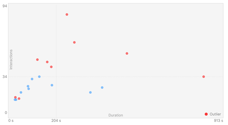
- Most Users Cluster Around 204s & 34 Interactions.
- Outliers (Red Dots): Some users took significantly longer or required a very high number of interactions. This indicates usability issues for some users such as: Confusing navigation (users struggled to find what they needed), Repeated interactions (clicking multiple times due to unclear UI), Task complexity (some users might have misunderstood the steps). We proceed to analyse the outliers to further identify possible problems of our prototype
- Users with High Interaction Counts but Moderate Duration
- Some outliers show high clicks but normal duration (~204s):
- This means they were actively engaging but possibly clicked more than expected.
- Could indicate unclear UI affordance (users unsure which elements were interactive).
- Users with Long Duration but Few Clicks
- There’s an outlier with long duration (~913s) but fewer interactions (~34 clicks):
- This suggests that the user was inactive for a while (idle time).
- Potential causes: Difficulties understanding instructions.
- Based on this data, we have some actionable Insights:
- Improve UI Clarity:
- If users are clicking too much, ensure buttons and CTAs are clearly labeled.
- Reduce unnecessary clicks by simplifying navigation.
- Detect Usability Bottlenecks:
- If some users take too long, identify which screens caused delays.
- Optimize task instructions to make steps clearer.
- Improve UI Clarity:
c – Task KPI:
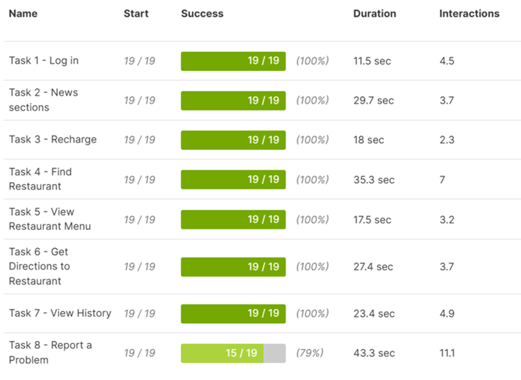
- Task Success Rate
- High Success Rate for Most Tasks (100%)
- 7 out of 8 tasks have a 100% success rate, meaning all users completed them without failing.
- This suggests that most of the prototype is well-structured, intuitive, and functional.
- Task 8 (“Report a Problem”) Has a Lower Success Rate (79%)
- 4 out of 19 users failed this task, meaning they either couldn’t complete it or abandoned it.
- Potential issue: Users may not be able to find the option, understand the process, or complete the required steps.
- Possible Action: Investigate why users struggled (review heatmaps, session recordings, click paths).
- High Success Rate for Most Tasks (100%)
- Task Duration
- Most tasks are completed within 10-35 seconds, which is reasonable for the expected complexity.
- Longest duration task: Task 8 – Report a Problem (43.3s)
- This confirms that users struggled with this task.
- If it should be a simple report submission, 43.3s is too long.
- Possible reasons: Confusing UI, unclear placement, or multiple steps required.
- Analysis of the user journey revealed that the “Submit Ticket” feature is not clearly visible:
- Users must navigate through the FAQ section first before reaching the reporting option.
- This adds unnecessary friction, making issue reporting more time-consuming.
- A dedicated “Report an Issue” section with direct access could improve usability.
- Task Interactions:
- Most tasks require between 2-7 interactions, which is reasonable.
- Task 8 – Report a Problem takes 11.1 interactions, which is high.
- Suggests the process is too complex (too many clicks, unclear steps).
- Action: Optimize the workflow to reduce unnecessary steps.
- Insights from task KPI results:
- Strong overall usability – Most tasks are completed successfully with efficient interaction.
- Issues with “Report a Problem” task – Lower success rate (79%) and longest duration (43.3s, 11.1 clicks).
- Potential improvement areas – “Find Restaurant” & “Get Directions” may need usability testing to reduce friction.
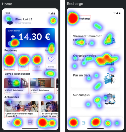
d – Visual Analytics Metrics – Heatmap :
- Home screen
- Button of newly implemented features has high clicks. This indicates that users are engaging as expected, and understand where to interact. The app is well designed and presented for these features
- Strong clicks on the navigation bar at the bottom, meaning users rely on these shortcuts. This suggests that users find the bottom navigation intuitive and effective.
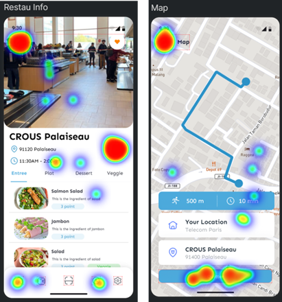
- Restaurant Information
- This screen show clicks on empty areas or images
- This could mean users expect these areas to be interactive, but they are not.
- Potential UI improvement: Make these sections tappable or guide users better.
- Maps/Find Restaurant
- The same problem as the Restaurant Information screen applies for Map. “Your location” has lots of clicks. This indicates that user might think click on this could change the start location
e – Visual Analytics Metrics – screen views:
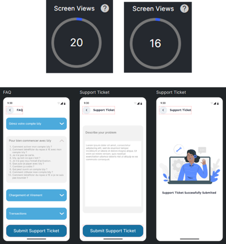
- Support Ticket Screen
- The support ticket screens have low view (20 & 16)
- Users might struggle to reach it
- Indicate navigation problems or lack of clear CTAs (Call-to-Actions)
- Further investigation of recorded test show that the feature is not clearly stated and is complicated to reach (hidden in FAQ)
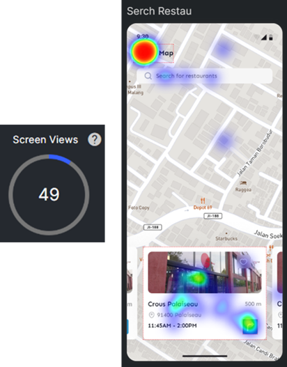
- Find Restaurant Screen
- This is a support feature screen but has a higher view than others (normally around 25). This indicates that users may be facing issues that require frequent reference
- Further analysis with heatmap:
- After reaching this screen, the next task is to view the Restaurant’s menu.
- Users can tap directly on the image, but the heatmap shows that users click the back button more often instead.
- This suggests that the UI and CTA are unclear, and users may need to return to this screen multiple times
f – Moderated User Testing Report:
The objective of this moderated user testing session was to observe how users interact with the improved prototype of the Izly app, focusing on usability and intuitiveness. The testing involved guiding users through a series of tasks and asking simple and quick questions to gather their feedback. A total of 19 participants took part in this session.
- Login:
- Feedback: Very easy to find & very intuitive process
- Insight: Users were able to locate and use the login feature effortlessly, indicating a well-designed entry point.
- News Section:
- Feedback: Easy to find & well placed
- Insight: The placement and accessibility of the news section were well-received, suggesting effective UI design.
- Recharge:
- Feedback: Very easy to find & very straightforward
- Insight: The recharge feature was clear and efficient, enhancing the user’s ability to manage their balance without confusion.
- Find Restaurant:
- Feedback: Very easy to find & well integrated
- Insight: The integration of the “Find Restaurant” feature into the app’s navigation was seamless and user-friendly.
- Restaurant Menu:
- Feedback: Easy to find, very clear & readable presentation
- Insight: Users appreciated the clarity and accessibility of the restaurant menu, facilitating a smooth browsing experience.
- Get Directions to Restaurant:
- Feedback: Very easy to find & somewhat helpful
- Insight: While the feature was easy to access, some users indicated that additional details or map options could improve usefulness.
- Check Transaction History:
- Feedback: Easy to find & very clearly displayed
- Insight: The transaction history was well-organized, allowing users to review past transactions without difficulty.
- Report a Problem:
- Feedback: Moderate to find & somewhat user-friendly
- Insight: Users experienced slight difficulty locating the “Report a Problem” feature, suggesting an opportunity to enhance its visibility and user flow.
Overall, the testing revealed that most features of the Izly app were perceived as easy to find and use, reflecting effective improvements in usability and design. The key area for enhancement identified was the “Report a Problem” feature, which could benefit from better visibility and a more streamlined user experience.
Future iterations should focus on:
- Improving the accessibility of the “Report a Problem” feature.
- Enhancing the “Get Directions” feature with more detailed navigation options.
- Continuing to refine the user interface to maintain the app’s intuitive and user-friendly nature.
Conclusion :
Through user-centered design and data-driven insights, we successfully improved the Izly app experience. Users appreciated the new features, simplified interactions, and intuitive navigation. However, there is still room for further refinement, especially in:
- Optimizing issue-reporting workflows for a smoother experience.
- Refining navigation to improve efficiency.
- Analyzing additional UX metrics for deeper insights.
With that in mind, we plan to:
- Enhance UI clarity with better-designed CTAs.
- Reduce complexity in reporting issues.
- Expand usability testing with a larger audience for further refinements.