A work by Lyla Demange, Rémy Fayet, Théo Garnier, Enzo Gelas and Damien Poquillon
Abstract
With the increasing importance AI is taking in our society, law instances had to adapt many texts and add new laws to try to frame its utilisation. In that context, the European Commission has recently deposited the EU AI Act. Only published in march 2024, a part of its rules already apply now. At Télécom Paris, where many students will work around AI, it is mandatory to bring new ways for them to learn more about this act and the reglementation they will face. In order to help them and make anyone more familiar with these new laws, Phd Thomas LeGoff created the AI Act Game, which presents various cases of AI utilisation that are targeted by the Act. He asked for our help to find the pros and cons of his application, and to find new ways to improve the user experience while playing the game. In this review, we condensed the results we got from various tests and ideas to improve this application, in order to motivate people to interest themselves in this important topic thanks to a better user experience.
Case-study description
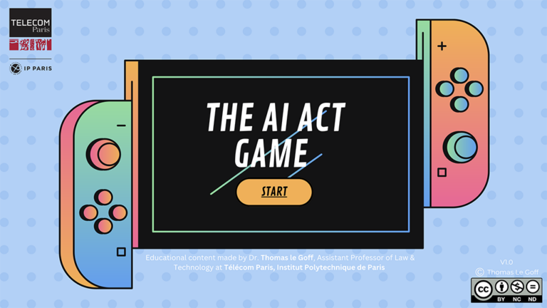
The AI Act Game is a pedagogical tool developed by Pr. Thomas LeGoff, professor at Telecom Paris. This tool is presented as a game, in which the user can learn about the recent (as for early 2025) AI Act, an European law which aims to regulate various uses of AI.
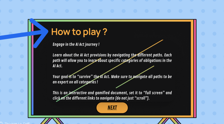
The game is hosted on Canva (link here), and is a bit like a choose-your-own-adventure book. The user is presented with screens containing both informative texts and interactive buttons that lead to other screens, etc…
In our study we wanted to identify the pain points, check the users journey and try to find key improvements that would ease the learning process. We identified three main points of interest :
- Learning : Do the users learn something from the game ?
- Gaming : Do they have fun playing the game ?
- Satisfaction : Do they like the game, recommend it to friends ?
When we first played the game we observed many pain points and suggestions of enhancement, but we tried as much as possible to mitigate our experience so it didn’t transpose to the data gathering methods.
We broke down the user journey under the following structure :


Data & Methods
In order to understand how the users are interacting with the game – if they understand it and learn from it – we needed to get heat maps of the slides, and click data. That’s why we exported the original game on QuantUX, using Figma, and made our participants play on that version instead of the original one.
We also directly got normalized post-game appreciations from the players by adding a short questionnaire at the end of the game.


For more detailed reviews, we created a form for players to explain their experience of the game. But as it was redundant with the short questionnaire, we did not give it to all participants (in fact, only a student and a lawyer answered to it)
We also got more detailed insight of the players’ experience by writing down their oral commentaries as our supervised/uncontrolled testers were playing.
Our participants :
Supervised and unsupervised testing (participants using our QuantUX version of the game)

We sent out our version of the game to Thomas LeGoff, who gave it to its colleagues and students. None of the unsupervised testers finished the game, so they did not answer the end questionnaire ! Subsequently, we can’t be sure about their identities and the numbers shown in the diagram are extrapolated.
For the supervised tests, the participants were treated separately : after a brief explanation of the game (it corresponds to the first paragraph of our Case-study Description section), we let them play by themselves, watching closely their actions and writing down their oral thinking. Must they have a question while playing (“What do I do here ?”), we only pushed them to “do as if you were playing without us watching”.
Note : all of our supervised testers went to the end of the game, on the opposite of the unsupervised testers : we can consider they felt somewhat compelled to finish it because of our presence.
Uncontrolled testing (participants using the Canva version of the game)
Our QuantUX version reproduced the game, but not exactly the experience of playing the game on the Canva medium. To at least get insights about that particular aspect of the game experience, we were present in the class session where Thomas LeGoff presented his game to his students. We wrote down their oral commentaries like we did with the supervised tests.
Results
Identification of the dropping rate
The heatmap data on QuantUX allowed us to identify in which parts of the game users spend time and where they dropped. Here, we highlighted the time spent on average by the users on the left figure. We see that people spend much more time on the introduction, where they are more likely to take the game seriously and to read every slide, while much less time is accorded to the definition slides. On the right, we ignored the introduction and the conclusion part. There, we can see that almost 70% of the time is focused on the use cases.


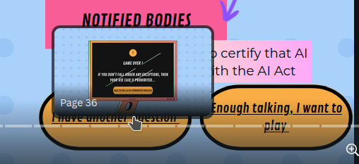
People actually quitted the game the more after the first few definitions (with a dropping rate of 15%). Only a third of our subject went to check every definition, while the other fast played to the next scene.
We also identified one problematic slide, that had many options to choose from, which felt overwhelming for the supervised testers. Moreover, only one answer was correct, and any other went back to the same slide after a “failure” slide.

We mustn’t forget that supervised testers also have some pressure due to us, and are more likely to go through the game entirely to try to please us. In our opinion, the number of clicks very high on the left slide definitely shows confusion among users.
First issue : gamification
Overall, the participants did not like the game and found it even less fun.

The citations indicate how the “game” label had deceived (and disappointed) them as the game lacks interactivity.
“It looks like an interface with choices but we don’t have any.“
“They must absolutely dilute the text in a game, in interesting interactivity, with at least a QCM to keep the attention. Now, I’m under the impression to read a biiiiiiig newspaper article cut in small parts, not to play a game.“

→ When a participant has been invited to not rate the game as a game but as a “learning support”, their liking rose to 8/10
Second issue : the navigation
Even for a specialist in the domain, the way of moving forward wasn’t always clear and it was not obvious which answer allowed to move forward in the game, and which answer would be a dead-end.

“I just got softblock”
“You can’t move it‘s horrible“
“I visited all the pages because I didn’t figure out how to exit and I told my self that ticking everything will let me escape.“
In other cases, the organization of the slide itself would be confusing for the participants, who don’t know in which order to read the text-blocks.

“I don’t where to look at when I come at this screen”
“At a moment, there is a diagram outside of the phone where most of the text was shown until then. The diagram is hardly readable, he doesn’t look like a coherent graphic element and I don’t understand intuitively in what way/order I’m supposed to read it.“
Another recurrent problem would be the design of clickable elements. In the slide below, only the latest title on a phone can be clicked, but the sole indication of it is a underlined text ! Such a design choice is not immediatly perceived by the players, and it misleads them into thinking they previously clickable titles are still working. Thus, we can see in the heat map slide below the misclicks of lost players.

“We can get quickly get tired of the system on the phone and give up after a few slide out of despair”
Third issue : the Canva navigation
As our study was not on the Canva version, we can only have testimonies of players (and ours) regarding this issue, but as it was also noted in our colleagues work, Study and Redesign of the AI Act Game, this is still a major issue.
While trying to click on buttons on the below-right of the slides, the slide selector embedded in Canva can often pop up and overrule the buttons, leading to the frustration of the player, and sometimes accidental “teleportations” at the end of the game.
“We need to tell him to put the buttons higher”
The qualities of the app
Although the users ranked the tool poorly on the fun scale, we identified other elements that made the experience relevant for them.
As per our interviews :
- The slides are well detailed and many topics are treated
- People, especially the students, usually learned a bit about the AI Act, while they were often new to this regulation
- In some cases, the user wants to learn more about the topic as the study case interested them deeply
- The game is quite aesthetic
“The text is legally correct and really thorough !”
Insights and Recommendations
Based on the gathered insights, we recommend the following tweaks, sorted from the slightest to the most complex. We recommend to implement the simple recommendation first, as it is independent from the support itself, and then only tweak the support. In order to make the most out of this game, we also recommend to switch from canva to a more appropriate support for a game, as suggested in Study and Redesign of the AI Act Game.
Here are our insights :
- Present the game only as an educational support. Presenting the tool as a game leads to disappointment and augments the risk of the user dropping early. Instead, presenting it as a support to understand the European AI Act should refine the expectations of the user, reducing their disappointment and spreading the game’s educational use.
- Improve navigation. Adding buttons to move more freely among the slides could help users to get back to study case or to the end of the game
- Color code essential information. Differentiating the colors between the titles and the buttons could help users to be less confused.
- Improve the readability and reduce the visual overload. The slide about the 8 study cases deserves to be clearer, as the user doesn’t know that only one choice is correct. Showing less text to the slides seems necessary. We could consider a button ‘see more’ to get more information on a particular study case that is interesting to the user, but stop having mandatory slides with a lot of text.
