Authors: Hugo Aoyagi – Antoine Le Maguet, Damien Robault – Petro Shulzhenko
Abstract
This study examines the ease with which users can generate and retrieve passwords using BitWarden. BitWarden is an open source password manager that is often used by people who value their personal data.
So, we developed a modified interface using Quant UX, altering the position of certain elements like the label and the overall page layout. For example, we decided to delete some options of the original apps that we judged to be complicated. Our objective was to test another version of the apps to develop our understanding of the user experiences.
Participants were asked to generate a password for a specific website and then retrieve it. So, we did the same test on the two versions of BitWarden (original and modified). Prior to the test, they answered questions regarding their familiarity with password management tools, their current usage habits, and their overall technological proficiency. Additionally, we want to know the importance given to the data privacy of participants. Finally, users were questioned after the first test and again after the second test to gather comparative feedback. The order of the tests was randomized, meaning participants could encounter the modified version either first or second with equal probability.
Case-Study Description
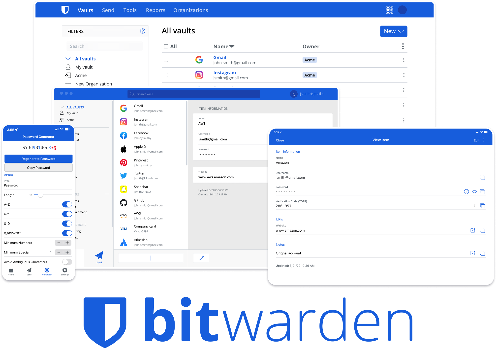
BitWarden is a password management system designed to securely store and autofill login credentials. Its primary audience includes individuals and organizations seeking a secure and convenient way to manage passwords. BitWarden’s main appeal lies in its open-source nature, end-to-end encryption, and cross-platform accessibility. However, our study identified several key usability weaknesses, including confusing menus, small action buttons, ambiguous labels, and poor prioritization of elements. Additionally, user reviews on Google highlight frustrations with the app’s UX.
Figure 1: Comments taken from Google Play Store on BitWarden
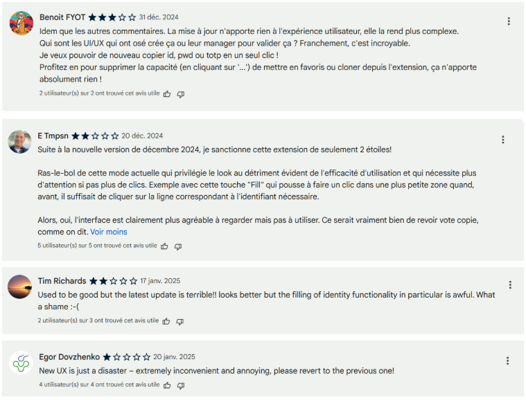
The different commentaries highlight that people don’t like the new version of the apps. In fact, they judge that the developers were more concentrated on the look of the app and the option proposed by the password manager than the user experiences. It makes some users find the version of the app complicated and Bitwarden can hurt the users with the different options integrated to the app. Our goal was to develop a modified interface that addressed these issues and to compare both versions based on user experience.
Data Collection
We collected data from direct user interactions with both the original and modified BitWarden interfaces by using QuantUX. The data included:
- Pre-test questionnaires
- Task completion times
- Success and error rates
- User-reported difficulty levels
- Activity heat maps
- Post test interviews
Figure 2: Starting Questionnaire
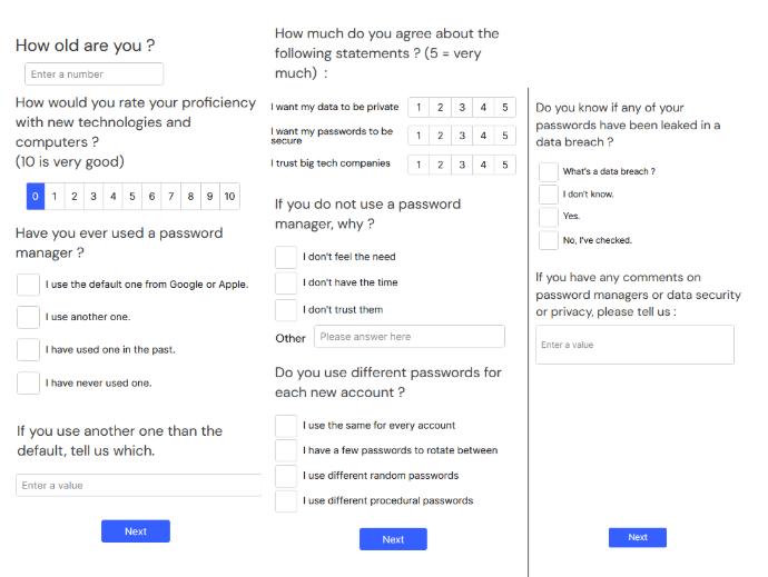
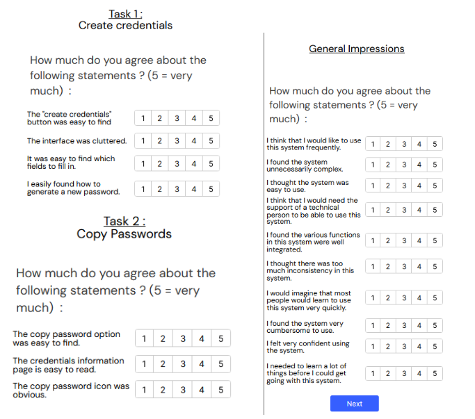
Figure 3: Post Task Questionnaires and System Usability Scale
All collected data were anonymized to ensure privacy.
This test will be useful for us to understand why people use a password manager and the compatibility of the different users with the technology. So, we decided to ask some questions to collect information about the participant and his skills with the technology. After we enter more precisely in our case study and the data privacy, we want to know the user’s proficiency with a password manager and understand why they use one or not. Next, they pass the two tests and they fill a system usability scale. It is important to know the advantages and problems of a version.
Our method
Figure 4: An overview of our testing pipeline.
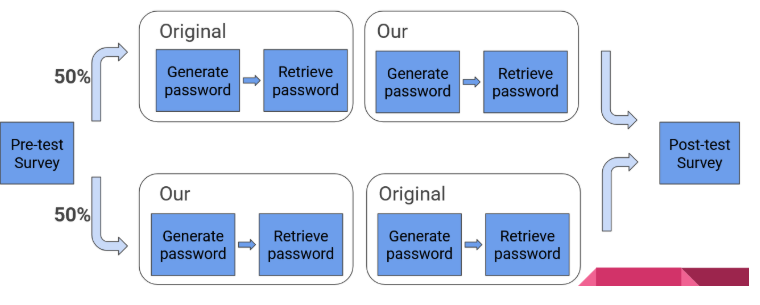
Participants were randomly assigned to interact with either the original or the modified BitWarden interface first, ensuring equal probability of encountering each version. They were tasked with generating a password for a specific website and then retrieving it later. We recorded completion times, success rates, and user-reported difficulty levels. Users were also questioned after each test to gather comparative insights. Post-test interviews provided further qualitative feedback on their experiences and challenges.
To make this test we use the quant UX website where we create two versions of the apps. The different pages of the version were connected together and after we submit the task to the participant they must achieve it. The two tests on the versions of the apps give us time data because we can know how many times it takes someone to achieve the two tasks : copy password and generate password. Moreover, the quant UX shows us where the user clicks. After, we just use a csv file to analyze time spent on a version and understand the difficulty for the users.
Figure 5: A few of the UI changes for the credentials creation page.
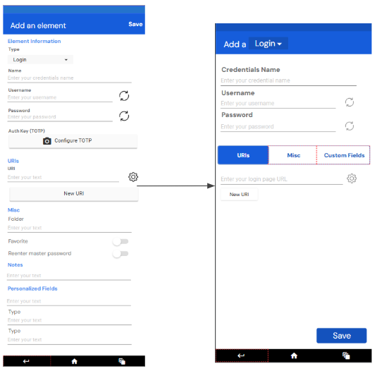
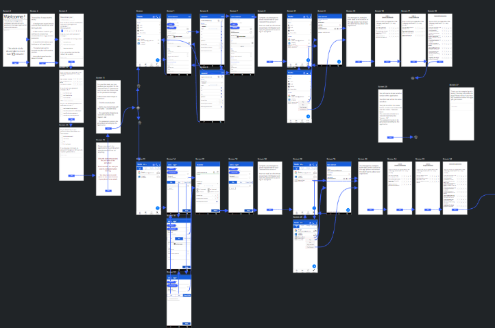
Figure 6: Our testing pipeline on quant-ux.com
Results
Our key findings include:
- The modified interface led to a 32% improvement in task completion time (Original: 67 seconds, Modified: 45 seconds).
- A reduction in the number of interactions needed to create a password (Original: 17, Modified: 14).
- A 20% increase in average user satisfaction.
- A 10% improvement in the ease of creating credentials, but a 6% decrease in ease of password retrieval.
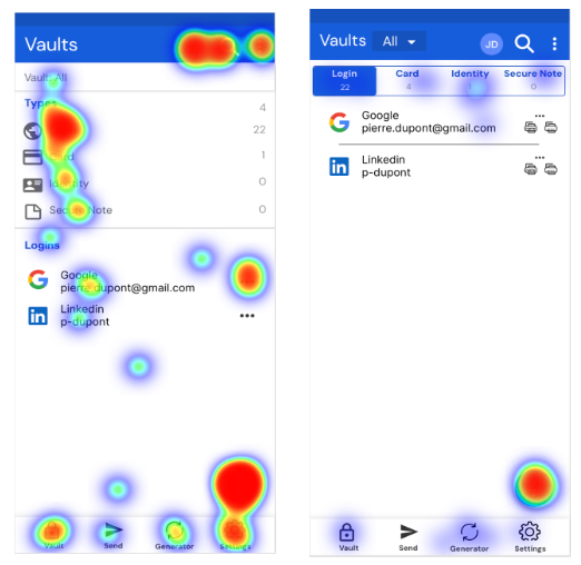
- Heat maps suggest that the modified UI provides a probable UX improvement by reducing clutter and increasing readability for the creating a new password interface but it showed similar performances with the retrieving a password interface.
Figure 7: Heatmaps of user interactions on password finding task for both versions : orignal (left), ours (right)
Our ending survey also gathered a few comments from user that would be useful to create a new better version of the application and the testing process :
- “I think it’s better to change logo for “generate password”, now it’s more “reload”.”
- “The tasks were difficult to get.”
- “I liked the first design better. It’s clearer and faster to use. For a password manager, I think speed is important. Maybe I preferred it because its interface is similar to NordPass, which I use.”
Insights and Recommendations
Based on our results, we recommend the following improvements to enhance user experience:
- Maintain consistency in interface layout to minimize learning curves for returning users.
- Reduce screen clutter by prioritizing essential features and improving scale prioritization.
- Increase action button size to enhance accessibility.
By refining these aspects, BitWarden can enhance usability and accessibility, ensuring a smoother experience for both novice and experienced users.
Limitations
The results and recommendations presented in this report have some limitations related to the design of the experiments and the possibilities available for the study. First, the sample size was relatively small, with only 30 participants, which limits the generalizability of our findings and presented statistics. The small sample size increases the impact of outliers and contributes to high variance, again limiting the robustness of the interpretations. Secondly, the mean age of participants is 23 years with only one participant over 50, therefore demographic distribution was skewed toward younger individuals which potentially can reduce the study’s relevance for older users. In addition, participants reported a high average level of technology proficiency, 8.5 out of 10, suggesting that the results may not accurately reflect the experiences of users with lower technical skills. Also, difficulties in interpreting the SUS questionnaire have limited the amount of user feedback, which can skew conclusions and insights toward the ones based on user performance statistical data. These factors should be considered when interpreting the results and applying them to a wider audience.
Conclusion
Our case study was focused on analyzing data about the usability of the app for new users. We thus designed a new version of the app that we think is more compatible with the user’s needs. Our tests were positive as we noticed improvements on the ease of users to complete the tasks. However, the analysis of the results was impaired by a low sample size and outlier users that impacted our results a lot.