Our research team, consisting of AHN Yeajin (M2 HCI, Université Paris-Saclay), BAI Wenting (M2 HCI, Université Paris-Saclay), MARIS Clara (M1 IGD, Télécom Paris), PHO Mai-Lan (M2 IGD, Télécom Paris), and SLIMANI Anis (M2 HCI, Université Paris-Saclay), conducted a user experience evaluation and redesign of the AI Act Game to assess its usability, engagement, and educational effectiveness.
Abstract
The AI-Act Game is a web-based interactive educational game designed by Dr. Thomas Le Goff (Télécom Paris) to educate legal practitioners and the general public on the AI Act, a regulatory framework formulated by the European Commission. The AI Act ensures artificial intelligence systems adhere to fundamental rights and responsible innovation by imposing a risk-based approach, transparency, accountability, and sufficient data documentation.
Our project aimed to optimize and analyze the flow and interaction of the AI Act Game through a quantitative UX study with an A/B testing approach. Version A, the original design, resembled a text-heavy, slide-like game interface, while Version B had a refined design with a similar structure but with better segmentation, hover interactions, and subtle gamification elements. 20 users (10 female, 10 male, aged 20-28) took part in a counterbalanced within-subject experiment.
The study collected quantitative data through quiz scores, usability questionnaires (SUS, UEQ), and heatmaps, and qualitative feedback through think-out-loud sessions and semi-structured interviews. Quantitative analysis compared quiz comprehension scores, interaction times, and confusion points between the two versions, and qualitative analysis used thematic coding to identify overall user issues regarding navigation, engagement, and content clarity.
Results indicate that the redesign was preferred due to its improved structure and readability, but the game lacked core gamification mechanics such as progression, lore-based decision-making, and engagement loops. A major issue was that the target audience was undefined; while professionals found the content too shallow, general users found it too complex. The study identifies the key areas of improvement, including improved navigation, increased interactivity, and better audience segmentation, so that the game can effectively fulfill its educational role.
Case study description
Developed at Télécom Paris, the game (https://www.canva.com/design/DAGF2FfogqE/QpjWW1ghhCr_GMZT_gLJ3A/view#1) provides interactive scenarios where players work through regulatory challenges with artificial intelligence, making decisions on risk classification, compliance, and prohibited practices.
This case study is particularly relevant in that it deals with the effectiveness of digital education systems in conveying complex legal systems to diverse groups. The AI Act Game is intended for use by legal professionals, who require detailed regulatory information, and by general users, who may need a more intuitive overview of AI regulation. Developing a system that serves both groups is extremely problematic in that the experience must find a balance between depth and accessibility without confusing one group or oversimplifying for the other.
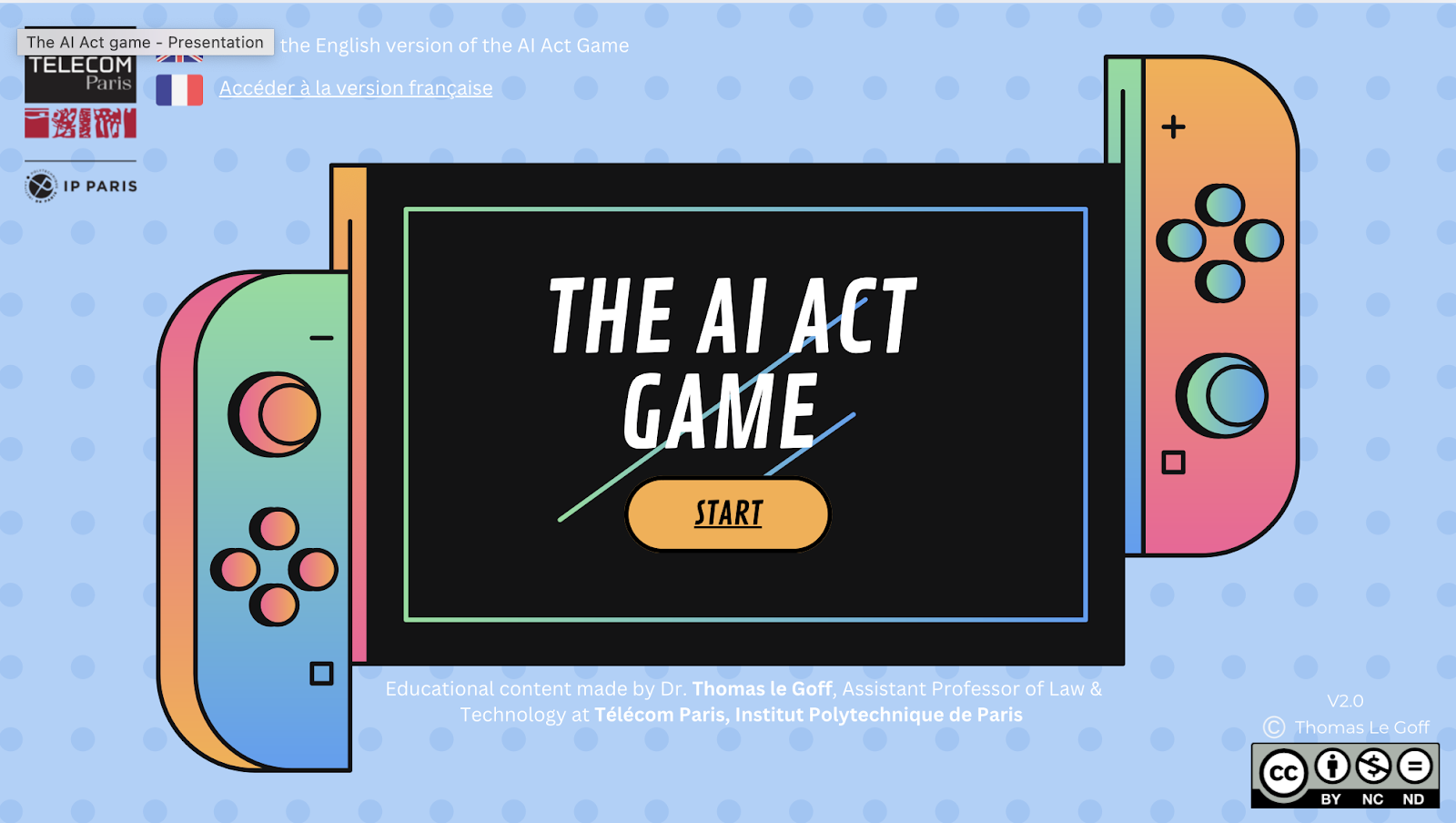
The game features a click-based interaction model in which the user engages with different AI use cases and legal situations. The first version of the game was closer to a text-heavy slide-based interface in which big blocks of information were presented with minimal interactivity. An improved version introduced improved segmentation, hover interactions for definitions, and subtle gamification elements to render it more interactive and usable. However, neither version featured core game mechanics, which was a concern from the perspective of user engagement and learning.
To determine the effectiveness of the AI Act Game, the study employed an A/B testing approach. Mixed quantitative and qualitative methods were used, including quiz results analysis, usability questionnaires, heatmaps, think-out-loud sessions, and semi-structured interviews. The study aimed to identify design errors, user engagement, and the influence of interactive elements on comprehension.
This case study represents the broader challenge of transforming education into an interactive digital experience. The findings provide a glimpse into the ways that interactivity affects learning, the application of gamification in educational software, and the difficulty of designing a system that is valuable to both expert and non-expert users. The results contribute to the ongoing discussion of how digital technologies can bridge the divide between regulatory complexity and public understanding.
Data
In our study, we recorded the following data :
- Heatmaps recording number and areas of clicks
- User journey maps of the navigation between the pages
- The average time spent on each page over all participants
- Notes from the thinking aloud while user were playing
- Notes from the semi-structured interview after user played
Methods
To analyze the game, we redesigned (Redesigned Version: https://www.canva.com/design/DAGdqani77I/5OSg8uIfYkFk25Zh517ahg/edit?utm_content=DAGdqani77I&utm_campaign=designshare&utm_medium=link2&utm_source=sharebutton) its elements to create a more attractive and gamified aesthetic while also adjusting the flow to improve user understanding. Based on the user journey map, we identified that the flow was one of the most confusing aspects. Even for us, it was difficult to understand what was expected and what was happening throughout the entire game experience.
This is how the original next to the redesign that we did:

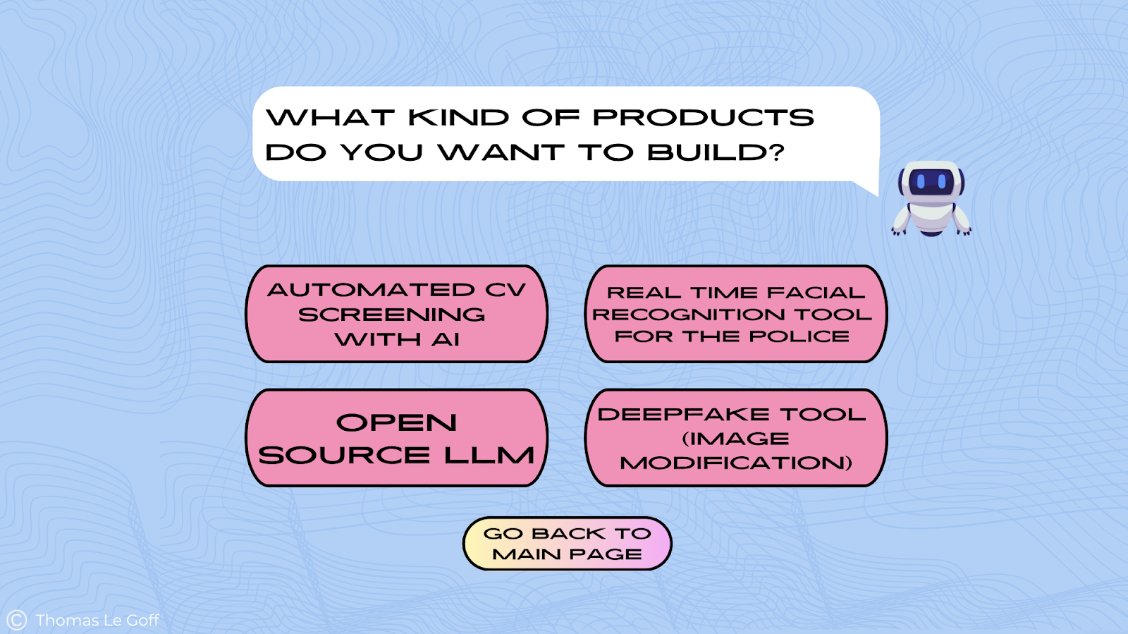
Therefore, in order to conduct a study we decided to focus on the four user cases which symbolizes in the game, the four product you can build:
After deciding on our approach on what exactly we will be texting from the game, we proceeded with the data collection process. We recruited 20 participants, with each team member testing on four users. To minimize bias, we had each participant play one case from the redesigned version and one from the original version. This approach ensured that all cases from both versions were tested per group for one team member. Additionally, we did not disclose which version they were playing and randomized the order, so participants did not consistently start with either the original or redesigned version.
Once we had everything planned, we began the user testing process. First, we obtained participants’ consent to use the data collected during the test. We then started testing, following the predetermined order of game versions. Participants played through a designated use case for either the original or redesigned version of the game. During gameplay, we encouraged them to talk and share what they are thinking in the moment, sharing their thoughts and reactions, which we noted down for further analysis using the think-aloud method.
After completing the first game version, participants took a quiz to assess how much information they retained. We then had them play the second version of the game, using a different case study to avoid repetition. They completed another quiz afterward and also we had separate quizzes tailored to each version to prevent any confusion in the results.
To gather quantitative data, participants filled out a questionnaire at the end of the testing session. This questionnaire included elements from the System Usability Scale (SUS) to evaluate overall usability, effectiveness, and satisfaction, as well as the User Experience Questionnaire (UEQ) to assess interface usability, aesthetics, and engagement through bipolar scales.
Finally, we conducted a brief interview with open-ended questions, documenting their responses in a shared document. These qualitative insights helped us gain a deeper understanding of their experiences and perceptions.
Limitations
A key limitation of the study was bias based on initial exposure, as participants’ feedback was influenced by which version they played first. To address this, a larger sample group would be needed, allowing for an even split between the original and redesigned versions to reduce bias related to use case order. Additionally, the lack of gamification limited the experience, as incorporating characters, interactivity, quizzes, or mini-challenges could have boosted engagement and reinforced learning objectives more effectively.
Results
Heatmaps
Before redesigning the presentation, we noticed that some elements looked interactive when they were merely decorative. This observation was confirmed by the study’s heatmaps, on this page for example:
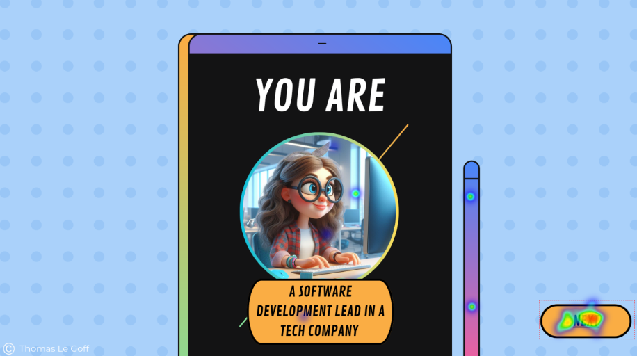
Here, the character is assigned to the users. Clicks on the character icon and title suggest that the users thought they could choose it. There are also clicks on the phone’s stylus that lead nowhere.
In this case, the heatmaps of the results simply confirm the observations we made while playing the game ourselves. With these observations in mind, we’ve tried to limit the non-interactive decorative elements in the redesigned version. The heatmaps of the redesigned version show good results in this respect.
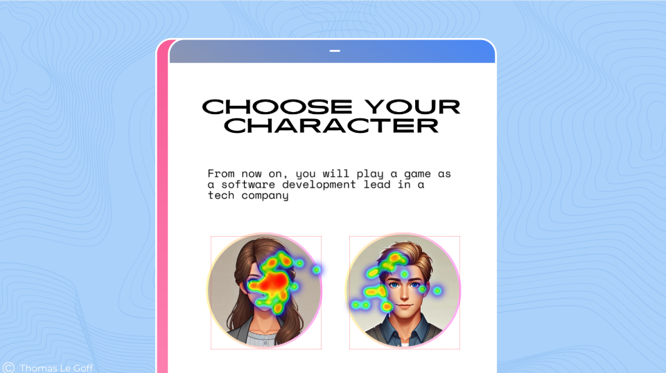
Overall, in the original version, 25% of clicks are not on an interactive element, when all the clicks are on a widget in the redesigned version. So it’s safe to say that these simple improvements have been a success.
There weren’t so many easy points to improve: we can now look at a section where it wasn’t so obvious what to do to improve the game and where we needed to use other elements than heatmaps to draw conclusions.
User journey
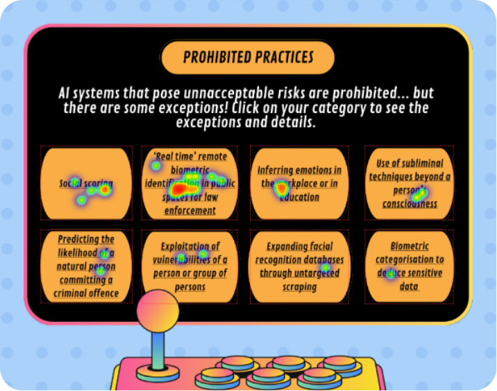
A major point of confusion for us was on the following page, from the Real time facial recognition use case. At this point we were getting lost and did not know what to do in the game. We thought the issue was that several buttons were leading to the same page. The page in question was very compact in text area and the font was very small, which was adding to our confusion.
Our impressions were confirmed by the heatmaps again, where we see that instead of clicking on the button leading to the rest of the game, users were trying out different ones.
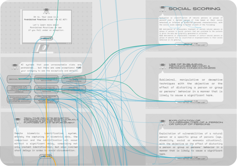
We get a much better idea of the flow of the users when we look at the user journey maps provided by the Quant UX Tool.

The “right” path to continue the game is the one following the vertical line. Instead, we see many diagonal lines from top right corner to bottom left, representing the going back and forth between the two pages shown earlier.
Spotting areas of confusion for the users was made easier by looking at these journey maps: multiple lines are easily identified and show areas of the game where the user is “stuck”.
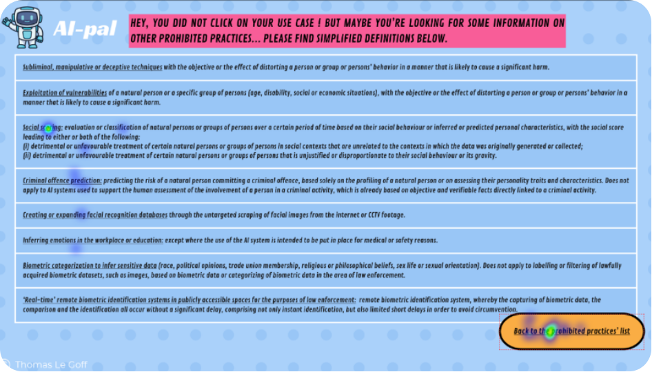
So, as we believed before the user tests this point of the game was confusing, we redesigned it so that each point would lead to individual pages. We split the landing pages into several ones: one for each prohibited practice. But it appears that the redesigned version was as confusing for users, as they were still going back and forth, this time between the individual pages…
Dwell time
As original and redesigned versions were both confusing points, we could compare the time spent on screen to assess which one was the most difficult for users.
This is how we learn that users spent twice as much time on the redesigned page than on the original one: on average, 12 seconds versus 6 seconds. Considering that the page is not an informative one, in the sense that it does not explain any concept from the AI Act, the time here was spent to progress in the flow of the game. The longer dwell time for the redesigned page therefore shows more confusion for the user.
Thinking aloud & semi-structured interviews
The thinking aloud allowed us to better understand what was the main issue in this section of the game. Many comments had in common that they showed users lacked clear instructions for continuing the game: they didn’t know what to do, nor did they understand the purpose or consequences of their actions.
“Is there a right answer and wrong ones?”
“Can I choose whatever I want?”
Or when arriving on the prohibited practice definition page:
“I don’t understand, what is this?”
“Do I need to read everything?”
“What is this document about?”
Contrary to what we thought, UI was not the most important. Users especially remember instructions, which are a priority for a good experience. In fact, users who didn’t have this use case gave much more positive feedback on their overall appreciation of the game.
Players who had no problems understanding the game – because they had a simpler use case – commented more on the aesthetics when we asked them about their immediate impressions after playing both versions. Here is an exerpt of the feedback of a user for CV Screening on original version and Open Source LLM on redesigned version.
Original: “High text density led to fatigue.”
Redesigned: “Bright colors and the AI character (“AI Pal”) added a friendly touch.”
Conclusions
Combining the heatmaps, user journeys, clicking information, dwell-time and qualitative feedback from both versions, we could spot the points of confusion and understand their origin.
It was also interesting to do A/B testing, because having similarities and differences in the feedback from two different versions has enabled us to understand the origin of comprehension problems, as in the previous example where the instructions were not highlighted enough.
Information retention
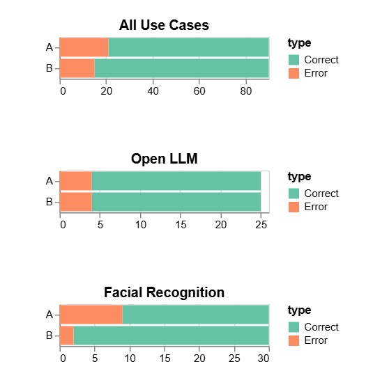
After playing each case, we asked participants to answer a short quiz, to check what they remembered from the game. There was one quiz per use case, regardless of the version. The graphs above aggregate the answers from all participants for each use case.
Participants had more right answers on the quizz when testing the redesigned version. However, we don’t think we can draw conclusions from it because :
- most people were answering out of deduction, or just from one word they remembered reading
- The quizz is biased as some participants were already interested in the use case before playing, when others were just discovering them. People who had some knowledge about their use case remembered better the information.
We only have a poll of 20 participants so the bias cannot be ignored.
Insights & Recommandations
Initially, our studies and participant feedback revealed a clear need for gamification. Participants consistently highlighted that gamification was more important than UI aesthetics, context, and flow. The current experience lacks essential game mechanics, such as progression, decision making, and engagement features. Without these elements, the experience felt more like an interactive document than a true game, leading to reduced engagement and less effective learning outcomes.
Additionally, we identified a significant issue with the unclear target audience. Survey responses from the System Usability Scale showed that 65% of participants needed additional support to navigate the game. The content and complexity did not suit either professionals or general users, legal professionals found it lacking depth, while general users found it overly complex. This highlights the need to clearly define the target audience and tailor the content accordingly.
From the user experience questionnaire we got results that showed a preference for Version B, with an average score of 3.60 compared to Version A’s 3.14 where the lower scores indicated confusion. Despite this, Version B still faced challenges with usability, content clarity, and engagement, highlighting the need for a more streamlined and user friendly experience.
Based on our insights, a key recommendation for future work is to transform the experience into a true game by moving from Canva to a more suitable game design platform. Additionally, the content should be restructured to align with a clearly defined target audience for improved clarity. On a positive note, there is no need to redesign the game’s visuals, as our findings showed they had little impact on the user experience despite initial expectations.