Abstract
In an era where digital platforms serve as primary gateways for information dissemination, the user experience (UX) of school websites plays a pivotal role in facilitating efficient communication between educational institutions and their soon-to-be students. This paper explores the significance of UX design for finding financial information about the cost of living for a new student at Telecom Paris. The goal was to analyse user feedback to come up with simple changes that can overhaul the existing UX of the website.
Case study description
We are studying the Telecom website at https://www.telecom-paris.fr/. This website is the official one for the school, and contains both news about the school, information on the cursus, on the campus, and on a varied range of actions by the school. It is aimed at both prospective students, current students, parents, doctorates, businesses, donors…
The navigation through the website can be done in three main ways. First, there are 5 distincts menus. The very top one in light blue, with only a handful of links, including one to change the language of the website. Then, there is a second one with buttons, which is organised around the different topics about the school (the school itself, research, innovation, international, business and campus). Just below, there is another bar composed of tabs, organised around the different kinds of students in the school. Next to it, there is a dropdown menu which asks you which kind of visitor you are. It is to be noted that the number of choices in this menu decreases when you are on the english page (with “Applicant”, “Researcher”, “Journalist” and “Alumni” missing). There is also a footer on the website with a menu similar to the previous one. Finally, there is a menu with a light turquoise blue background with links concerning the section of the website the visitor is currently in. But visitors can also explore the website using a search bar and through links inside the different pages.

The interest of the website is that it contains a lot of information and is addressed to a varied range of visitors. It then becomes a challenge to ensure that each different type of visitor obtains the information it needs. This is all the more true of international students, who may be confused about how the French system works.
For our analysis, focused on looking at the price of living and studying on the campus, there are three key indicators which must be found by the user : the school fees, the price of rent on campus, and an estimation of how much a meal can cost. The first information is directly present on the website using the “MSc in Engineering” tab, and then by clicking on “Registration fees and scholarship” in the “Admission procedure” section. It seems quite difficult to find a link to this page without being in the right section first. The information about rent can be found on external pages linked in the “Housing” page, located in the “Campus” tab, and in the “Campus life” section. The information about the price of a meal is missing, but one can find the name of restaurants in the “Catering” page next to the “Housing” one. There are several ways to reach those two pages, which are easier to find. There is also an interactive map which condenses a lot of information about those two subjects, located on the “Housing” page. However, this map contains missing images and there is not always a link to the different things it presents, making it less helpful than it might be.

Data
To study the website, we asked 8 people to perform the task of estimating the living and studying cost on campus, and recorded several types of data:
- Recorded mouse activity (position and clicks) of the people we have interviewed
- Navigation history during the interview
- Notes about the interviewees reactions, comments and actions on the website while performing the task
- Responses to a standardised form about the experience performing the task on the Telecom website
- Responses to oral questions asked by the interviewer: “How was your experience of the website during the experiment ?” “Are there any specific thoughts you would like to share with us ?”
The data collected was stored on a dedicated server with a programmed end of life (2 months after the experience) acknowledged by the participants in the consent papers signed before and after the experience.
Five of our interviewees were students, and three of them were parents of students. As the cost of living and studying on campus is also an information interesting for students’ parents, we believe it is interesting to see how an older generation fares with the website.
Methods
To collect the mouse activity of the users, we used the Chrome extension “Mouse-Tracker”, which records any movement of the mouse in a csv file, as well as the absolute position of the mouse, and if there is a click or not. This allows us to know the number of clicks performed by the user.
While the experience was taking place, we also took notes while observing the behaviour of the users and conversing with them.
Once the task was completed, we asked the interviewees to answer a standardised form on cognition.run.
Finally, we scanned the browser history at the end of the experience to count the number of pages visited and the overall time it took to complete the task.
Once we got all the data, we aggregated it for analysis, and we were able to draw some interesting conclusions.
Results
The first result we came across while reviewing our data was a flaw in the Mouse Clicker extension. In fact it often recorded less clicks than visited pages, which is impossible. This is not the biggest deal as the navigation on the telecom website gives a very close equivalence between the number of clicks and the number of pages visited (that we surely know thanks to the browser’s history). However, it also implies that our data collection about the mouse movement might also be flawed. Indeed, looking at the timestamps, it looks like we only got the data about the first couple of minutes of each experiment.
Still, as you can see in the two graphs below, it provides some interesting insights into how the users managed to access information. We can see many big traversals of the screen, some very fast to get from a menu to another or to an interesting information, some slower (and often horizontal), which should be linked to the reading of the items of a menu or to a long line of text. Finally, there are quite a lot of back-and-forths, of saccades.
Examples of the mouse movement of two interviewees


Observing the user during the experience revealed that some features of the website were not used at all by our users. The footer menu at the bottom of the page was completely ignored, except by one interviewee, but it never helped them find any interesting information for their task, and they ended up relying on the same menus as the rest of our interviewees. The small turquoise section menu has also been used twice only, but with greater success. The search bar was used by three people, as it is a convenient alternative for people afraid of the gigantic menus of the Telecom website. However, only one of them managed to take advantage of it to find useful information, as many results are not important pages and make the relevant information harder to find.
The experience took quite a lot of time with an average time of 18min, across an average 14 pages visited.
Overall, the participants were able to find the available information on the website, though it took time and was never straightforward. Therefore, their experience of the website was mostly negative.
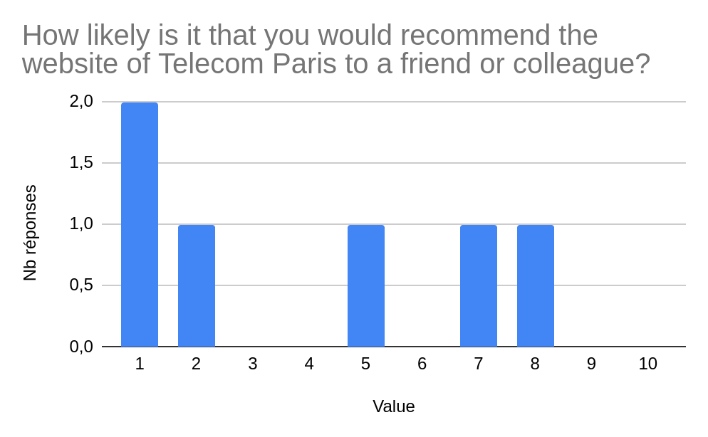
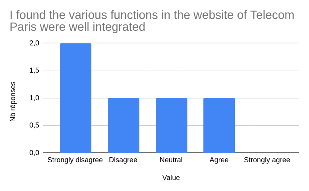
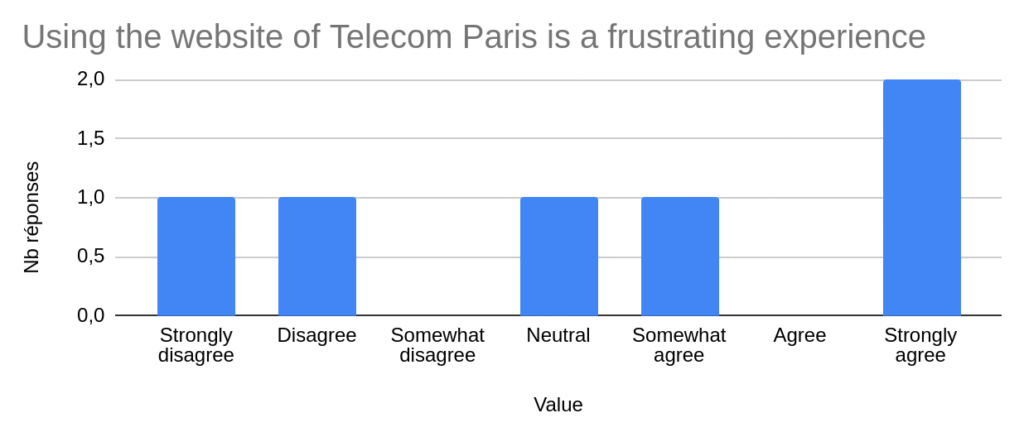
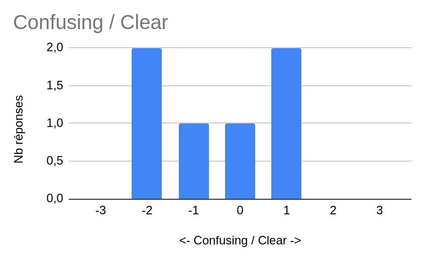
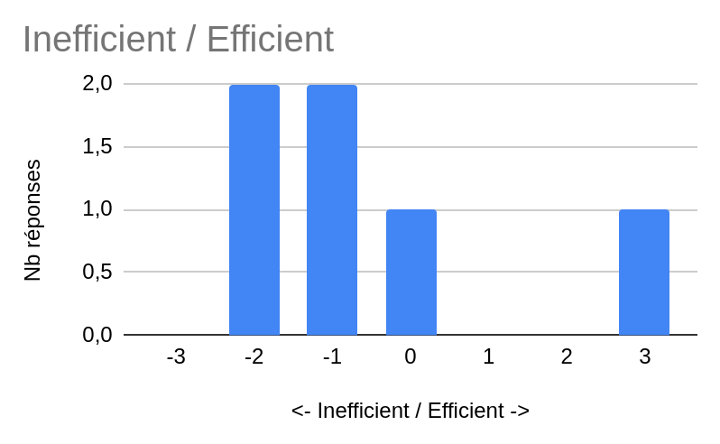
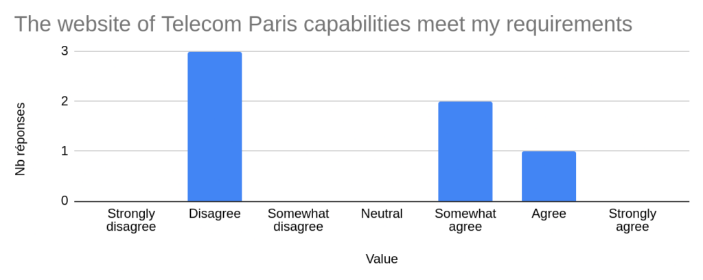
We also performed a survey afterward asking questions about their experience with the website, you can find all the results at the end of the article.
Example of answers:
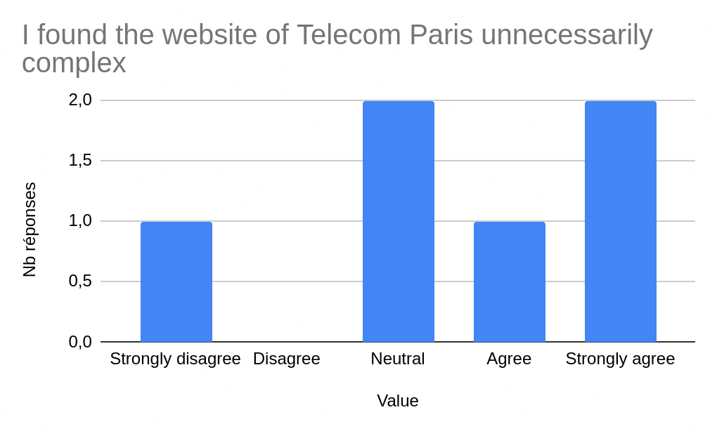
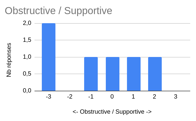
Overall it seems the website was perceived as obstructive and not very easy to use. We still have to keep in mind that our sample was limited, hence further research is needed.
Insights and recommendations
From our analysis, we can make some recommendations to improve the UX of the website.
First, there are too many menus not used: remove some of them to save space and user attention. Instead, focus on improving the search bar to make it usable with ChatGPT or a simple hierarchy sorting the results by importance.
Then rework the “You are a” menu by adding a “new student” item that contains cost of living estimations. In the french version, the “candidat” item redirects to a page that says “congratulations on your admission” which makes no sense. Make a proper candidate page and a proper “new student” page where the cost of living information can be easily found with a quick estimation. This could be the fastest way to access the information. Make it more visible on the main page.
A redirection to this page could be added to the campus section of the main menu to increase the probability of the user finding it. On the contrary, it would be great to get rid of the page “redir” which is just confusing for the user.
Finally, give price estimations and a link for restaurants, instead of just the address (the users found it frustrating).
Going further
This analysis could be completed by having access to the raw user data of the website to study the demographics of the users, and which pages are more often accessed than others. Mouse tracking could be done better with a more advanced tool. Finally, eye tracking could be used to understand what visually matters on the website, among all the menus and information present on the screen.
Annex