Case-study ran by Katharine GAFFNEY, Cilia IHADADENE, Ghislain LORAS and Valentin POVSE.
Nowadays, tons of companies offer food delivery services. Some only exist in specific countries while others tend to be known worldwide. Apps are designed to be efficient, easy to use and promote consumption. It is vital for those company to study the typical behavior of the different types of consumers to make sure that they keep on using their services instead of a competitor’s one, as this market is very competitive.
Therefore, it is legitimate to ask ourselves what’s our choice when we’re hungry? Here in France, we could enjoy a pizza with Domino’s Pizza’s app, a burger fast food with My Quick or almost anything with Deliveroo. Hence, for the same product, what are the reasons for ordering food on an app or another?
In this study, we will focus on the biggest fast-food chain in the world: McDonalds. There are many ways to enjoy a burger from McDonalds such as drive through, click and collect, delivery… In France, ordering online can be done using apps like Deliveroo or UberEats but only few people actually know that McDonalds also has its own official app McDo+.
Thus, what drives customers to use a food delivery app or another? Can this choice be based on its simplicity? Its aesthetic? Its reputation? The point of our study will therefore be to determine the factors that push consumers to use whether UberEats app or McDo+ app when wanting to order a McDonalds meal. To answer this question, we will firstly focus on a general analysis of a wide French users sample to gather data about their typical needs, habits and knowledge of the various solutions. Then, we will analyze the reviews left on Google Play and App Store about both apps to see their influence on consumption. Next, we will introduce our user journey experiment conducted on a smaller sample. Finally, we will conclude on the strong and weak points of both apps and answer the initial question.
General Analysis: General form results analysis
Before doing the user journey, we’ve created a survey to compare the UberEats application and the McDo+ delivery service. We’ve chosen to write this form in French, as we’re comparing the two applications in France. We shared it on several channels, such as the school survey group, as well as on several private channels. We managed to get around a hundred responses, which gives us interpretable results.
We asked different types of questions in this survey, the aim being to find out whether people knew about and used these applications. We also wanted to know why people would choose one app over another for McDonald’s delivery. Here is the link to the survey and the link to the answers.
In order to analyze the data, we first looked at the different percentages on the single-answer questions, then read the different responses to identify the elements that came up most often.
Before analyzing the results, it’s important to point out that this survey was mostly answered by young people (+90%) aged between 18 and 25, and that the majority of respondents are students on initial courses or apprenticeships.

Fig 1: Age question
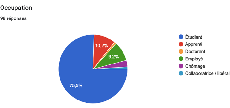
Fig 2: Activity question
UberEat application:
This application is known by 98% of respondents, and more than three quarters have already used it. Of those who have, few use it regularly. The app is criticized for its price and the working conditions of its drivers.
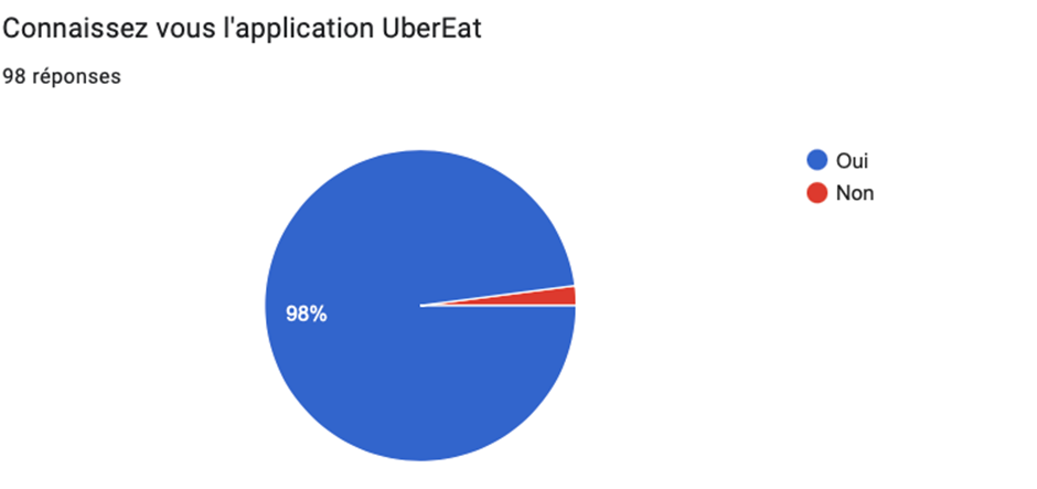
Fig 3: UberEats knowledge question
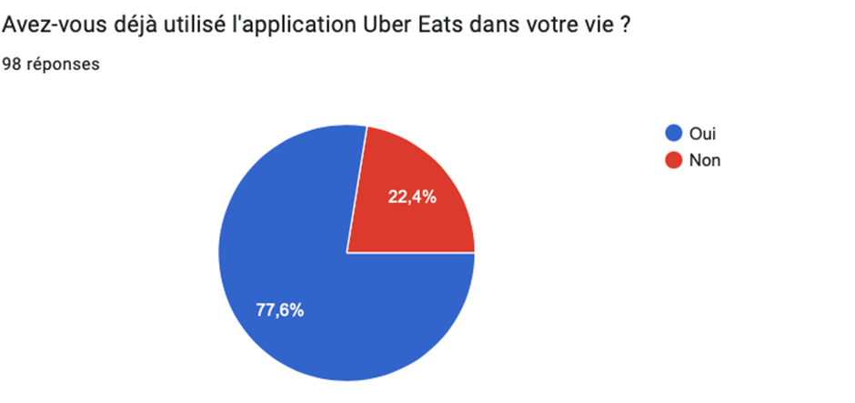
Fig 4: UberEats usage question
Delivery via McDo+:
65.5% of respondents are not familiar with the McDo+ app delivery service, and only 20% of respondents have used it.
As for the McDo+ app, the majority of respondents don’t use it because it’s not very user-friendly, the app lacks promotions, in addition respondents rarely order from McDonalds to require the app.
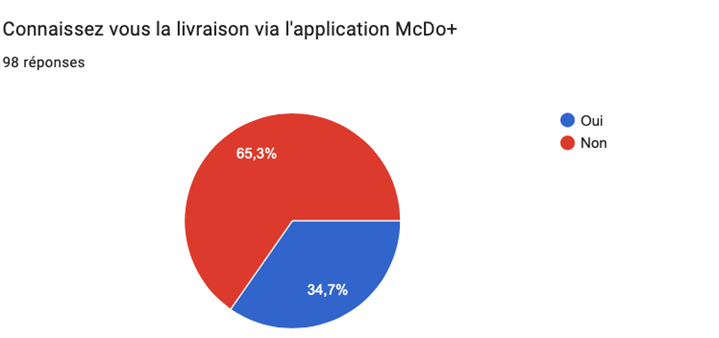
Fig 5: McDo+ delivery knowledge question

Fig 6: McDo+ usage question
In conclusion, 53.1% of respondents prefer to use the UberEat app instead of the McDo+ app to order at McDonalds. This choice is based mainly on the fact that they don’t know the McDo+ application on the one hand, and on the other hand, the UberEat application is better known and offers promotional offers.
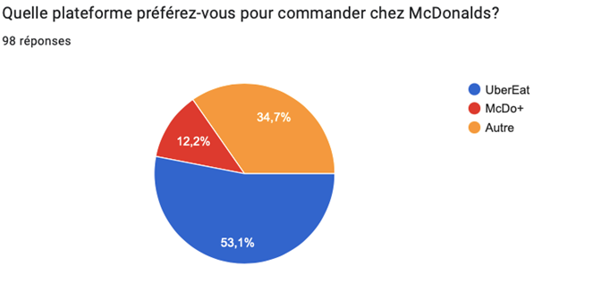
Fig 7: Favorite app question
Review Scrapping: Google Reviews analysis
In order to study what people think about our two applications, We thought about analyzing the reviews of UberEats and McDo+ on the download platform.
Raw reviews:
To do so we started by scraping the reviews of what people think about the apps on the downloading platform apple stores and google stores.
We then scrapped 10000 random reviews from both websites, the datas are presented as follow:

Fig 8: Sample of the reviews scrapped
We could then draw a histogram from the reviews gathered to know distributions of rating for both reviews. We then got the next figure:
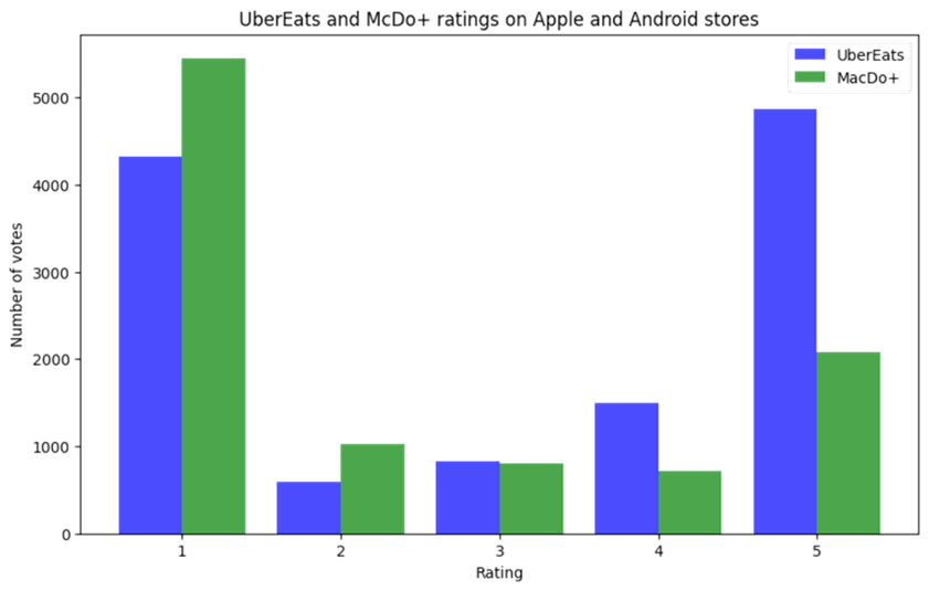
Fig 9: Histograms presenting the number of reviews in both applications depending on the rating
This distribution comforted us in our hypothesis, McDonalds has serious issues with its application, the proportion of the ratings show it.

Fig 10: Pie chart presenting the proportion of reviews for each McDo+ rating
Word selected reviews:
The problem with the reviews analyzed before is that they analyze other problems on the application not linked to the delivery and thus can’t be opposed to UberEats. To resolve this issue we scrapped only reviews containing the words “delivery” or its derivative such as “deliver”, “deliverer” … (as the analysis was made for French reviews, the words were “livraison”, “livreur”, “livrer”, “livré” …)
The stripped reviews can now be draw as a histogram and a pie chart to perform a distribution analysis:
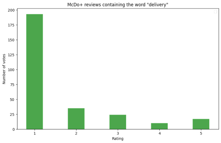
Fig 11: Histogram of McDo+ reviews containing vocabulary linked to delivery
The distribution in a pie chart is as follow:

Fig 12: Pie chart of the rating distribution
The charts show an even worse distribution of the rating. However, the number of reviews for the analysis has dramatically decreased so it’s less submitted to the law of big numbers.
The main problem gotten from the reviews:
The new reviews linked to delivery can be analyzed literally to get the gist of the problems suggested by the people. A cloud of words is a way to extract some recurrent ideas from the reviews and enlighten the words linked to this issue. Here is the cloud of words from delivery reviews:
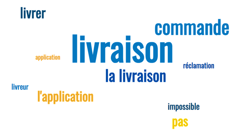
Fig 13: cloud word of the McDo+ delivery reviews
Most of the words are obviously linked to delivery as it was our main source of filtering, however a second cloud with the words “pas” (not), “impossible” (impossible) and “réclamation” (claim) present one of the recurrent issue of the app which is the impossibility to seek help or report a problem on the app.
By looking at the review containing delivery like words, three main problems from the UX of McDo+ application comes up:
- Difficulties to seek help on the application: That’s what we could analyze on the cloud of words. Users are having trouble finding a way to call the delivery management. They are frustrated from the automatic response or the lack of customer support.
- Lack and incoherency of delivery information: The reviewers present the delivery information about when and where their delivery is to not be reliable at all. They share a great frustration about not knowing when they’ll get their meal while on other delivery platforms, a map with the delivery man on the way is a common feature.
- The loyalty program system: Users write about loyalty program’s bug which are not linked to UX, however they present it to not be clear at all and to omit some points that could have been gained. They don’t understand how and when to use those points and feel their loyalty to be betrayed.
Solutions:
The scrapping of reviews presented three main issues that could easily be solved.
First of all, the difficulty to seek help is a major issue and should be answered easily by a company as big as McDonalds which has customer service. Adding a customer service selection on the “account” tab is easy to do and would reduce the frustration gotten by customers not being able to seek help as well as ideas of improvement for the app.
Secondly, adding a map with the customer delivery location on it would be a huge plus as the users would know where their delivery is and when it’ll be arriving. Their frustration comes from just seeing a number moving, seeing their delivery progress from the location of their food moving makes it less frustrating to wait.
Finally, the loyalty program system should be rethought as it is not clear for the customer. A help page with a clear presentation of the possible gains and the conditions should be added to explain to the customer why their points could not be used and how to use them.
User journey experiment: Experimental user journey analysis
The purpose of a user mapping journey is to visualize and understand the steps and experiences that a user goes through when interacting with a product, service, or system. It provides a comprehensive view of the user’s interactions, motivations, and difficulties throughout their journey.
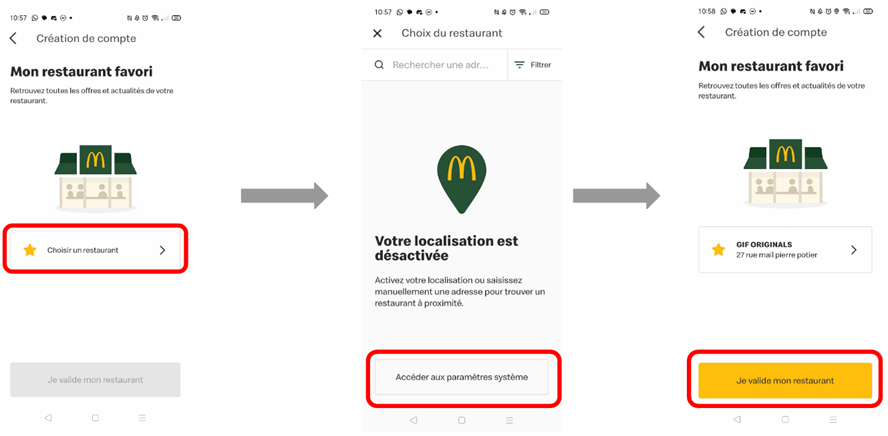
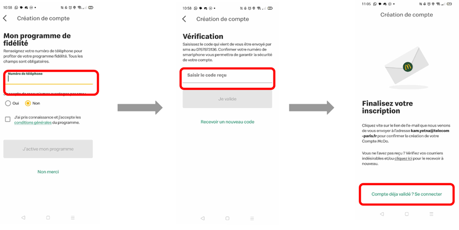
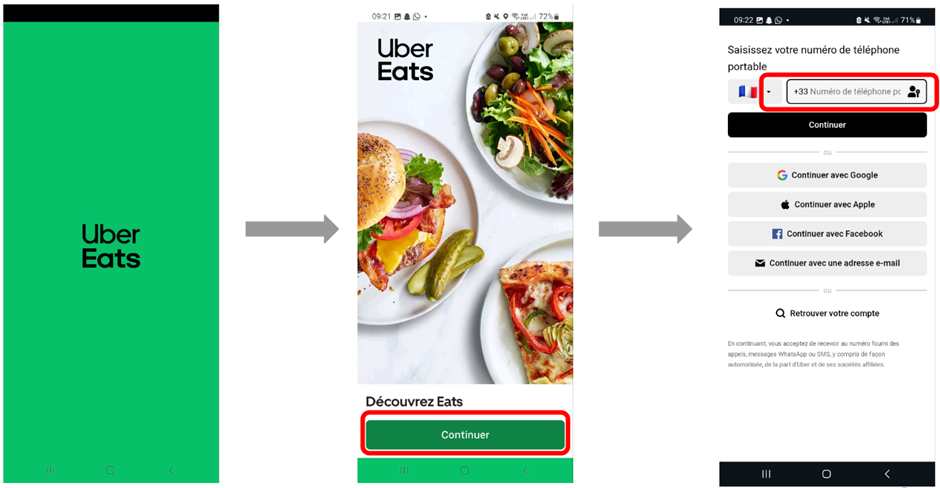
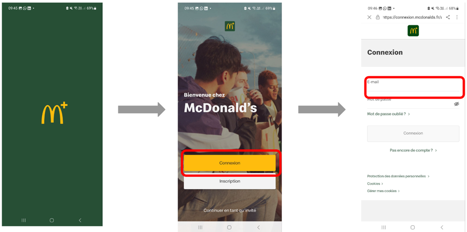
In the first step, we established two user journeys ourselves, one for the registration process and the other for ordering a menu on both applications. In a second step, we will see that we asked other persons to do the same user journey in order to collect their opinions on the difficulties/ease encountered.
User journey – Subscribe
UberEats


McDo+


User journey – Log in
UberEats

McDo+
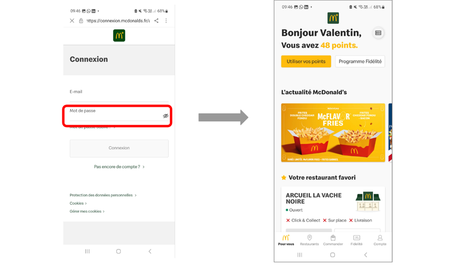
User journey – Order
UberEats


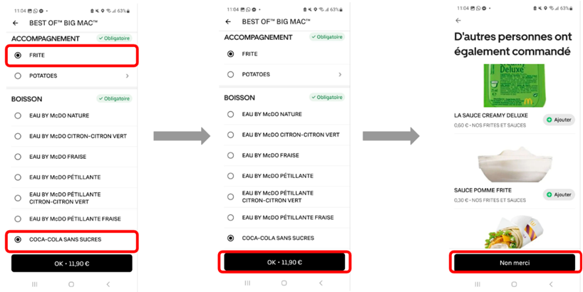

McDo+
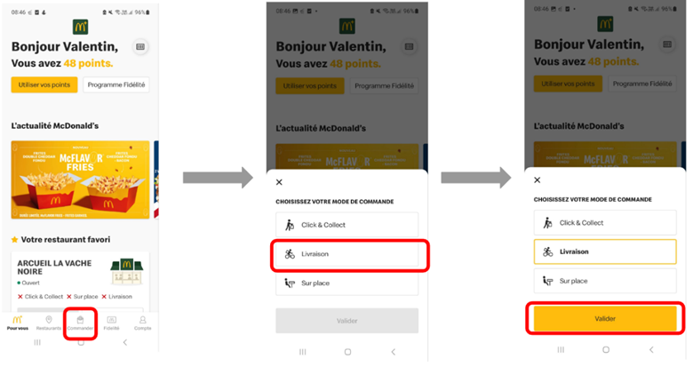


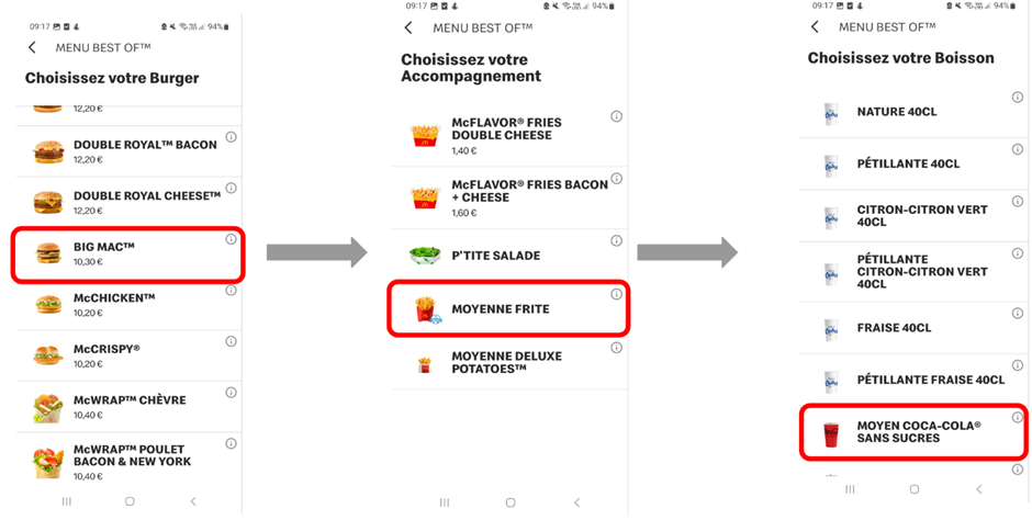
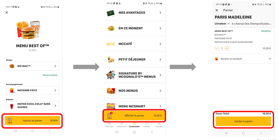
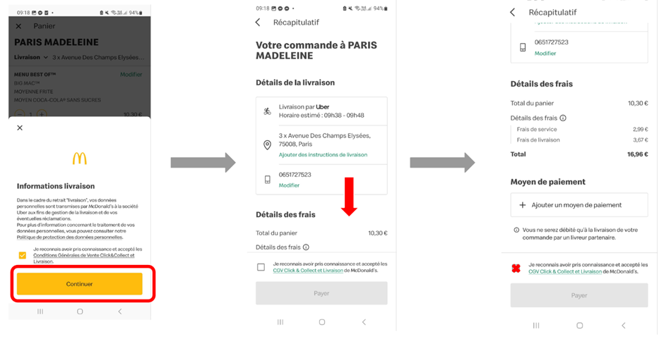
In order to continue comparing the two applications, we decided to present two user journeys to about ten individuals. At the end of the two processes, one for signing up and one for ordering a McDonald’s menu, we asked them to fill out a form containing the following questions and to justify their answers:
- Which application did you prefer overall?
- Which application was the simplest to use?
- Which application had the best design?
- How can the user experience be improved?
- In the future, which application do you intend to use when you want to place a McDonald’s order?
In fine, we have collected 12 answers for both user journeys. The following part presents the results of the surveys.
Results for subscribing to both apps
Firstly, regarding question (1), 83.3% of users stated a preference for the UberEats app over McDo+. The most frequent argument is that UberEats is easier to use than McDo +. We noted before in the user journey mapping that UberEats presents less steps to subscribe.
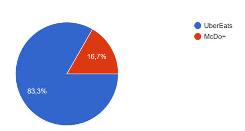
In response to question (2), 83.3% of users found UberEats to be simpler to use. The main reason is that the application only requires a phone number and name for registration, whereas McDo+ redirects to a web page that demands an email address and the creation of a password.

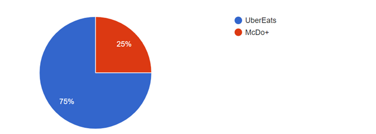
Regarding the best design, users again chose UberEats at 75%. They found the application to be more attractive, sleek, and with more pleasant colors.

For the last question, we asked which application users would prefer to use for ordering food in the future. 58.3% of them preferred UberEats compared to 41.7% for McDo+. It is noteworthy that choices here are less decisive, notably because users are concerned about potential additional service fees with UberEats.

Results for ordering food on the apps
Similarly, to the previous user journey, we asked users the same questions. For the first question, users overall preferred UberEats at 75%. This can be explained by the fact that they were able to order more quickly. Some also mentioned that they paid less on UberEats thanks to discounts they obtained through the application.
For question (2), we asked which application was the easiest to use. 66.7% of users stated that it was UberEats, mainly because it has fewer steps for ordering and fewer options to choose from.

Now, considering the design of both applications, UberEats is overwhelmingly chosen with 91.7% of preferences.
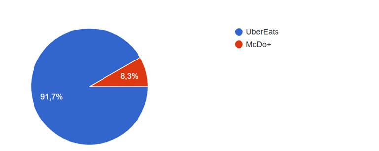
Finally, we asked them which application they would use to order a McDonald’s menu. Once again, the majority of users voted for UberEats.
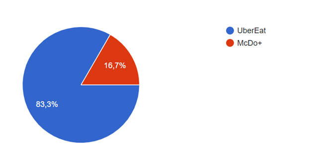
In conclusion, UberEats emerged as the clear favorite among users in all aspects, including ease of use, design appeal, and overall preference. Users consistently praised UberEats for its simplicity, attractive design, and streamlined ordering process. These findings affirm UberEats’ dominance as the preferred platform for food ordering.
Offered solution: Weak and strong points analysis
The previous sections allowed us to gather information about users’ opinions on both UberEats and McDo+ apps and deduce the most important and recurring advantages and drawbacks mentioned.
The most frequent drawbacks quoted by users were poor app design and few delivery locations available on the McDo+ app whereas for UberEats, only its ethics was cited. On the other hand, the most frequent advantages quoted by users were simplicity to use and rapidity to place an order or subscribe on the UberEats app whereas for McDo+, only the availability of its loyalty program was cited.
McDo+ App Design
According to the surveys we conducted, the most problematic part of the use of the McDo+ app comes from its design, regarded as poor. Users feel like they have to seek for information and that this research on the app can sometimes be long and difficult. Because in this context users want to access the service quickly and easily, they might give up the use of an app to another competitor’s at the slightest inconvenience. They also reported technical issues in the app’s reviews on both Google Play and App Store such as app crashing, loss of loyalty points or double delivery fees charging. Because the app is not designed to receive users’ complaints, bugs are hardly escalated to the McDo+ team and users end up compelled to refrain from using the McDo+ app.
McDo+ Delivery Locations
The McDo+ app offers several services such as maps indicating the closest restaurants, eat in preorder, click and collect or delivery. At first sight, all those features seem very convenient in a user point of view as the app appears to aggregate multiple use cases. However, even though a user can be located close to a restaurant, it is possible that a delivery cannot be performed.
For a very long time, delivery services were only available in big cities such as Paris and this is due to the fact that McDonalds did not have enough staff members to ensure the food delivery for every restaurant location. This resolved in bad reviews being left online and poor impressions being left in past users’ mind. Even though nowadays McDo+ offers delivery services for most its locations, users tend to be reluctant to switch their habits. Moreover, McDo+ uses UberEats to perform its food delivery making it more expensive.
UberEats Ethics
The most frequently mentioned drawback of the UberEats app is related to its ethics and more specifically the way UberEats treat and pay its delivery staff. Because this has nothing to do with the app’s user experience, we will not develop this point.
UberEats Simplicity and Rapidity
Users noted how simple and fast the UberEats app is to use. They don’t feel overwhelmed by the app design and find it easy to seek information when needed. New users can sign up in what they consider to be a reasonable time and effort. Regular users don’t have to log in very often but when they do, they also succeed without any inconvenience. Ordering food appears to be instinctive for them and they don’t feel any pressure from the app.
Even though this observation can surely mean that the design of the app is well perceived by the users, it is also biased as the app can be used for many other restaurants making the opportunities to get used to it bigger than the McDo+ app that consumers will use only when wanting to order from McDonalds.
McDo+ Loyalty Program
The only advantage cited by the users about the McDo+ app refers to the possibility to get loyalty points and use them to get discounts or free items. Users view this possibility as an added value since UberEats and other food delivery apps do not offer consumption-based discounts. With the app, users can effectively view their current amount of loyalty points, the number of points needed for certain discounts or items and add them to their cart.
However, and as mentioned previously, some issues have been reported about the loss of loyalty points so if this topic becomes more serious and recurrent, users might definitely stop using the McDo+ app.
Recommendations
As mentioned in the review scrapping section solutions for the McDo+ app can be implemented. It is necessary to make the platform instinctive and easy to use for the customer, which is what the McDo+ app currently lacks. The main issue the users face is the lack of clear information. Therefore, adding a visible help section, a clear list of the restaurants from which a delivery order can be placed, and a customer service desk would make the user experience way more intuitive and enjoyable in the future.