Introduction
Nowadays, booking a flight has become a common thing. You can decide to go on a trip to another country, comparing flights from your smartphone to find the better price. However, many flight comparator apps exist, and even if they all look the same, some have features that make the user experience easier and more efficient.
In this article, we are going to ask ourselves “What makes a flight comparator app simple and effective to use?”
To achieve this, we establish a list of objectives on which we will work with various Quant UX methods to find the answers to our questions:
● Comparing the user experience of flight comparator applications to try to identify what allows an application to offer a good experience
● Highlight the key factors which allow a comparator to offer a better User Experience than another
● There are many flight comparators, we will focus on two very well-known ones (these are the two best-known): Kayak and Skyscanner
● We will not take into account the empirical performance of the comparator. For example, if someone gives a bad review on the app because their flight has been canceled, we won’t take their comment into account because it’s an airline issue, not an app issue.
In order to obtain the most coherent and comprehensive answers possible, we will proceed with data collection in three different ways: scraping reviews, conducting a survey, and conducting personalized interviews. Through these various studies, we will, throughout this article, address these questions and understand how flight comparison applications manage to offer such a simple usage of their complex services.
Quantitative Data Analysis
The goal of this analysis
The goal of this analysis is to find useful feedback for Flight Comparator Applications. We want to find a way to extract UX related feedback from a huge pool of reviews, we’ll do this analysis on the Skyscanner and Kayak applications.
Quick remarks
We can’t really retrieve all the reviews for an app that we aren’t the owner of, but I managed to extract a reasonable amount of reviews for both of the applications (about 50K reviews each).
Review Scrapping
For the scraping of the reviews, I used a simple python package named google-play-scraper to retrieve the reviews. I then cleaned them a bit (removed some non latin reviews while keeping the emoji’s).
Sentiment Processing
Since I am a beginner in sentiment analysis and natural language processing, I only did some basic processing. I decided to use an artificial intelligence pre-trained model to do sentiment analysis on the data. I first used Nltk(Natural Language Toolkit) pre-trained sentiment analysis to run on the reviews, but the model wasn’t picking up on subtleties and didn’t give accurate results. I found the twitter-roberta-base-sentiment trained on 58~ millions tweets and fine tuned for sentiment analysis. It gave me much more accurate scores.
The model gave for every review three scores: a positive, neutral and negative score.
Quick Outline
Kayak and Skyscanner were both created around the years 2003-2004. Skyscanner has attracted 5 times more google play store downloads than Kayak.

Both of the two applications have a similar ratings histogram and around the same mean rating (4.8 for Kayak and 4.7 for Skyscanner at the date of this report)
What can you do with this
With this amount of data, you can’t read all the reviews one by one, so you need a way to extract interesting feedback from all the reviews.
The cleaned data is enough to do most of the work to extract feedback, but sentiment analysis really supercharges the analysis and helps us find good feedback quicker, and that matters a lot when you deal with a humongous amount of data.
For example, filtering the reviews depending on dates and certain updates already give back important information, but with the different scores really help surfacing most critical 5 star reviews or most positive 1 star reviews.
First analysis : Skyscanner 2020 update
Plotting the average rating per year for the two different applications gives us an interesting result. What can we conclude with only the reviews ?
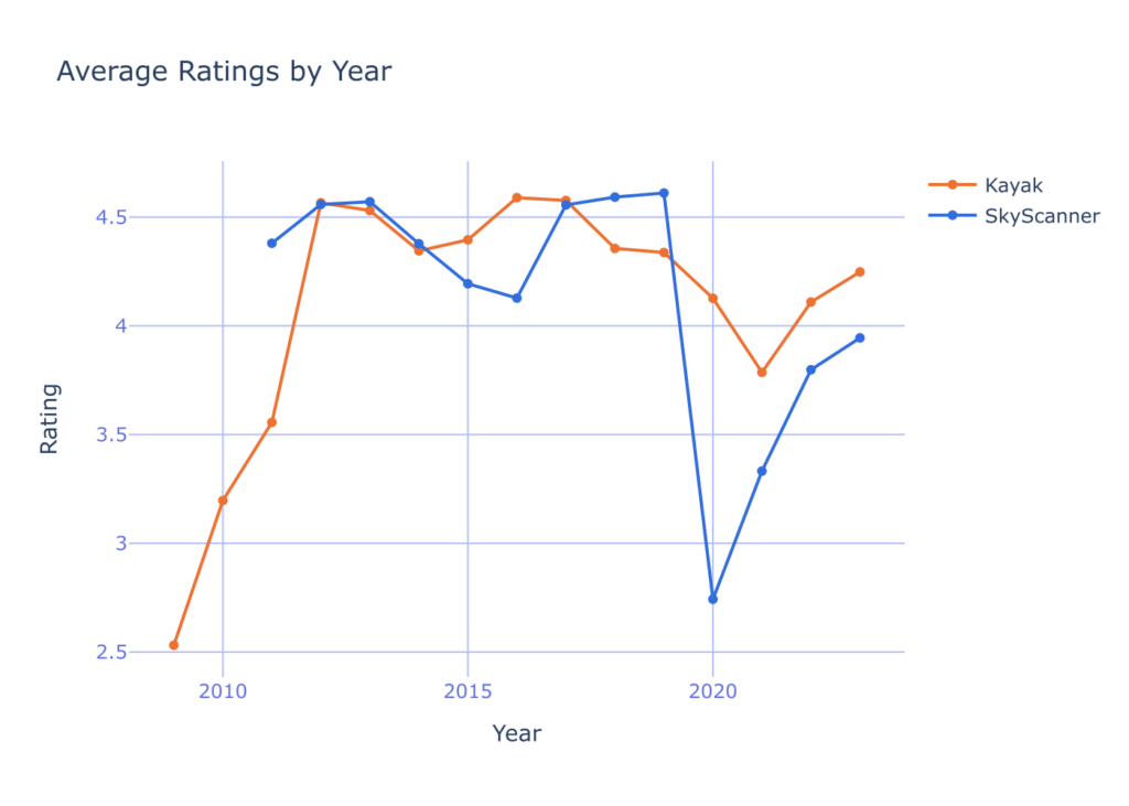
With the analyzed reviews, you can easily find problems, but before you need a bit of filtering so you don’t end up with feedback you don’t really care about. For this update, we want to get the feedback for the UI and design, and not for the customer service, flight cancellations, etc…
After a bit of filtering with end up with theses :
I hate the app since the last update. I tried to get used to it, but the user experience and the lack of features compared to the previous app plus the bad customer service when you face an issue made me uninstall this app. You made a bad business decision !Skyscanner seems to get worse and worse every time I use it. It's trying to do too much.What the hell happened?! It was one of my most used tools and now either I am too stupid to make a basic search or you made it so complicated it makes me want to throw my phone away. Please change this new interface pronto!The last update is very bad .. flexible dates chart not exist anymore ..so annoying and the app being same the other appsAnd this is only a fraction of the reviews you can find that exactly points out what is the UX/UI issue about this update.
Second analysis : For the designers
I see this second analysis as a way for designers to find feedback on the things they work on. Because sometimes, it is quite hard to know what is good or not, even with A B testing, and more with smartphone applications design, because A B testing is less easy then for websites.
Something I discovered is that in these great piles of reviews, most of them are useless and complain about things that designers don’t care about. Because most of the reviews are about the app’s not launching after an update, or bugs that are more for engineers than for designers.
With this in mind, I’ll give some review examples that I found using the data I collected and processed to give you insight on how it is resourceful.
Feedback about the calendar for example:
Won't be using until they add whole calendar view, which is the most useful setting on the browser site. "
 "It is nice app. searches wide variety of ticket provider and recommends better rates. can you make one improvement- during flight search i always need to select the date. can you provide next and previous date navigations. say im searching flight for 6 november and i don't find one suiting my choice then i can select next and previous and it shows data of 7 nov or 5 nov date and so on. currently i have open the calendar select 7 nov

Does not show prices of flights for whole months like on the website, witch is the only reason i use skyscanner. the app only shows range of prices and you have to choose the dates to see the prices instead of choosing date after seeing prices on the calendar. i guess i will have to keep using the website if i want to use skyscanner services.

What was once a simple app is becoming cluttered and unituive. people that use this model want simplicity and value speed but now theres too much going on. when searching, what has happened to searching for a whole month and when using explore to search for a whole month, you don't get a calendar to choose from but a list of already selected flights. the whole reason i use skyscanner is to see that calendar view to choose specific dates and compare.
Feedback about the search :
I hate the new update, they've taken away the multi city search and you can't change cabin class! why remove functionality? deleted.

Hate the new look.. i can not select multiple passengers on my search.. also page layout crappy .. don't like it anymore

the last update is so disappointing. logo looks like weather app. start up flight searching separated pages (dates, where to, from where) are inconvenient. please, revert to previous searching modes as before using convenient search from 1 page all-in-one: date, to, from, quantity of passengers etc.
Quantitative Data Analysis Conclusion
The App Store reviews hold a lot of useless reviews by frustrated customers, but if you dig a lot and with the right tools, you can eventually extract useful and resourceful reviews.
With the example of Kayak and Skyscanner, that even long lasting apps supported by great corporations can still have flaws, and that the flaws can be pinpointed with the help of store reviews and sentiment analysis
You can find all the material used for this analysis on this link. You’ll find the scripts, data. You’ll find the above report at this link.
Qualitative survey
Objectives of the survey
In addition to the quantitative study revealing general information and user opinions on the applications, we would like to obtain answers to some of our questions in particular. The best way to achieve this is by creating a qualitative survey.
This survey should allow us to question a relatively large number of people about the specific questions we ask them. In this way, we can conduct a sort of large-scale interview, which will be very useful for better understanding what people think about flight comparison platforms on certain specific points. In this case, our objective is to try to understand what people particularly like when they use a certain comparison platform. We also want to understand why they prefer certain platforms over others and which features they prefer the most. Once again, we will focus our study particularly on the Kayak and Skyscanner applications, which we believe are the two most representative ones.
Presentation of the results
To begin with, to get a better idea of people’s habits regarding flight booking, we started with general questions. It is worth noting that most of the 54 people who responded to our survey are students and therefore between 18 and 25 years old.
Firstly, we notice that the majority of the respondents have already booked their own flight tickets themselves:

This question allowed us to separate people who had never booked flights from those who already had experience.
Before delving into the heart of the survey, among those who had never booked flights, even if the survey didn’t continue for them, it seemed interesting to ask them how they would do it if they had to. The response is quite remarkable as it proves that even for people who have never booked tickets, the first instinct for most of them is indeed to turn to comparators:

This result is very consistent when the question ‘how did you do it’ is asked to people who have already booked tickets. Here again, the question highlights the fact that comparators are the most favored tools for finding the best price for a flight:

Now that we know a majority of people already use flight comparison platforms to book their tickets more easily, we want to know which comparators they use/prefer and why?
Firstly, we will assess the popularity of the comparators:

We notice that the top 3 are Google Flights, Skyscanner, and Kayak. This question also shows that the specific study focus on Skyscanner and Kayak applications was relevant since they both are part of the top 3 apps.
Next, a rather simple question was asked: Do people find comparison applications easy to use?

The answer is that the average is 3.7/5. For applications that put a lot of effort into their creation in terms of UX design, this is a relatively surprising rating.
Next, the core of the survey revolved around the two following questions about what makes a comparison platform easy to use and what features the respondents preferred. Firstly, we wanted to know what, according to them, made using a flight comparison application simple:

Then, we asked them to tell us what their favorite feature was. We’ll see it in the analysis below, but it’s often functions that combine complex algorithms and simple interfaces that win the most votes (such as dynamic maps or dynamic calendars):

You will be able to find all the responses on the following link: https://docs.google.com/spreadsheets/d/1YBy_b7qT4BV_XoJasbiJR1slZxq1mhwSO4qZQG_OhKI/edit?usp=sharing
Analysis of the survey responses
Finally, what can we take away from this qualitative survey? What did it teach us additionally? We learned that users don’t find comparison platforms very easy to use. However, they do appreciate smooth navigation and the inclusion of maximum functions to help them find the desired results as quickly as possible. We can highlight the following four key points:
- Advanced functions (which depend on complex algorithms) appeal when they are simple to use.
- Ergonomics and ‘ease of navigation’ are important. For the user, everything should be at their fingertips; buttons/functions should be where they expect to find them (highlighted at the right moment, etc.).
- We often find the same search pattern regardless of the application used: destination selection >> calendar with prices + filters >> search for the best tickets.
- Even if empirical performance is not specifically addressed in our study, it remains important for users who often discuss it even within the scope of this study on usage.
Interviews
In addition to the commentary analysis and forms, we conducted interviews with 5 people ranging in age from 22 to 82, with different levels of comfort with new technologies. We conducted interviews in order to obtain qualitative data, even if not very quantitative
To do this, we have established a protocol to avoid any external factors that could compromise the quality of the responses, because asking a question in a different way can lead to different answers.
Our protocol is divided into 5 parts:

- The profile section gives us all the information we need about the person to get an idea of their level of comfort with technology.
- The section on familiarity with the applications allows us to see if a person is already well accustomed to the appactions, which would explain a faster time to use and greater ease of use.
- Then we explain a scenario to the person before recording the screen and seeing how they move through the application, and above all how long it takes. This allows us to see if one application is more efficient than another in certain areas.
- The ergonomics questionnaire gives us more precise information and feedback from users.
- Finally, we ask users to sign an authorization form so that we can use the data collected as part of this course.
The protocol is available here : https://drive.google.com/file/d/1aaN4KQeut5eSdLM8zlWxqNUXL5KHbM35/view?usp=sharing
During these interviews we asked people to perform a similar scenario on both applications, in order to record the time they spent on each page. We were then able to deduce a page path with a number of interactions to navigate between pages and also an average time spent on each page. Here you can see the path from the main page to a desired flight, with the number of interactions for the transition between each page (Skyscanner then Kayak) :


It’s worth noting that on Skyscanner, compared with Kayak, people remain “stuck” on the page for choosing a destination. This is due to the fact that Skyscanner requires more interaction than KAYAK to enter a destination (Destination Search > Pre-Calendar on the following graph).
However, when selecting a filter for flight prices, Skyscanner is more efficient than KAYAK (Unfiltered Results > Filtered Results on the following graph).

To improve this graph and get more representative times, we could have added a coefficient according to people’s level of comfort with technology and the different applications. For example, a person who knows Kayak well will have a time with a small weight in the average of all times.
A compilation of screen recordings is available here :
- Skyscanner : https://drive.google.com/file/d/18Rg4DpkRlZsBL5WuY4x0iOpTEi8MtYsb/view?usp=sharing
- Kayak https://drive.google.com/file/d/1mDRvI98jFnTOWLLFTcw-kyV5x8hYztM7/view?usp=sharing
The interviews provided detailed information on the strengths and shortcomings of each application. Here are the recurring comments:

All the data from the paper interviews were transferred to an Excel file for graphing. They are available here : https://docs.google.com/spreadsheets/d/1y4YDzCPoAlOndhU2wHDcsV-lVfPdj52HIRzkujFVsEo/edit?usp=sharing
So from these interviews, we can deduce that to make a more user-optimized application we would need to :
- Skyscanner filter
- Kayak destination search
- Add prices on the calendar and live colors that change according to these prices
- Add a way to select dates other than scrolling the calendar
Of course, the interviews are not quantitative, but they do give us an initial idea of the protocol to follow if we had more time and resources.
Global Analysis
Firstly we can ask ourselves what did we finally learn? After analyzing the 3 experiences responses gathered from the apps review, from our survey participants, and from the interview, a clear picture emerged regarding what the users appreciate the most in flight comparison apps. Among the diverse array of responses, several key themes stood out prominently.
What People Like:
- Advanced and Easy-to-Use Functions: Users expressed a strong preference for features that are both advanced in functionality yet simple to navigate. These functions significantly aid them in their search for the best flight options.
- Cooperative User Interface: The interface of the application plays a crucial role in user satisfaction. Participants appreciated interfaces that actively cooperate with them, guiding them seamlessly through the search process.
- Efficient Results Retrieval: Speed is of the essence for users. They highly value applications that allow them to find results swiftly, streamlining the booking process and saving them valuable time.
How Is It Translated in Terms of App Conception?
Understanding users’ preferences is only half the battle; translating these insights into tangible app features is where the real innovation lies.
- Use of Graphical Interfaces to Facilitate Searches: Integrating intuitive graphical elements such as maps and calendars can greatly enhance the user experience, simplifying the search process and presenting information in a visually appealing manner. Most comparison platforms offer cooperative interfaces that are highly user-friendly on the front-end, despite incorporating complex functionality in the background. These features include dynamic price displays on maps based on dates, calendars that update prices according to date constraints, duration, number of stopovers and more.
- Guiding Users Quickly to Results: Crafting well-thought-out navigation paths within the application ensures that users can swiftly navigate through various options and arrive at their desired results with minimal effort. Limiting the number of information inputs reduces cognitive load and enhances user satisfaction.
- Prioritizing Easy Navigation: Implementing features such as preloading, utilizing high-quality images, employing a vibrant color scheme, and minimizing the number of icons contribute to creating an interface that is both aesthetically pleasing and user-friendly. These design choices enhance overall usability and ensure a positive user experience.
In conclusion, by aligning app design with user preferences for advanced yet accessible features, cooperative interfaces, and efficient results retrieval, developers can create flight comparison apps that meet the needs and expectations of their users effectively.
Conclusion
There’s a good reason why comparators are so similar to one another: They feature the most common search paths, enhanced by advanced functions to help users search quickly and easily.
Nothing is left to chance, from the placement of icons to the naming of functions and overall ergonomics, comparators always direct the user intuitively to what they want to do next.
Comparators are an example of applications whose UX development has been pushed and tested, and which today have almost reached an optimum in relation to what the applications offer.